Tuesday, March 17, 2020

BlueSkiesResearch.org.uk: Herd all about it

Published this three days ago on the other place but forgot to forward here. Things are moving fast and I'll have more to say shortly.
-----------------------------

Here are a few numbers that I've been bouncing around my head. The govt's strategy is clear: they want the disease to spread widely, in order that we as a population may achieve "Herd Imunity". A simple relationship that has some importance to this blogpost: if the basic reproductive rate is R0, then herd immunity requires a critical proportion pc = 1-1/R0 of the population to achieve immunity (as this reduces the effective R0 in the population to 1, meaning infections do not spread). In the absence of a vaccine, the only way of achieving immunity is for this proportion to actually catch the disease. R0 for coronavirus is uncertain but probably around 3, meaning we need 2/3rds to be infected and subsequently immune, say 40 million people in round numbers.

In order to achieve this over the spring/summer, we have about 20 weeks. 2 million cases per week on average, let's say 4 million per week around the peak (it won't be a completely flat infection rate). That's more than half a million per day.

The Govt's estimate of the death rate is no more than 1% (and they claim to be confident about this), but that is still 5000 deaths per day. On average, there are currently about 1700 deaths per day from all causes in the UK — that's just demographics and average mortality.

Incidentally, at the time of writing, about 10% of Italy's daily deaths are now due to the coronavirus, despite the total number of recorded cases being less than 0.03% of their population.

So, getting back to the UK, the govt's explicitly stated plan is for the death rate to increase by a factor of about 4 for a sustained period, with ¾ of these due to COVID-19. Along with the deaths, we may reasonably expect a rather larger number to require hospital treatment. 5% would be 25,000 new hospital admissions per day. Every day. For a sustained period. It doesn't take a genius to work out that this will not happen, people will not be treated and in reality this is likely to push the death rate higher. I find it hard to believe that a 1% mortality rate will stick when people who need urgent critical care are left to fend for themselves.

I find this "plan" to be abhorrent and sociopathic. Unless there is quite literally no better alternative. However, the Govt has made no attempt to argue the case.

What I feel we should be doing is taking steps to reduce the spread, while also aiming to limit the economic damage. The Chinese approach of a full lockdown is clearly not sustainable in the long term, but South Korea, Japan and Singapore all seem to have achieved markedly better control with weaker restrictions and might all provide useful lessons.

We don't need to stop all transmission to win! We only need to reduce transmission by a factor of about R0 to stop the epidemic in its tracks. If infected people generate fewer than one new case on average, it will die out. Someone estimated that China achieved a 10-fold reduction, getting the effective R0 down to 0.3 in their full lockdown. Something in between "nothing" and "stay in your room" could surely balance our socioeconomic needs with the health of the nation.

Even if we simply cannot get the effective reproductive rate down below 1 on any plausible basis, it is still surely worth lowering it from the current level. Let's say we halve transmission by (eg) getting as many people as possible to work from home, reducing social mixing events substantially. I'm only talking about halving our daily interactions, not becoming hermits! If the effective R0 is halved from 3 to 1.5 then the growth rate over time is reduced by a factor of almost 3. And the total number of cases to achieve herd immunity is reduced from 2/3 to 1/3. Half as many cases over 3 times the time interval is a factor of 6 in the stress on the system. Getting R0 to 1.2 would have dramatic effects, with a growth rate 5 times slower and a total penetration of 1/6th of the population. That's a factor of 20 compared to my original calculation.

if the govt thinks this is unachievable or too costly, I'd like to see their working. Currently, they don't show any indication that they are even trying.

Saturday, March 14, 2020

Turning Japanese


I have seen the suggestion that the Japanese haven't got their numbers right. I think this is just racism, and don't see a reason to suspect them of making it up any more than anywhere else is making it up.

The Japanese obligation for for super-cleanliness used to annoy me when I lived there, as it is basically abused to make women's lives even more difficult. It is even worse than you might expect, as washing machines don't really wash, cleaning chemicals don't really clean, and vacuum cleaners totally suck (ie Don't Suck! I hate to say it, but Dyson saved us from the dust capybaras.). So, armed with such weapons and total cultural requirement for being super-clean, women ... well let's just say that the women spend an awful lot of scrubbing. I suppose it keeps them fit (and too tired to complain).

I had realised that the cleanliness has been historically very good for Japanese health, especially in the days before modern medicine, slowing the spread of disease in a warm humid densely populated place, and probably being a big reason why people live so long. However, until about a fortnight ago I believed that the quirks of Japanese behaviour were meaningless, and just demonstrated how arbitrary social rules such a politeness really are.

But now I list them I see they are almost all part of the social distancing regime we are now all being advised to adopt.

There is, basically, no skin to skin contact. For example, when people give you change in a shop, it goes on the table and you pick it up. People bow from 1-2 metres away rather than shake hands. Even when squashed together on a train, there's a merciful layer of clothing dividing people.

People rarely touch their faces but do cover their mouths a lot; often when talking, which can be quite annoying when you are trying to understand what people are saying! And of course when they feel at all unwell, a facemask is worn.

No oozing from orifices! The Japanese sniff in public and blow their noses in private. Japanese people even carry a small personal towel with them to dry their hands in case they have to use a less than perfectly clean public convenience.

Food is minimally touched, and is eaten with chopsticks, including "finger food" from communal plates. You haven't lived until you have seen pizza eaten with chopsticks...

I guess I noticed these things more than some, as women are much keener on doing it all properly, and the men are relatively dirty. It always amazed me that Japanese women could wear pure white from top to bottom (did they throw their clothes away after each wearing?). But with the women scrubbing up the men's mess - well, there's your herd protection! When I came back to the UK I was a bit revolted; it felt like I was living among a nation of sticky toddlers.

Furthermore, the Japanese have defeated the ego. The group is way more important than the individual, and everyone is very used to making considerable sacrifices in terms of time, and personal discomfort, for the sake of the group, and, often, their elders.

Thursday, March 12, 2020

BlueSkiesResearch.org.uk: Capacity

I was so excited by learning how to embed R code in my blogpost on Monday that I didn’t explain the motivation behind my post very well 🙂

Recently a lot of "flatten the curve" graphics have been doing the rounds recently on Twitter. This is a typical example which is presented and explained in more detail in this post. Covid-19-curves-graphic-social-v3

and here is a slightly more sophisticated version showing much the same thing. Though oddly it’s not based on a logistic curve which suggests to me it is just a graphic artist drawing pretty curves. Not that this really matters.

flatten-the-curve-smaller
They have been widely lauded as great communication. However I wonder whether they are actually rather misleading. As a scientist I want to see those axes labelled and scaled properly, and the "capacity" line put in the right place.

So that’s why I did the simple calculations in the previous post. My numbers are not authoritative but on the other hand at least there are numbers involved, which can be queried and tested, rather than just pretty lines on a page. Back of the envelope calculations suggest that "capacity" in the UK and elsewhere is actually right down near the zero line compared to plausible epidemic peaks, rather than being about half way up even in the uncontrolled case as these graphics suggest. I’d love to have people tell me why I’m wrong here. From what I’ve read, the healthcare system in Italy is totally overwhelmed and they are only right at the start of the upslope with 10,000 cases nationally (under 0.02% of their population).

I also saw a real UK-based doctor on a forum saying that their healthcare centre had done some calculations and thought they could cope if the peak was stretched out over 10 weeks, but not if it came over 3. I asked about the basis of the numbers but didn’t get a reply. If a total of a million people are infected over a period of 10 weeks, that means 14,000 per day, maybe 1000 needing admission to hospital for treatment. Per day. Every day, over a long period. Of course they don’t all stay in hospital indefinitely, but this still seems to be a huge additional load. And that’s if we assume only a million cases in total, which is well under 2% of the population. Epidemics can easily reach a third (eg 1918 "Spanish flu", 1957 "Asian flu").

So, I don’t really get it. Are they assuming (hoping) that there is a huge proportion of undetected, uninfectious, asymptomatic cases such that each recorded diagnosis actually represents 5 or 10 cases? That would give a far lower fatality rate per case and allow for a widespread infection without overwhelming healthcare. It seems lot to pin your hopes on though.

If my calculations are reasonable, then the message would be that we need to actually control the epidemic fully by getting R0 down below 1, not just stretching out the doubling time a bit. R0 here is the reproductive rate, ie number of new cases that each case generates, currently thought to be about 2-3 in the case of no social distancing. China achieved this by locking down a whole city (and South Korea may be achieving similar results with less draconian action). We’ll see how Italy performs shortly. It currently looks like the UK is aiming to emulate them rather than learn from them.

Tuesday, March 10, 2020

BlueSkiesResearch.org.uk: Coronavirus

This is mostly an excuse to publish a blogpost using Rmarkdown. This is a system for combining R code in a "markdown" text document which can be readily compiled into html or pdf etc and also automatically published on WordPress which hosts the Blueskiesresearch blog. One slight problem I've not been able to solve is how to handle graphs: while I can automatically generate them as separate files (eg png format) I can't automatically upload them to WordPress and so have to manually edit the post and fix the figures after compiling and uploading the post. If any readers know how to automate this, I'd like to hear about it. Anyway, on with the show.

Before I start I should point out that I have no particular authority to speak on this topic. I'm writing about coronavirus COVID-19 from a position of no more knowledge than anyone else who has followed the media. I hope I'm being pessimistic but I do think it's likely to be a major problem. The 1%(ish) mortality rate is not the reason. A bit more than 1% of the population dies in any given year and if a substantial additional chunk of people, the vast majority of who are already suffering from health challenges, were to die a little quicker than expected then it would be sad for them and their families but the broader impact would be modest.

The real problem appears to me to be the combination of (a) roughly 10-20% needing hospital treatment ranging up to the level of intensive care and (b) the rapidity of the spread of the virus when unchecked by social distancing. To put it simply, if we all get ill at the same time there is not the capacity to treat a significant population in hospital. England has enough hospital beds for 0.04% of the population — the lowest in the developed world, for which we can all thank the Tories, but there's no point banging on about that as it's not going to change in the next 3 months. Less than a tenth of these are intensive care beds – enough for about 0.0035% of the population at any one time. Say 2000 beds. If people (optimistically) need only 5 days in hospital then we can treat 400 new people each day, meaning 4000 cases per day (at a 10% hospitalisation rate) is the limit of our capacity. More than that, and people with serious breathing difficulties simply won't be treated. Which will put the death rate up, perhaps substantially.

I've seen graphics representing the impact of social distancing and other ways of slowing the spread, but they seem mostly rather schematic. I thought it would be nice to have some actual calculations. So here are a few simple logistic simulations based on different doubling times and total penetration of the epidemic. All of them start out with a total of 300 cases on the 9th March. Recent data in the UK and also Italy, Germany has suggested a rather rapid doubling time of around 3 days but I am hoping that's a bit of a blip due to catching up on cases and/or that it could be easily stretched out a bit by people behaving a bit more cautiously. Taking a look at Japan, they are taking significant but not draconian action and their doubling time is more like a week. As well as different doubling times, the red, blue and orange curves also have a different total penetration of 80%, 60% and 40% respectively of the UK population. These are largely guesses on my part but slower spread does also generally mean more people manage to avoid it. There is also the effect of summer with warmer/drier weather, which we may hope to help reduce spread. I haven't explicitly accounted for this.
growth-1
The green line is the most fictional of the lot, it is my presentation of what capacity we might currently have and what the effect could be of ramping this up. As described above, I've assumed as a starting point that we can currently cope with 4000 new cases per day — probably optimistic in itself, but hopelessly inadequate in the face of an uncontrolled epidemic. The area that lies under each epidemic curve but above the green line represents the number of cases that will exceed the capacity to treat them (well actually it's 10 times that number, under my assumption of a 10% hospitalisation rate). My additional assumption is that we can ramp this up with a doubling time of 14 days. I should emphasise this is just make-believe for the sake of plotting pretty graphs and is in no way an informed estimate. Ramping up capacity has almost no effect for the red curve, but it would mean a far higher proportion of cases being properly treated for the blue curve and would keep us ahead of the orange curve — even though the epidemic growth rate in that case is initially more rapid than the capacity growth rate. If capacity is not increased, however, even the orange case would be very challenging for our health care system. While I don't want these simple calculations to be taken too seriously, they do suggest that working out how to treat people adequately and efficiently with limited resources might be an important part of the solution. But we certainly have to do what we can to stretch out the doubling time beyond a week at least.

Let's hope I'm wrong and that these graphs are shown to be hopelessly pessimistic. Here are a few ways that things could turn out better:
* There may be a much higher proportion of mild cases (often undetected and non-infectious) meaning less hospital treatment required as a proportion of total cases.
* Warming weather may slow the spread substantially from May onwards.
* We may actually be able to slow the doubling time down substantially with a bit more attention to hygiene and social distancing without completely killing the economy.

For some perspective, the "Spanish" flu pandemic of 1918 infected about 1/3rd of the global population and killed 2–3% of these (Wikipedia numbers). The numbers I've presented are worse in some ways but not wholly incomparable. We do have much stronger connectivity these days and COVID-19 seems to be quite challenging in various ways.

If people have ideas for more credible calculations I can easily test them out. But I don't want anyone to suffer under the misapprehension that this is in any way authoritative or believable. It's just lines on a screen.

Tuesday, February 18, 2020

BlueSkiesResearch.org.uk: Blue Skies Research on tour: Exeter edition

A while ago Mark (leader of the top secret project we are involved in) suggested that it had been a while since we visited the Met Office in Exeter where he works (blog tells me it was exactly 5 years ago, shortly after we had returned to the UK and before Blue Skies Research was really that well established). And then a few months later an invitation dropped through our letterbox for Malcolm’s birthday party. So, a cunning plan was hatched…we could travel down on Thursday, give seminars about our recently submitted papers (see previous posts here and here) on the Friday and stay for the Saturday party.

I always enjoy visiting the Met Office, it’s a hugely impressive place with a massive concentration of bright people working on interesting problems in the geosciences. Of course there must be some boring handle-turning in the day to day work and it’s a long way from just about everywhere. But Exeter is a nice enough place. Tickets and hotel were booked (not the Royal Clarence which has burnt down since our last trip) and the trip down was uneventful enough. Unfortunately Mark texted while we were on our way to say he was ill and was going home from work rather than meeting us for dinner that evening.

We got down in time for me to go for a short run in the fading light. The river seemed a bit high with all the recent rain.

2020-02-13 17.39.40
I didn’t run along this side of the river where the path was submerged! There was a better path on the other side. And then on Friday morning, having scoped out the route through town, I managed to get a bit further along the river for sunrise.

2020-02-14 07.50.36
Actually this particular bit is a canal.

We then had the (what we later discovered to be quintessentially Exonian) experience of seeing our bus vanish up the road a few minutes before we got to the stop at the scheduled time…fortunately there was enough time in hand to get to the Met Office. Mark was still absent but had already arranged a full day of activities with people to talk to.

Seminars seemed to go ok, we gave a double-header with two fairly short talks summarising the two papers. Here and here are our pdfs if anyone is interested. I think there was also video streaming for people who couldn’t make it on the day, but probably no recording of this. It seems that a lot of people do a bit of working from home and/or part-time hours which is in principle a good thing though did mean there were a few absences.

By the end of the day we were quite tired from the unusual amount of talking – cats are a little less demanding! We are generally happy to work by ourselves on a day-to-day basis but it’s also great to have the occasional opportunity to bounce ideas around with people doing related work and we had a lot of interesting discussions.

2020-02-14 16.51.44
Saturday was party day, and fortunately Storm Dennis passing over didn’t cause too many problems though I think a couple of attendees didn’t make it and it also meant the local parkrun was cancelled so we just mooched briefly through town in the morning. Of course we had seen the news of lots of rain and wind across the country and wondered if our trip home on Sunday would go smoothly.

2020-02-15 13.35.57
Birthday boy above

I woke early on Sunday…and quickly found that there were almost no trains out of Exeter. Just one early train to London in fact, 2 hours earlier than our plan, so I quickly booked us onto it and we got to the station in plenty of time…to sit on the train for 20 minutes until they told us it wasn’t running after all and we would be offered a bus to Taunton instead. We briefly considered just going back to bed and staying an extra day but instead decided to take any option going in roughly the right direction and crossed our fingers, which in practice meant going to London and then out towards Leeds and amazingly managing to get home at the originally planned time. Train apps are a bit of a life-saver in these situations (also helpful with the train cancellations on our previous London trip) as it would have been rather more challenging to work out route options otherwise. I don’t really blame the train companies in these situations, there’s not a whole lot they can do about such a volume of rain in a short interval. It seems that the Exeter area was particularly badly hit this time and once out of the immediate vicinity, there was a reasonable service though at times it felt more like a cruise than a train journey!
wet2


Tuesday, January 28, 2020

BlueSkiesResearch.org.uk:What can we learn about climate sensitivity from interannual variability?

Another new manuscript of ours out for review, this time on ESDD. The topic is as the title suggests. This work grew out of our trips to Hamburg and later Stockholm though it wasn’t really the original purpose of our collaboration. However, we were already working with a simple climate model and the 20th century temperature record when the Cox et al paper appeared (previous blogs here, here, here) so it seemed like an interesting and relevant diversion. Though the Cox et al paper was concerned with emergent constraints, this new manuscript doesn’t really have any connection to this one I blogged earlier though it is partly for the reasons explained in that post that I have presented the plots with S on the x-axis.

A fundamental point about emergent constraints, which I believe is basically agreed upon by everyone, is that it’s not enough to demonstrate a correlation between something you can measure and something you want to predict, you have to also present a reasonable argument why you expect this relationship to exist. With 10^6 variables to choose from in your GCM output (and an unlimited range of functions/combinations thereof) it is inevitable that correlations will exist, even in totally random data. So we can only reasonably claim that a relationship has predictive value if it has a theoretical foundation.

The use of variability (we are taking about the year-to-year variation in global mean temperature here after any trend has been removed) to predict sensitivity has a rather chequered history. Steve Schwartz tried and failed to do this, perhaps the clearest demonstration of this failure being that the relationship he postulated to exist for the climate system (founded on a very simple energy balance argument) did not work for the climate models. Cox et al sidestepped this pitfall by the simple and direct technique of presenting a relationship which had been directly derived from the ensemble of CMIP models, so by construction it worked for these. They also gave a reasonable-looking theoretical backing for the relationship, which was based on an analysis of a very simple energy balance argument. So on the face of it, it looked reasonable enough. Plenty of people had their doubts though as I’ve documented in the links above.

Rather than explore the emergent constraint aspect in more detail, we chose to approach the problem from a more fundamental perspective: what can we actually hope to learn from variability? We used the paradigm of idealised “perfect model” experiments, which enables us to generate very clear limits to our learning. The model we used is more-or-less the standard two layer energy balance of Winton, Held etc that has been widely adopted, but with a random noise term (after Hasselmann) added to the upper layer to simulate internal variability:
Screenshot 2020-01-25 17.10.47
The single layer model that Cox et al used in their theoretical analysis is also recovered when the ocean mixing parameter γ is set to zero. So now the basic question we are addressing is, how accurately can we diagnose the sensitivity of this energy balance model, from analysis of the variability of its output? 

Firstly, we can explore the relationship (in this model) between sensitivity S and the function of variability which Cox et al called ψ.
Screenshot 2020-01-24 13.31.05
Focussing firstly on the fat grey dots, these represent the expected value of ψ from an unforced (ie, due entirely to internal variability) simulation of the single-layer energy balance model that Cox et al used as the theoretical foundation for their analysis. And just as they claimed, these points lie on a straight line. So far so good.

But…

It is well known that the single layer model does a pretty shabby job at representing GCM behaviour during the transient warming over the 20th century, and the two-layer version of the energy balance model gives vastly superior results for only a small increase in complexity. (This is partly why the Schwartz approach failed). Repeating our analysis with the two-layer version of the model, we get the black dots, where the relationship is clearly nonlinear. This model was in fact considered by the Cox group in a follow-up paper Williamson et al in which they argued that it still displayed a near-linear relationship between S and ψ over the range of interest spanned by GCMs. That’s true enough as the red line overlying the plot shows (I fitted that by hand to the 4 points in the 2-5C range) but there’s also a clear divergence from this relationship for larger values of S.

And moreover…

The vertical lines through each dot are error bars. These are the ±2 standard deviation ranges of the values of ψ that were obtained from a large sample of simulations, each simulation being 150 years long (a generous estimate of the observational time series we have available to deal with). It is very noticeable that the error bars grow substantially with S. This together with the curvature in the S-ψ relationship means that it is quite easy for a model with a very high sensitivity to generate a time series that has a moderate ψ value. The obvious consequence being that if you see a time series with a moderate ψ value, you can’t be sure the model that generated it did not have a high sensitivity.

We can use calculations of this type to generate the likelihood function p(ψ|S), which can be thought of as a horizontal slice though the above graph at a fixed value of ψ, and turn the handle of the Bayesian engine to generate posterior pdfs for sensitivity, based on having observed a given value of ψ. This is what the next plot shows, where the different colours of the solid lines refer to calculations which assumed observed values for Ïˆ of 0.05, 0.1, 0.15 and 0.2 respectively.
Screenshot 2020-01-24 13.31.33
These values correspond to the expected value of ψ you get with a sensitivity of around 1, 2.5, 5 and 10C respectively. So you can see from the cyan line that if you observe a value of 0.1 for Ïˆ, that corresponds to a best estimate sensitivity of 2.5C in this experiment, you still can’t be very confident that the  true value wasn’t rather a lot higher. It is only when you get a really small value of ψ that the sensitivity is tightly constrained (to be close to 1 in the case ψ=0.05 shown by the solid dark blue line).

The 4 solid lines correspond to the case where only S is uncertain and all other model parameters are precisely known. In the more realistic case where other model parameters such as ocean heat uptake are also somewhat uncertain, the solid blue line turns into the dotted line and in this case even the low sensitivity case has significant uncertainty on the high side.

It is also very noticeable that these posterior pdfs are strongly skewed, with a longer right hand tail than left hand (apart from the artificial truncation at 10C). This could be directly predicted from the first plot where the large increase in uncertainty and flattening of the S-ψ relationship means that ψ has much less discriminatory power at high values of S. Incidentally, the prior used for S in all these experiments was uniform, which means that the likelihood is the same shape as the plotted curves and thus we can see that the likelihood is itself skewed, meaning that this is an intrinsic property of the underlying model, rather than an artefact of some funny Bayesian sleight-of-hand. The ordinary least squares approach of a standard emergent constraint analysis doesn’t acknowledge or account for this skew correctly and instead can only generate a symmetric bell curve.

One thing that had been nagging away at me was the fact that we actually have a full time series of annual temperatures to play with, and there might be a better way of analysing them than to just calculate the ψ statistic. So we also did some calculations which used the exact likelihood of the full time series p({Ti}|S) where {Ti}, i = 1…n is the entire time series of temperature anomalies. I think this is a modest novelty of our paper, no-one else that I know of has done this calculation before, at least not quite in this experimental setting. The experiments below assume that we have perfect observations with no uncertainty, over a period of 150 years with no external forcing. Each simulation with the model generates a different sequence of internal variability, so we plotted the results from 20 replicates of each sensitivity value tested. The colours are as before, representing S = 1, 2.5 and 5C respectively. These results give an exact answer to the question of what it is possible to learn from the full time series of annual temperatures in the case of no external forcing.
Screenshot 2020-01-24 13.31.48
So depending on the true value of S, you could occasionally get a reasonably tight constraint, if you are lucky, but unless S is rather low, this isn’t likely. These calculations again ignore all other uncertainties apart from S and assume we have a perfect model, which some might think just a touch on the optimistic side…

So much for internal variability. We don’t have a period of time in the historical record in which there was no external forcing anyway, so maybe that was a bit academic. In fact some of the comments on the Cox paper argued (and Cox et al acknowledged in their reply) that the forced response might be affecting their calculation of Ïˆ, so we also considered transient simulations of the 20th century and implemented the windowed detrending method that they had (originally) argued removed the majority of the forced response. The S-ψ relationship in that case becomes:
Screenshot 2020-01-25 18.04.13
where this time the grey and black dots and bars relate not to one and two layer models, but whether S alone is uncertain, or whether other parameters beside S are also considered uncertain. The crosses are results from a bunch of CMIP5 models that I had lying around, not precisely the same set that Cox et al used but significantly overlapping with them. Rather than just using one simulation per model, this plot includes all the ensemble members I had, roughly 90 model runs in total from about 25 models. There appears to be a vague compatibility between the GCM results and the simple energy balance model, but the GCMs don’t show the same flattening off or wide spread at high sensitivity values. Incidentally the set of GCM results plotted here don’t fit a straight line anywhere nearly as closely as the set Cox et al used. It’s not at all obvious to me why this is the case, and I suspect they just got lucky with the particular set of models they had combined with the specific choices they made in their analysis.

So it’s no surprise that we get very similar results when looking at detrended variability arising from the forced 20th century simulations. I won’t bore you with more pictures as this post is already rather long. The same general principles apply.

The conclusion is that the theory that Cox et al used to justify their emergent constraint analysis, actually refutes their use of a linear fit using ordinary least squares, because the relationship between S and ψ is significantly nonlinear and heteroscedastic (meaning the uncertainties are not constant but vary strongly with S). The upshot is that any constraint generated from ψ – or even more generally, any constraint derived from internal or forced variability – is necessarily going to be skewed with a tail to high values of S. However, variability does still have the potential to be somewhat informative about S and shouldn’t be ignored completely, which many analyses based on the long-term trend automatically do.

Friday, January 24, 2020

BlueSkiesResearch.org.uk: How to do emergent constraints properly

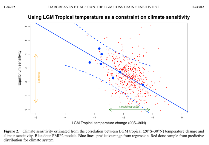
Way back in the mists of time, we did a little bit of work on "emergent constraints". This is a slightly hackneyed term referring to the use of a correlation across an ensemble of models between something we can’t measure but want to estimate (like the equilibrium climate sensitivity S) and something that we can measure like, say, the temperature change T that took place at the Last Glacial Maximum….

Actually our early work on this sort of stuff dates back 15 years but it was a bit more recently, in 2012 when we published this result
Screenshot 2020-01-22 15.13.02

in the paper blogged about here that we started to think about it a little more carefully. It is easy to plot S against T and do a linear regression, but what does it really mean and how should the uncertainties be handled? Should we regress S on T or T on S? [I hate the arcane terminology of linear regression, the point is whether S is used to predict T (with some uncertainty) or T is used to predict S (with a different uncertainty)]. We settled for the conventional approach in the above picture, but it wasn’t entirely clear that this was best.

And is this regression-based approach better or worse than, or even much the same as, using a more conventional and well-established Bayesian Model Averaging/Weighting approach anyway? We raised these questions in the 2012 paper and I’d always intended to think about it more carefully but the opportunity never really arose until our trip to Stockholm where we met a very bright PhD student who was interested in paleoclimate stuff and shortly afterwards attended this workshop (jules helped to organise this: I don’t think I ever got round to blogging it for some reason). With the new PMIP4/CMIP6 model simulations being performed, it seemed a good time to revisit any past-future relationships and this prompted us to reconsider the underlying theory which has until now remained largely absent from the literature.

So, what is new our big idea? Well, we approached it from the principles of Bayesian updating. If you want to generate an estimate of S that is informed by the (paleoclimate) observation of T, which we write as p(S|T), then we use Bayes Theorem to say that
p(S|T) ∝ p(T|S)p(S).
Note that when using this paradigm, the way for the observations T to enter in to the calculation is via the likelihood p(T|S) which is a function that takes S as an input, and predicts the resulting T (probabilistically). Therefore, if you want to use some emergent constraint quasi-linear relationship between T and S as the basis for the estimation then it only really makes sense to use S as the predictor and T as the predictand. This is the opposite way round to how emergent constraints have generally (always?) been implemented in practice, including in our previous work.

So, in order to proceed, we need to create a likelihood p(T|S) out of our ensemble of climate models (ie, (T,S) pairs). Bayesian linear regression (BLR) is the obvious answer here – like ordinary linear regression, except with priors over the coefficients. I must admit I didn’t actually know this was a standard thing that people did until I’d convinced myself that this must be what we had to do, but there is even a wikipedia page about it.

This therefore is the main novelty of our research: presenting a way of embedding these empirical quasi-linear relationships described as "emergent constraints" in a standard Bayesian framework, with the associated implication that it should be done the other way round.

Given the framework, it’s pretty much plain sailing from there. We have to choose priors on the regression coefficients – this is a strength rather than a weakness in my view, as it forces us to explicitly consider whether we consider the relationship to be physically sound, and argue for its form. Of course it’s easy to test the sensitivity of results to these prior assumptions. The BLR is easy enough to do numerically, even without using the analytical results that can be generated for particular forms of priors. And here’s one of the results in the paper. Note that unlabelled x-axis is sensitivity in both of these plots, in contrast to being the y-axis in the one above.
Screenshot 2020-01-22 15.14.21
While we were doing this work, it turns out that others had also been thinking about the underlying foundations of emergent constraints, and two other highly relevant papers were published very recently. Bowman et al introduces a new framework which seems to be equivalent to a Kalman Filter. In the limit of a large ensemble with a Gaussian distribution, I think this is also equivalent to a Bayesian weighting scheme. One aspect of this that I don’t particularly like is the implication that the model distribution is used as the prior. Other than that, I think it’s a neat idea that probably improves on the Bayesian weighting (eg that we did in the 2012 paper) in the typical case that we have where the ensemble is small and sparse. Fitting a Gaussian is likely to be more robust than using a weighted sum of a small number of samples. But, it does mean you start off from the assumption that the model ensemble spread is a good estimator for S, which is therefore considered unlikely to like outside this range. Whereas regression allows us to extrapolate, in the case where the observation is at our outside the ensemble range.

The other paper by Williamson and Sansom presented a BLR approach which is in many ways rather similar to ours (more statistically sophisticated in several aspects). However, they fitted this machinery around the conventional regression direction. This means that their underlying prior was defined on the observation with S just being an implied consequence. This works ok if you only want to use reference priors (uniform on both T and S) but I’m not sure how it would work if you already had a prior estimate of S and wanted to update that. Our paper in fact shows directly the effect of using both LGM and Pliocene simulations to sequentially update the sensitivity.

The limited number of new PMIP4/CMIP6 simulations means that our results are substantially based on older models, and the results aren’t particularly exciting at this stage. There’s a chance of adding one or two more dots on the plots as the simulations are completed, perhaps during the review process depending how rapidly it proceeds. With climate scientists scrambling to meet the IPCC submission deadline of 31 Dec, there is now a huge glut of papers needing reviewers…

BlueSkiesResearch.org.uk: Catastrophic tipping points of no return, returned!

Science has been done and papers written! Deadlines have been met! And not by the Govt’s imaginative strategy of declaring that the deadlines no longer exist, as they are doing with NHS waiting times. Though that did seem like an appealing strategy at some points. I will blog about some of it over the next week or two, which may also help marshal our thoughts for a few talks on our work that jules and I are going to give in the next couple of months.

But before I get on with that…just when you thought it was safe to get back on the see-saw…

Someone (ok it was ATTP) recently asked for a copy of my tipping points essay, so having found a version in my increasingly chaotic disk space I thought I might as well put it up here. It’s the final submitted version, there were a few edits in proofs but nothing significant. I don’t have an electronic version of the final publication but the physical book I have in my possession looks very smart (I haven’t had time to read it). If you want Michel’s contrary essay then you’ll have to ask him for it or else just buy the book which is linked in this previous post. I think we were largely talking past each other as he preferred to focus on mathematical details whereas I was aiming more towards the  original concept of hothouse catastrophising. At least how I see it. I’m sure there are lots more interesting essays in the book (and you can read that however you prefer).
Anyway, there you are. Brickbats and bouquets welcome.

Saturday, January 18, 2020

Will the real Chancellor please stand up?


Britain is better off in. And that’s all because of the Single Market.
It’s a great invention, one that even Lady Thatcher campaigned enthusiastically to create.   
The world’s largest economic bloc, it gives every business in Britain access to 500 million customers with no barriers, no tariffs and no local legislation to worry about. It’s no surprise that nearly half of our exports go to other EU nations, exports that are linked to three million jobs here in the UK. 
And as an EU member we also have preferential access to more than 50 other international markets from Mexico to Montenegro, helping us to export £50 billion of goods and services to them every year. 
Even the most conservative estimates say it could take years to secure agreements with the EU and other countries. 
Having spent six years fighting to get British businesses back on their feet after Labour’s record-breaking recession, I’m not about to vote for a decade of stagnation and doubt.


The chancellor has warned manufacturers that "there will not be alignment" with the EU after Brexit and insists firms must "adjust" to new regulations. Mr Javid declined to specify which EU rules he wanted to drop. 
Speaking to the Financial Times, Sajid Javid admitted not all businesses would benefit from Brexit. "We're also talking about companies that have known since 2016 that we are leaving the EU. Admittedly, they didn't know the exact terms."

I'm old enough to remember a time when the Govt promised us the “exact same benefits ” as membership of the single market. Good to know that all those Brexit voters knew exactly what they were voting for. Shame they still haven't managed to share their vision with the rest of us.


Friday, January 10, 2020

Maths homework

For those who struggle with arithmetic, £130Bn is more than 14 times the annual contribution of £9Bn that the UK currently makes to the EU. The end-of-year £200Bn estimate is more than 22 times larger, and exceeds the totality of our contributions over the entire 47 years of our membership. It seems a hefty price to pay for a blue passport and a new 50p piece.

Of course the long-term damage is far greater than can be measured in purely economic terms. Students and the young in particular will be thrilled that the Govt has recently refused to commit to participating in the wildly popular and effective Erasmus exchange program. The rest of the EU members and associates will no doubt be devastated that they will only have 30 countries to choose from rather than 31.

In unrelated news, the racists who told Meghan Markle to f off back where she came from, are apparently upset that she has decided to do just that. Shrug. Some people just love to hate, I guess. The story even got a mention in the Guardian which has obviously gone down-market.