Wednesday, April 22, 2020

BlueSkiesResearch.org.uk: Bayesian deconstruction of climate sensitivity estimates using simple models: implicit priors and the confusion of the inverse

It wasn’t really my intention, but somehow we never came up with a proper title so now we’re stuck with it!

This paper was born out of our long visit to Hamburg a few years ago, from some discussions relating to estimates of climate sensitivity. It was observed that there were two distinct ways of analysing the temperature trend over the 20th century: you could either (a): take an estimate of forced temperature change, and an estimate of the net forcing (accounting for ocean heat uptake) and divide one by the other, like Gregory et al, or else (b): use an explicitly Bayesian method in which you start with a prior over sensitivity (and an estimate of the forcing change), perform an energy balance calculation and update according to how well the calculation agrees with the observed warming, like this paper (though that one uses a slightly more complex model and obs – in principle the same model and obs could have been used though).

These give slightly different answers, raising the question of (a) why? and (b) is there a way of doing the first one that makes it look like a Bayesian calculation?

This is closely related to an issue that Nic Lewis once discussed many years ago with reference to the IPCC AR4, but that never got written up AFAIK and is a bit lost in the weeds. If you look carefully, you can see a clue in the caption to Figure 1, Box 10.1 in the AR4 where it says of the studies:
some are shown for different prior distributions than in the original studies
Anyway, there is a broader story to tell, because this issue also pops up in other areas including our own paleoclimate research (slaps wrist). The basic point we try to argue in the manuscript is that when a temperature (change) is observed, it can usually be assumed to be the result of a measurement equation like:

TO = TT + e        (1)

where TO is the numerical value observed, TT is the actual true value, and e is an observational error which we assume to be drawn from a known distribution, probably Gaussian N(0,σ2) though it doesn’t have to be. The critical point is that this equation automatically describes a likelihood P(TO|TT) and not a probability distribution P(TT|TO), and we claim that when researchers interpret a temperature estimate directly as a probability distribution in that second way they are probably committing a simple error known as “confusion of the inverse” which is incredibly common and often not hugely important but which can and should be avoided when trying to do proper probabilistic calculations.

Going back to equation (1), you may think it can be rewritten as

TT = TO  + e       (2)

(since -e and e have the same distribution) but this is not the same thing at all because all these terms are random variables and e is actually independent of TT, not TO.

Further, we show that in committing the confusion of the inverse fallacy, researchers can be viewed as implicitly assuming a particular prior for the sensitivity, which probably isn’t the prior they would have chosen had they thought about it more explicitly.

The manuscript had a surprisingly (to me) challenging time in review, with one reviewer in particular taking exception to it. I encourage you to read their review(s) if you are interested. We struggled to understand their comments initially, but think their main point was that when a researcher writes down a pdf for TT such as N(TO2) it was a bit presumptuous of us to claim they had made an elementary error in logical reasoning when they might in fact have been making a carefully considered Bayesian estimate taking account of all their uncertainties.

While I think in theory it’s possible that they could be right in some cases, I am confident that in practice they are wrong in the vast majority of cases including all the situations under consideration in our manuscript. For starters, if their scenario was indeed the case, the question would not have arisen in the first place as all the researchers working on these problems would already have understood fully what they did and why. And one of the other cases in the manuscript was based on our own previous work, where I’m pretty confident in remembering correctly that we did this wrong 🙂 But readers can make up their own minds as to how generally applicable it is. It’s an idea, not a law.

Our overall recommendation is that people should always try to take the approach of the Bayesian calculation, as this makes all their assumptions explicit. It would have been a bit embarrassing if it had been rejected, because a large and wildly exciting manuscript which makes extensive use of this idea has just been (re-)submitted somewhere else today.  Watch this space!

I think this is also notable as the first time we’ve actually paid paper charges in the past few years – on previous occasions we have sometimes pleaded poverty, but now we’ve had a couple of contracts that no long really applies. Should get it free really as a reward for all the editing work – especially by jules!
Tuesday, April 21, 2020

BlueSkiesResearch.org.uk: “5-day doubling” and the great COVID-19 uncalibrated modelling fiasco

(Small edit made 21 Apr to add a corollary at the bottom of the post.)

I’ve said bits of this in various places and at various times to various people, but I don’t think I have written it down in a complete and coherent form. Actually, bits and pieces of the story have come to me at different times and in different ways, so perhaps I didn’t have a coherent story before. Anyway, it seems important and I don’t want it to get whitewashed from history, so here goes.

The story possibly starts on the 12th March, when Vallance stated that we were 4 weeks behind Italy. And also, quite specifically the peak was 3 months away:
For the UK, the peak is expected to fall in three months' time, likely in the summer months, and tail off throughout the autumn, the government said. Vallance said that the UK is around four weeks behind Italy
It’s fair to say the “4 weeks” comment was met with a bit of scepticism by the general public, eg here. And here. When the Govt’s Chief Scientist is being openly mocked for his comments, it seems to me that something is seriously wrong. For context, on the 12th March we’d had about 500 cases and 8 deaths. 15 days earlier on the 26 Feb, Italy had had very similar numbers – in fact slightly fewer cases and more deaths. In both countries, the numbers of cases and deaths were doubling roughly every 3 days, meaning we would get to Italy’s then current values of 20,000 cases and 144 deaths in about a fortnight or so (5 doublings = 32x). 4 weeks was obviously risible.

Then a few days later the 16th March, Vallance talked specifically about a 5 day doubling time (on this youtube video, starting from 27 mins in). And people were puzzled. 5 day doubling would indeed put us about 4 weeks behind Italy (ie the required 5-and-a-bit doublings would take about 26-27 days), but Italy wasn’t doubling every 5 days, and neither were we. We were both doubling on a 3 day time scale instead, possibly quicker than that.

It was actually jules who cottoned on to this first. She had been looking at the numbers more than me, and working out the doubling rate. At this point I was more thinking about the govt’s strategy to fill the streets with bodies under their “herd immunity” plan. It seemed very clear that the weight of critically ill people was going to be a huge burden that the NHS would have no possibility of treating, and my first blog post (which didn’t even have a proper model in, just some curves) focussed on that particular detail.

Anyway, 5 day doubling. Where did this come from? Took me a little while to work it out. It wasn’t until I got hold of the SEIR model and started playing around with it that it started to come together. Ferguson had posted a paper on the 16th March that outlined his modelling. Although his model is of course far more detailed than the SEIR model I was using, it described the parameters in enough detail to emulated rather well by my simpler model. And….the doubling rate he had used was 5 days. You don’t need to do too much digging – or have a great deal of expert knowledge – to find it in the paper:
a 6.5-day mean generation time. Based on fits to the early growth-rate of the epidemic in Wuhan, we make a baseline assumption that R0=2.4 but examine values between 2.0 and 2.6.
What this means is, the number of cases grows by a factor of 2.4 in 6.5 days. Which is equivalent to doubling in 5.1 days. They just imposed that – admittedly, the parameters were estimated from the Wuhan outbreak, but this result came a very small data set very early on. It is also well known that the basic reproductive rate R0 depends on the social context and it’s far from certain that it would transfer directly from the Chinese denizens of a wet market to the population of the UK. To some extent, the effective duration of the period in which people pass on the infection could vary in practice vary too, depending on whether people go to bed or go to work etc. So there is simply no way that putting in the first estimate for Chinese parameters (with a modest uncertainty range) could be considered a robust and reliable modelling strategy, especially since there was already strong evidence that these values were not appropriate even for the later growth of the Wuhan outbreak let alone closer to home. There was ample evidence from other European countries that their doubling rates were far faster than 5 days, and growing evidence from the UK that we were following the same path.

I did a bit more playing around with my model, including parameter estimation, and quickly came to the realisation that R0 had to be rather larger than Ferguson had said.

I emailed Neil Ferguson about this on the 27th, and also CCed David Spiegelhalter, on the basis that as a public-facing stats expert with a strong interest in health he’d get what I was talking about and realise it was important..and, well, they did reply which was more than I was really expecting, but only to politely brush me off. Prof Ferguson did at least acknowledge that he now thought a higher value of R0 in the range of 2.8-3 was appropriate. And true enough, the very day I emailed them, Govey had talked of a 3-4 day doubling. But that requires a rather larger R0 in the range of of 3 to 4 (assuming the same 6.5 day time scale), and is still a bit slower than the data were consistently showing. Later research from IC with a simpler model pointed to a value of around 4.

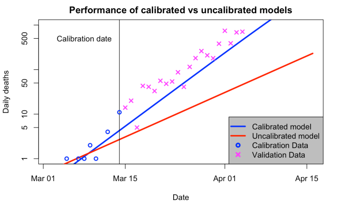
As for why this matters, here are results from two model simulations. One of them – the uncalibrated one – is very close to what the IC group showed to the Government. The other one is what you get if you calibrate the model to the growth rate shown in the UK data that was available at that time.

For the red line, I used Ferguson’s model parameters and initialised the model as he described in his paper, timing the epidemic so that it had the correct number of total deaths (21) up to 14 March. For the blue one, I first fitted the parameters to the time series of cases reported in the UK, which were probably reasonably reliable up to that time as they were still tracing contacts and testing etc. Similar parameters would have been obtained from fitting to Italy, Spain and the Wuhan outbreak. I then initialised the simulation as for the red curve (daily deaths on 14th are slightly different but the integral up to that date is the same).

Want to guess which one is closer to the future observations? Well, you don’t have to. The initialisation leaves the blue line about a day or two behind reality (only!) but tracking it at the same rate. The red line…just…well. No comment. The logarithmic axis really helps to hide how far away from reality it is.
performance
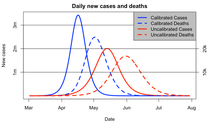
And as for why this really mattered…the red curve below was how the Ferguson et al model predicted the epidemic was going to pan out. A couple of months to the peak in infections and deaths following almost a month after that. Terrible, but still a little way away, and and Vallance was saying we mustn’t suppress the epidemic too quickly.

However, in reality we were on the blue curve. A peak of over 3 million new cases per day was less than a month away. Well over 20k deaths per day at the start of May. And the govt was just shilly-shallying around.
forecast
The big puzzle for me in all this is, why on earth didn’t Ferguson calibrate his model to the 3-day doubling exponential growth rate that was clearly visible in the data? Ok, perhaps I’m a bit biased due to model calibration being basically what I have spent the last couple of decades on, but it’s a pretty fundamental component of forecasting in every field of science that you can think of. Apart from this one, it seems. Every weather forecast is generated by a model that’s tuned to look like reality, both in terms of parameters (as part of its design and commissioning) and also initialised to look like today’s weather. The epidemiologists did the latter ok – choosing a start date to fit their epidemic to start about the right time – but never bothered to tune their parameters to match the growth rate.

It will, I suspect, forever remain a mystery as to why this happened.

A small corollary of the above, added on 21 Apr: It is very straightforward to calculate the effect of a delay to the lockdown. A week of unchecked growth at 3-day doubling corresponds to a factor of 5, meaning that 80% of the total size of the first wave we are currently in could be directly attributed to the Govt delaying by a week, if it was felt that the evidence could and should have supported action that much sooner (ie, when most of the rest of Europe was taking action). That means 80% of the peak strain on the NHS, 80% of total cases and also 80% of all resulting deaths. What this calculation doesn't account for, is what happens in the longer term. We may all get it in the longer term anyway (well 60%+ of us). But we might not, and even so, the huge peak was 5x bigger than it would have been if controlled just a week quicker.

Wednesday, April 15, 2020

BlueSkiesResearch.org.uk: Model calibration, nowcasting, and operational prediction of the COVID-19 pandemic

Title as post. Yes, this is us dipping our toes into epidemiology. Turns out that calibrating a simple model with observational data is much the same whether it’s paleoclimate or epidemics. The maths and the methods are much the same. In fact this one is a particularly easy one as the model is embarrassingly linear (once you take the logarithm of the time series). I’ve been posting my analyses on Twitter and the other blog, but since this is a real paper with words and figures and references and stuff, it can go here too (plus, I can upload a pdf here unlike blogspot).

We have been doing a very straightforward MCMC calibration of a simple SEIR model (equivalent of energy balance box model in climate science, pretty much). The basic concept is to use the model to invert the time series of reported deaths back through the time series of underlying infections in order to discover the model parameters such as the famous reproductive rate R. It’s actually rather simple and I am still bemused by the fact that none of the experts (in the UK at least) are doing this. I mean what on earth are mathematical epidemiologists actually for, if not this sort of thing? They should have been all over this like a rash. The exponential trend in the data is a key diagnostic of the epidemic and the experts didn’t even bother with the most elementary calibration of this in their predictions that our entire policy is based on. It’s absolutely nuts. It’s as if someone ran a simulation with a climate model and presented the prediction without any basic check on whether it reproduced the recent warming. You’d get laughed out of the room if you tried that at any conference I was attending. By me if no-one else (no, really, I wouldn’t be the only one).

Anyway, the basic result is that the method works like a charm and we can reliably deduce the changes in R due to imposed controls, and it looks increasing clear that it’s been less than 1 in the UK for several weeks now, while the experts are still talking about the peak being a couple of weeks away. The whole experience is just…so strange.

Anyway, I did try talking politely to some of the experts but just got brushed off which may partly explain the tone in the manuscript. Or maybe that’s just me 🙂

The paper has been submitted to medrxiv but who knows what they will make of it. My experiences when I have poked my nose into other peoples’ fields has not usually be a very encouraging one so I’m half expecting them to reject it anyway. So be it.

Here is today’s forecast to encourage you to read the paper.

uk_14_apr

Sunday, April 12, 2020

Reporting delays etc

Made this GIF overnight. It's showing how my forecast evolves as more data is added to the system. Initially it doesn't assume any control will be imposed, and then at the appropriate day (23rd March) it assumes a change in R (value to be estimated) which feeds through into deaths after a couple of weeks according to the model dynamics.


But something about it bugged me. Why did the model fail in mid-late March? If it's supposed to be a decent forecasting system, it should be predicting where the future data will lie. The late March data were not affected by the lockdown, it's just that the model is overestimating the pace of growth from early data. I played around with a few ideas and really didn't manage to fix it. I did, however, notice that the data jumped sharply from the 13th to 14th of March, from 1-2 deaths per day, to 10+ deaths per day, without a single day in between. This is actually pretty implausible from a statistical point of view if the underlying death rate is growing steadily in an exponential way, as theory and practice expects.

So I went and had a more careful look at the data. 

These data are actually not, as people might assume, the number of people who have died on a given day. They are actually the number of reports collected in a given 24h period, which may represent deaths on any previous time. I already knew this and also knew that it shouldn't affect the growth rate estimate, so long as the delays are fairly consistent over time. This can be checked with an alternative data set in which deaths are actually collated by true date of death rather than date of report, and this is what the next plot does:

Oops I didn't label the axes properly. Deaths vs dates. The red/pink circles are the same as the previous data, that is to say, the number in the daily report that features on the news each day. The blue/cyan triangles, on the other hand, are the deaths that are known to have actually occurred on on each day. The first thing to note is that the blue/cyan points are for the most part higher, and that's despite these numbers only relating to England, so the UK as a whole will be another 10-20% higher still. There is a drop-off towards the present day where the totals are probably not yet complete and some to-be-added deaths will turn out to have occurred on these days. This is specifically warned about in the data. Ignoring these points, the slopes of the two data set are strikingly similar just as theory expects (which is good, as I was relying on this for my analyses to make sense).These are the dotted pink and cyan lines, with the extent of the lines both showing the points I used to derive them. So far, so good.

So now look at the initial segment where I have drawn a couple of bolder lines in red and dark blue. These are linear fits to the darker blue and red data points, and their slopes are quite different. The blue one agrees withe the cyan - I also extended this with the thin solid cyan line and it's coincidentally (confusingly) identical to the dotted one. The red one, on the other hand, extends as the solid pink line and clearly misses the future data. Just as my slightly more complex model fit did. You can also see that the blue dots show no fewer than 5 days actually had 3-9 deaths inclusive, despite there being none of these in the red data. My fit using the full model is not actually just a linear regression but it's rather similar, and creates the same effect.

My conclusion is that the reason my prediction struggles here is the red data were just particularly poor at this point, and this wasn't due either to bad luck with the randomness of death, or that the model doesn't represent the underlying dynamics well (the blue data are perfectly linear), but instead almost certainly due to some weird reporting errors being significantly larger than I had allowed for in my estimation. Because the chance of not getting a single day in that range of intermediate values is extremely low in a world where we had roughly a whole week with the expected death rate in that range. I don't know if they actually changed the system around that time or not - might do a bit more digging.


Friday, April 10, 2020

EUROMOMO

A couple of weeks ago, commenter David Young was scathing of the threat of COVID-19. Look at the EUROMOMO web page, he said. 
"there is no evidence I could see that mortality is above the expected numbers over the last few weeks."
 and 
"Italy does show a spike the last few weeks but well below the peak in 2016-17."
Moreover, this is all backed up by impeccable analysis from Nic Lewis and we know how good he is. he has looked at the Diamond Princess which had only 8 deaths out of 700 cases, mostly old, and  without a single death in the 60-69 age bracket, he has shown the fatality rate is negligible.

Well, let's see how this stacks up a full 2 weeks later.

Week 14 in EUROMOMO is now out. Click for full size.

They've literally had to rescale their axes for multiple countries to keep the death numbers on the plot. Belgium, France, Italy, Spain, Switzerland and England are all at or above their highs from the cold 2016/17 spell. And this is after a few weeks of lockdown that has stopped the death rates from zooming up higher.


And as for the Diamond Princess, there are actually 12 deaths now from the 700 cases, including one in the 60-69 age range of 200 cases. An empirical fatality rate of 0.5%. According to David, Nic said the death rate was 0.11% for this age group, but what's a factor of 4 between friends?

I expect David will appear shortly and acknowledge that he was wrong and that Nic massively underestimated the death rate and that in fact mortality across much of Europe is at an extremely high level despite strong attempts to suppress the epidemic. I can see his flying pig coming in to land right now..

Thursday, April 09, 2020

Updated method and forecasts

I've tweaked the method just a little since my earlier forecasts. 

You may have noticed that the initialisation of my short-term forecasts was fairly poor. This is an inevitable consequence of naively fitting parameters in a simple imperfect deterministic model using a long time series. It gives good overall parameter estimates but the inevitable limitations of the model mean that the final state (from which we look ahead in a forecast) isn't truly a realistic estimate. This can easily be seen in my very first forecast for the UK for example. The spread of model trajectories is quite wide and biased high compared to the last few data points:

A consequence is that even if the trend is perfect, the one-day forecast will be quite poor. We weren't really going to jump from the observed 621 to 1900 deaths in a single day for example, but the day-ahead forecast spread reached that high a value. Various fudges can be used to address this problem, using anomalies is one but that's problematic during exponential growth and won't satisfy the nonlinear model dynamics. The route I have chosen is to weight the more recent data more highly in the fit. The justification for this is that it is a reasonable approximation to allowing the model to forget older data as would happen automatically if I used a stochastic model with sequential updating, or otherwise represented dynamical model error in a more explicit manner. It clearly works at a heuristic level and I'm working on how best to calibrate the effect and implement it in a more technically justifiable manner. I suppose I may end up publishing this somewhere, so I ought to make sure it is defensible.

Last week I looked at Lombardy, and argued that the lockdown was probably working. Here is a re-run of my forecast, withholding the last 7 data points, using a version of the updated method.


You see those cyan flashing circles? They are the 7 latest data points, which were not used in any way in this estimation. Promise!

For giggles, have a look at what IC forecast for Italy last week, and how well that turned out. Each of their forecasts run from Monday to Sunday, the last 4 weeks of experimental forecasts have obs plotted alongside (under!) them and the pink plume is what they forecast just a few days ago for this week. That last one might be just about ok.


 Here is what my method predicted for all of Italy starting from the same Sunday as their most recent failed forecast, again with validation data plotted:


I must admit I am impressed as to how well it has worked, though it should be noted that at the heart of it, it's basically a 3 parameter fit for a model that generates two straight lines (in log-space) with a bend joining them so not a terribly difficult problem. If you know the shape of the bend and how it is formulated, there's a good chance you can predict roughly where and when it's going to stop bending. The remarkable thing is that the experts at IC haven't managed to achieve this. I find it baffling that they are quite so hopeless. There are about 50 or 60 of them co-authoring that report, and they do it for a living. 

Here is another example, my forecast for Spain, initialised a week last Sunday, versus the IC group forecast at the same date (the rightmost greenish plume with dots below was initialised at the same date).


And here is the current UK forecast...before today's figure comes out.

This is the IC forecast for the UK for this week again (pink plume again, below). The data were already outside their range by yesterday. What on earth were they thinking?


Wednesday, April 08, 2020

Dumb and dumber

All these people exhorting amateurs to "stay in their lane" and not muddy the waters by providing analyses and articles about the COVID-19 pandemic would have an easier job of it if it wasn't for the supposed experts churning out dross on an industrial scale.

Two new forecasts for the UK caught my eye yesterday. First from IHME, it predicts a rising death toll to a daily value of over 200 by the end of the week, peaking at about 3000 later in the month (with much uncertainty). It seems to be some sort of curve-fitting exercise. They are regarded as "world-leading disease data experts" by the Guardian at least. Here is their forecast for the UK as reported in the Guardian:


and again from their own report with uncertainties (lines are at 1k intervals). So you can see they expect a strong rise and guarantee that it will go over 1k deaths later in the month.


The article describing their method is here, it's some sort of fancy curve fitting that doesn't seem to make much use of what is known about disease dynamics. I may be misrepresenting them somewhat but we'll see below what a simple disease model predicts.

Next, the famous IC group. And these are the real ones with Ferguson as last author, not the jokers who generated the silly 5700 number that got a brief bit of attention. This is the MRC-funded, WHO-collaborating lot. And what have they done here? They've also basically fitted a curve through historical death data,  and extrapolated it into the future. Their prediction is for a whopping 14k deaths with a range of 8-16k - just in the next week! A minimum of 1500 on the 7th day in that forecast too.


So why do I think these are bonkers? Because we KNOW that a lot changed two weeks ago. And we KNOW that this feeds though into deaths in about 3 weeks. Typical time from infection to death may be a little over 3 weeks but a bunch of people die significantly quicker and this means the effect of the social distancing controls should be feeding though into death rate, oh, about now.

This below is what I get from fitting my simple SEIR model to the available death data, backdated to Sunday to form a fair comparison with the IC group. 

Now, before looking at it too carefully, I do need to give a "health warning" on its validity. In particular, I don't expect the uncertainty range to be very well calibrated. I'm really focussed mainly on the best fit, and the parametric uncertainty included here is a rather subjective component. I suspect the uncertainty intervals to be rather too broad, especially at the top end (which essentially allows for continued strong growth of the epidemic, contrary to what has been seen in other countries that clamped down sooner). The corollary being that I'm pretty confident of reality lying inside the bounds, and optimistic of my median being a much better estimate of the truth than the central forecasts provided by the experts above :-)

The forecast is necessarily vague at this point, because although I believe R changed at the breakpoint, I don't yet know what it changed to. "About 1" is a plausible estimate, it might be higher but we can certainly hope that it's lower as it proved to be in Wuhan and also Italy after they clamped down.


My model predicts a total of 8k deaths next week, with a 5-95% range of 4-19k. Yes it's a wide uncertainty range, I think my prior on Rt is probably still too broad as I don't really expect to see a value lower than 0.5 or higher than 1.5 (and these are just the 1sd spread limits in the above). But I am very optimistic that the median estimate generated by this method is better than the experts have provided, and they don't seem to believe that anything in the lower half of my range is possible at all. Ominously for them, the recent data are already consistently lower than the median, albeit marginally.

I'll come back to these in a week to see how we fared.

Sunday, April 05, 2020

A time to die?

Edit: To save the reader from having to plough through to the bottom, it is apparent that people in some countries are only being tested once seriously ill and indeed close to death. Hence, the time from "case" to "death" is very small, even though the time from infected/infectious may be much longer.
---

A cheery title for a cheery topic.

One issue that causes significant difficulties in assessing the epidemic is not knowing the fatality rate or case numbers with any real certainty. We do at least have a ballpark estimate for fatality rate of around 1%, probably higher if you only count symptomatic cases, but maybe a bit lower if you assume a significant number of asymptomatic ones too. I've generally been assuming 0.75% for the total fatality rate, based on 1.5% for symptomatic cases and an equal number asymptomatic. This number doesn't really affect many of my shorter-term calculations anyway though it matters for the total death toll under full epidemics.

However there is another issue that is also extremely important in understanding and interpreting observations, which that has not received anywhere so much attention. This is the length of time that it takes people who die, to die. Since death data are the only semi-reliable numbers that we have (not perfect, but better than anything else in the UK for sure), even if we assume the death rate is known, and so we know how many cases there must have been at some point in the past, if we don't know when these cases occurred, we are little the wiser. Given a 3 day doubling time, 100,000 cases 5 days ago and 100,000 cases 15 days ago mean very different things for today!

The time-to-die calculation in the IC work seems to be very strongly reliant on a very small data set from early in the Wuhan outbreak. The analysis of these data is presented in this paper here. I think it's a nice piece of work that does the best job available with the limited data. But it only considers 24 deaths, to which it fits a parametric curve. Here is the data set, and the fitted distribution.


The red curve is a direct fit to the data, the blue one is after adjusting for the epidemic growth (which will have biased the observed sample towards shorter times, simply because when looking at deaths on a given day, there were more new cases 10 days ago than there were 20 days ago etc). Ticks are every 10 days, ie the longest observed time to death is 21 days and there isn't a single death in the upper 30% end of the estimated (blue) distribution which falls above this value. This long tail has been created entirely by a parametric extrapolation. I have no idea what theoretical basis there may be for using a Gamma distribution as they did. It may just be convenience - I have no problem with that in principle, but it does mean that this result is rather speculative. 10% of the deaths are estimated to take fully 30 days from symptoms appearing.

During the exponentially-rising part of the epidemic, this time to death can't be easily deconvolved from the death rate anyway, and it might be concealed from view by uncertainties in this parameter. However, we now have epidemics that have played out at least in part down the exponential decline of a suppressed outbreak. This exponential decline focusses attention on the long tail of the time to death distribution, as in this situation there were many more new cases 20 and even 30 days ago than there were 10 days ago.

It is a simple matter to convolve the observed case statistics (faulty as they may be) with a hypothesised time to death distribution to see what this predicts for the shape of the death time series, and look at how this compares to what was actually seen.

In all the plots below, the red case data is expected to lead the other two curves, but the timing of the predicted deaths (black) really should match the observed deaths (blue). I have normalised the curves to have the same magnitude in order to aid visual comparison. Cumulative curves are probably easier to assess by eye but I'll present the daily values too. Click to see larger, I deliberately kept them a bit small as there are so many.

Here are results from Wuhan (Hubei province actually):


 and South Korea

 and Italy

 and Spain


There is a very clear tendency towards too big a lag in the predicted death data (black line) according to the time-to-death curve. South /Korea is pretty good but the others are quite badly wrong. Deaths should still be shooting up in Italy and Spain!

As a simple test, I just arbitrarily shortened the time-to-death by using a gamma distribution with the same overall shape but 15 days shorter mean time (yes, 3.8 rather than 18.8 - I said, just an arbitrary test, and a rather extreme one). And look...


It's a startling improvement in all cases except South Korea. SK may be a bit unrepresentative with the early spread focussed among young church-goers (probably a low death rate and I'm guessing a long time to die) but I shouldn't throw out all inconvenient results just because it suits me.

I don't have an answer to this, but I think it's an interesting question. A 3.8 day mean time to death is surely unrealistically short as an average (from onset of symptoms). It may be the case that the time to get test results accounts for some of this difference - ie, the case numbers reported in these data sets are already somewhat delayed relative to symptoms developing, due to the time it takes to process and report cases. But is there really 15 days added delay here? It seems unlikely.


Saturday, April 04, 2020

Are we achieving suppression in the UK?

Some people are talking about a peak in deaths over the next week or two. And suppressing the disease such that we might be able to lift the lockdown eventually (end of May has been mentioned). But when will we tell how well the controls are working? I've already shown that it takes a while to really show up convincingly in the daily death data (and I haven't even taken account of additional delays in reporting deaths once they've happened). Clearly the reported case numbers for illness are wholly inaccurate and reflect testing policy more than anything else.

Here are a few hypotheticals, again based on the SEIR model fit to daily death data. This time, I have tried a few scenarios in which the effectiveness of the lockdown is measured as a scaling on the R0 parameter. In order from top to bottom, in the plot below R0 stays the same, then is reduced by 50%, 75% and 95% of its value, at the date of the lockdown. The two end cases are IMO wholly implausible and I've put them in just to show the bounds of what the model could do.

First the daily death figures, with recent observations shown. The data don't distinguish much between the scenarios, though you could say it's slightly optimistic that the most recent couple of days are towards the lower end of the spread, but still compatible with even the blue plume at this stage. The plumes do separate out a bit and in another week we will have a much clearer picture of which is closest to the truth. The original R0 in this fit is 3.3 so the green plume with Rt = 1.6 is still trending up towards a widespread epidemic whereas the red one with Rt = 0.8 is achieving control at a much lower level, albeit taking a bit of time to do so. 


The yellow plume shows that people keep on dying at much the same rate for a while even if the disease is quickly reduced with Rt = 0.16. This is a consequence of the long time that some people take to die - at least according to the fitted distribution of time to death that I've taken from the Ferguson et al work. I think it may be worthwhile to revisit this time to death as it was based (as so much of the modelling has been) on a very small set of Chinese data from early on in their outbreak. Rather amazingly, the entire shape and size of the time-to-death distribution beyond 20 days is based on the extrapolation of a parametric fit into a region which contains not a single data point. I'm not saying it's wrong and they probably did as good a job as was possible with the limited data available at that time, but it could surely be improved (revalidated) now.

I've said I don't believe the data on reported cases, but the level of illness is still something that the healthcare system experiences and it's possible that this will provide an earlier indicator. If fewer people are getting ill then there will be fewer 999 calls and lowered demand on beds etc. The symptomatic cases respond much more rapidly and clearly to controls, as shown below. 


So in the red case of even marginal control, where Rt is just over 0.8 on average, the number of new cases falling ill each day should be dropping off quite quickly (consistently by about 5% per day) and by now be well down from their peak. This may not be immediately felt if the beds are still full of course, but it could be observable soon even if time from symptomatic to seriously ill is another week (some people die faster than this). It will certainly be clear soon enough if the cases are really dropping.

Friday, April 03, 2020

Lombardy Lockdown is working?!?

A few small tweaks to the model I was using yesterday and a bit more data have resulted in quite exciting results. Firstly, I improved the death calculation which I had implemented a bit naively. I didn't think it mattered, and perhaps it doesn't much, but every little helps. Now also using the Gamma infection-to-death distribution in the IC work.

I've also changed the prior a bit, I reckon with hindsight that the mean of Rt = 1.5 was a bit high. I'm really interested in whether the data point to a value lower than or higher than 1 with highest likelihood, and if the prior mean is 1.5, a posterior result of 1.3 (say) doesn't really tell you. So I have changed to N(1,1) for the prior of Rt.

And we have two more days of data, since yesterday's file wasn't quite up to date. And the result is....

Looks pretty impressive to me. The lockdown seems to be working! I wonder how believable it is? With deaths starting to trend slightly down, it does seem hard to imagine that the disease is growing.

Uncertainties in all this are a bit dodgy and open to question. But it certainly seems more likely than not that the lockdown in Lombardy has worked.

Thursday, April 02, 2020

When was the Lombardy Lockdown?

Two posts in one day! 

Wuhan has a nice long time series which gives a good test of the model and the fitting. Which it seemed to pass pretty well. Next on the hit-list was Lombardy, which has had the second-longest lockdown. Jules and I thought (yes this was a prior decision) that it was more logical to consider Lombardy as a region rather than Italy as a whole, as this one area was so far ahead of the rest of the country and also had substantially different policies in place with restrictions coming in at an earlier date, Actually, defining the date of lockdown wasn't that easy in this case. According to the Wikipedia page, the restrictions started on 21 Feb, were extended around the end of Feb and early March, and then went national around 8 March. While it may seem inappropriate to consider highly localised restrictions, if they covered the majority of the outbreak, then this will dominate the behaviour of the total exponential growth until the rest catches up. So it really isn't that obvious (without doing a lot more detailed investigation) what date to use. I'll try a range.

8 March is when the lockdown was imposed firmly across Lombardy (there's a later date of 11 March that applies nationally) and perhaps this is the biggest effect on R. Though some things took place earlier in March, like some schools and universities being shut down. Here are results when I assume a date of 8 March for the change in R:


So...it sort of looks like there's a bend, and the model makes some effort to fit it, but tends to overshoot a bit. Marginally narrowed compared to the prior which was N(1.5,1) remember. And nudged down a bit to lower values but still likely greater than 1. Though some people will eye up those data points and the median of the result and say the model is being unreasonably pessimistic. Time will tell. I'll come back to this in a minute.

But first, back on 22 Feb there was a local shutdown around the area of the initial outbreak. If I try this date, on the assumption that even though it's small, control in this area might dominate the overall growth, then I get the following: 

Amusing but nonsense. Rt is actually pushed up compared to my prior guess, and while that is not impossible, what really appears to be happening is that the model is trying to fit the initial uncontrolled fast growth phase with this post-intervention value. It really seems to be saying that the 22 Feb interventions did not have a strong effect.

So, how about some time in between? Choosing the mid-point of 1 March gives the following:


 It's a decent fit, Rt is pushed down and constrained a bit. Of course post-hoc playing around with the intervention date isn't really in the spirit of objective scientific testing and research, but I never claimed to be doing objective scientific research so that's ok. There is obviously a risk that I've overfitted the intervention date but it looks to me like this simulation provides a pretty good explanation of what we can see in the data.

As with Wuhan, 3-4 weeks of data after the intervention date is showing some evidence of a reduction in R0, probably below even the prior assumed mean of 1.5, though maybe not below 1. This seems reasonably encouraging news at least in terms of avoiding the worst extreme of a completely uncontrolled explosive epidemic, though it may mean the controls have to be in place for a while.

What can we learn from Wuhan?

Epidemiology Thursday again, so my boss is allowing me to spend some more time doing calculations. I have set up a proper MCMC sampler to do the parameter estimation more efficiently which is also helpful for churning through a lot of different cases.

Wuhan (Hubei) is a great test case for this sort of modelling and parameter estimation as we have a good long time series, albeit I know people have some doubts about the reliability of their data in current situation but that doesn't really affect what I'm doing. There are doubts about the reliability of all data in this sort of situation!

The main aims in this post are to see:

(A) Can we model the epidemic curve, including the effect of the lockdown?
(B) What parameters do we obtain from fitting the data?
(C) How soon after the lockdown can we estimate its effectiveness, and how do rapidly we learn over time?

C is really the fun one. But starting at the beginning...

The model is the same old SEIR, with uncertainties primarily in R0 during the initial growth, and Rt after the lockdown (that's still the reproductive ratio R but it applies after a given time t). I have to also allow the initial state to vary (it is strongly related to R0) in order that we get the right size epidemic at the right time. Including uncertainty in the time constants of the model doesn't actually make much real difference here, changes in R compensate for changes in the reproductive time period anyway. I've allowed for half a day of uncertainty (at one standard deviation) in the latent period. The other parameters that I could have allowed to vary are held fixed for now, there's no point having too many more degrees of freedom than constraints as it just means the estimation process is a bit less well behaved.

For priors in R0 and Rt, I used N(mean, sd) = N(3,2) and N(1.5,1) respectively - the prior for R0 is very broad and although I do expect the lockdown to have an effect, I don't know how much. Rt could easily be less than 1 in this prior, but it's rather more likely to be greater than this value. I could have implemented this change as a scaling factor on R0 which might have been better, but I'm not altering it now.

I should also mention for completeness that I massaged the Hubei data just a little to remove obvious errors. I could only find daily cumulative data starting on the 23rd Jan, so I had to add a couple of weeks prior to that as the first death was reported on the 9th and there were 17 by the 23rd. I also eliminated some obviously erroneous zeros in the daily death figures by shifting 1/3rd of the deaths from the two immediately adjacent days. I'm working primarily in log-space so zeros are particularly irksome. And anyway they are just missing data, not real days with no deaths (except at the very start).

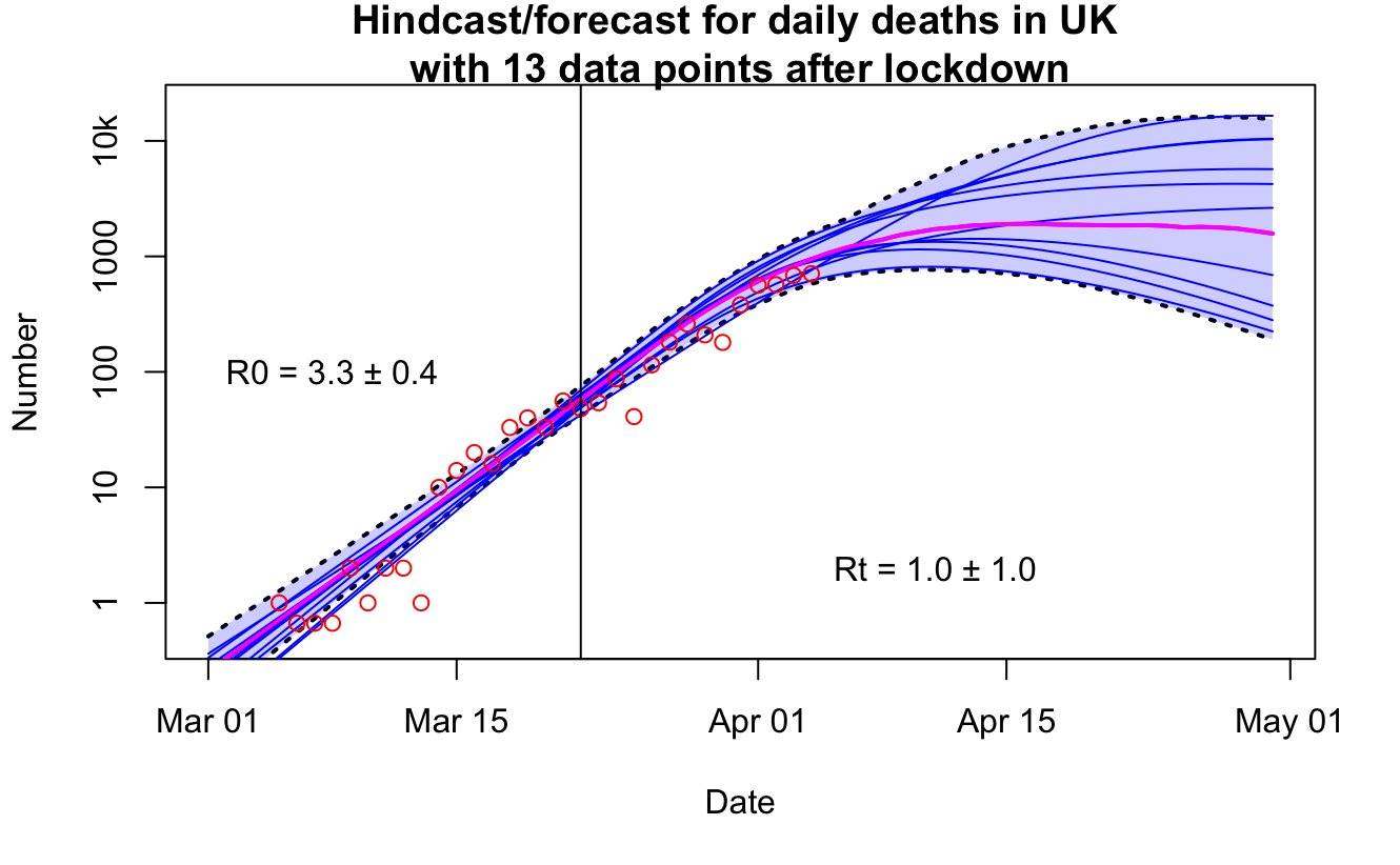
And without further ado,..the fit to the Hubei data. With lockdown date (when R changes) indicated. And the before/after values shown on the plot. As previously, the plume is 5-95% range, I've put the median as the magenta line and the thin blue ones are just a few random samples from the ensemble. The red circles are the obs after the massaging I just described.


That's pretty amazing IMO for such a simple model to do such a good job. The parameter values seem very reasonable too, compared to the literature. Yes I know there's a bit of extra whitespace at the top of the plot, the reason is to put all of them on the same axes for easy comparison.

So.....how quickly could we learn about Rt, the value after the lockdown? One week after, perhaps? Here's the result when we use the first 7 days of data after that date. 


It's a big fat nope. The Rt value shown there is simply the prior choice I made (slight variation due to sampling/rounding error, the exact mean in the ensemble here is 1.551!). Therefore this plot shows the range of futures I assumed under my prior assumption, with some trajectories heading up to herd immunity without much hesitation, and others bending down towards suppression very rapidly. 

How about 2 weeks of data? Does that give us a hint? 


No, not really. If you know what is coming, you could claim there's a slight reduction in the growth rate over the last few days of data, and this is reflected in a slightly lower estimate of R0, but it doesn't constrain Rt. In this model. In fact the time scale for Rt to affect deaths in this model does theoretically allow for it to influence the last few data points and thus for these data to help in the estimation of Rt, but they aren't sufficiently strong evidence to really tell us much.

Three weeks post lockdown, however, and there appears to be something going on. Rt is nudged lower than the prior estimate, and its uncertainty is starting to reduce a touch. Even in the worst case of an ongoing epidemic, this is slower and smaller than in the previous results.


4 weeks, and it's clearer, but even then there is still a substantial chance of Rt > 1. 

5 weeks down the line, it is much better bounded:

That was a very unlucky sample line that shoots off upwards. I checked what was going on in case of a bug or lack of convergence and it just happened to lie at the 99.8th percentile of the posterior 5000-member ensemble. But even so, it's not getting to the top of the graph by the end of March.

Usual caveats apply: it's a simple box model, and I've made a few assumptions that might not be fully justified. But overall I'm really impressed with how well it works.