Thursday, May 21, 2020

BlueSkiesResearch.org.uk: The EGU review

Well.. that was a very different EGU!

We were supposed to be in Vienna, but that was all cancelled a while back of course. I might have felt sorry for my AirBnB host but despite Austria banning everything they didn’t reply to my communication and refused a refund so when AirBnB eventually (after a lot of ducking and weaving) stepped in and over-ruled them and gave me my money back I didn’t have much sympathy. They weren’t our usual host, who was already full when I booked a bit late this year.

Rather than the easy option of just cancelling the meeting, the EGU decided to put everything on-line. They didn’t arrange videoconferencing sessions – I think this was probably partly due to the short notice, and also to make everything as simple and accessible as possible to people who might not have had great home broadband or the ability to use streaming software – but instead we had on-line chat (typing) sessions with presentation material previously uploaded by authors, that we could refer to as we liked. There was no formal division into posters and oral presentations. Authors could put up whatever they wanted (50MB max) onto the website beforehand and people were free to download and browse through at will. It is all still up there and available to all permanently, and you can comment on individual presentations up to the end of the month (assuming the authors have allowed this, which most seem to). The EGU has posted this blog with statistics of attendance which shows it to have been an impressive success.

Some people put up huge presentations, far more than they would have managed in a 15 minute slot, but most were more reasonable and presented a short summary. We did poster format for ours as we felt that this allowed more space for text explanation and an easier browsing experience than a sequence of slides with bullet points. Unfortunately my personal program of sessions I had decided to attend has been deleted from the system so I can’t review what I saw in much detail. I usually take notes but this time was too busy with computer screens.

Of course, being in Vienna in spirit, I had to have a schnitzel. I might have to have some more in the future, they were rather good and quite easy to make. Pork fillet, not veal.

IMG_0439
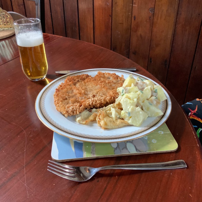
The 2nd portion at the end of the week was better as I made my own breadcrumbs rather than using up some ancient panko that was skulking in the back of the cupboard. But we ate them too quickly to take pictures! Figlmüller eat your heart out!

The chat sessions were a bit frenetic. Mostly, the convenors invited each author in turn to post a few sentences in summary, following which there was a short Q-and-A free-for all. This only allowed for about 5 mins per presentation, which meant maybe 2 or 3 questions. But this wasn’t quite as bad as it seems since it was easy to scroll through the uploaded material ahead of time and pick out the interesting ones. Questioning could also run over subsequent presentations, it wasn’t too hard to keep track of who was asking what if you made the effort. As usual, there were only handful of interesting presentations per session for me (at most) so it was easy enough to focus on these. It was also possible to be in several different chat sessions at once, which you can’t do so easily with physical presentations! The structure made it more feasible to focus on whatever piqued our interest, and jules in particular spent more time at those sessions she does not usually get around to attending because they are outside of her main focus. Some convenors grouped presentations into themes and discussed 3-5 of them at a time, for longer. Some naughty convenors thought they would be clever and organise videoconferencing sessions outside of the EGU system, which actually worked pretty well in practice for those (probably a large majority to be honest) who could access it, but not so good for those who had access blocked for a number of reasons. Which is probably why the EGU didn’t organise this themselves. Whether it is actually preferable to the on-line chat is a matter of taste.

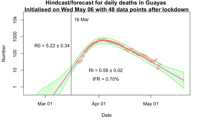
Jules was co-convening a couple of sessions and the convenors set up a small zoom session on the side to help coordinate, which added to the fun. A bit of personal chat with colleagues is an important aspect of these conferences. Her presentation is here and outlines some early steps in some work we are currently doing – an update to our previous estimate of the LGM climate, which is now getting on for 10 years (and two PMIP/CMIP cycles) old. I think we should probably find it encouraging that the new models don’t seem very different, though it may just mean that they share the same faults! There is some new data, perhaps not as much as we had hoped. And the method itself could do with a little bit of improvement.

I had actually found it a bit difficult to find the right session for my work when originally submitting it. It didn’t seem to quite fit anywhere, but in the end it turned out fine where I put it. The data assimilation stuff was a little less interesting methodologically speaking, perhaps because it’s a sufficiently mature field that everyone is just getting on with the nuts and bolts of doing it rather than inventing new approaches. I did get one idea out of it that I may end up using though, and this from the Japanese looks absolutely incredible from a technological point of view – nowcasting cloudbursts over Tokyo with a 30 second update cycle! With the extra year they’ve now got, it will probably be operational for the Olympics.

Jules and I also co-authored Martin’s work with us on emergent paleoconstraints which we were originally going to present for him as he wasn’t planning to attend. But, with the remote attendance he ended up able to do it himself which was a small bonus.

Best of all – no coffee queues! Well that and not needing to schlep out at 8pm looking for dinner each night…which is fun but gets pretty tiring by the end of the week. On the downside, we had to buy our own lunches rather than gatecrashing freebies all week like we usually (try to) do.

As for the future…well it seems pretty embarrassing that it took current events into forcing the EGU into moving on-line. Some of us have been pushing them on this for years and it’s always been met with “it’s too complicated” by the powers that be. I suspect they mostly like the idea of being in charge of a huge event and enjoy hobnobbing at all the free dinners (don’t we all!) but that doesn’t justify forcing everyone to fly over there and spend at least €2k minimum – probably rather more for most – to take part. It’s a huge amount of time, money, and carbon and we really ought to do better. If one good thing is to come out of the current mess, it might be that people finally wake up to the idea that working remotely really is fully feasible these days with the level of communication technology that is available. Blue Skies Research has been living your future life for more than 5 years now, and it’s great! Roll on next year. I know that turning up has added benefits, and don’t expect all travel to stop. But with remote access, people can easily “go” to both of the AGU and EGU each year, drop in to the bits that interest them, without having to devote a full week and more to each, with huge costs, jet-lag, the carbon budget of a small country, etc.

I expect that the AGU will want to put on a better show this December. Even if travel is opened up by then (which I wouldn’t be confident about at this point) I doubt this will happen quickly enough for the event to be organised in the usual manner. It will be good to have a bit of friendly rivalry to spur things on. In recent years, the AGU has generally been ahead of the EGU in terms of streaming and remote access – last December we watched a couple of live sessions and even asked a question (via text chat) though we were lucky that the small selection of streamed sessions included stuff of interest to us. The EGU has tended to put up streams of just a few of the public debate sessions rather than the science, and this only after the event with no opportunity for direct interaction. Bandwidth is a problem for streaming multiple sessions from the same location, but maybe even an audio stream with downloadable material would work? One thing is for sure, back to “business as usual” is not going to be acceptable now that they’ve shown it can be done differently.

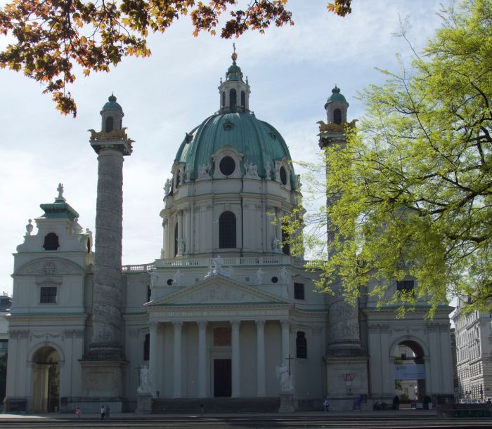
Here’s Karlskirche which I hope to see again in the flesh some time.

karl

Coincidentally, just a few days after the EGU I took part in this one-day webinar. It had a bit of the same sort of stuff – I presented the same work again, anyway! This was a zoom session which worked pretty well, there were one or two technical problems but you usually get in a real conference anyway with people plugging their laptops into the projector. It was great to have people from a range of countries attend and present at what would normally have been a local UK meeting of climathnet people. I have never quite managed to attend any of these before because they always seemed like a long way to travel for a short meeting that mostly isn’t directly relevant to our research. I expect to see a rapid expansion of remote meetings of various types in the future.

Tuesday, May 19, 2020

Oops

There I was, thinking I was typing into the void...and it turns out the comment notification had got turned off so I hadn't seen them. As well as lots of unread comments, there were quite a few stuck in moderation (it's off by default, but I think that goes on automatically after a period of time).

I am having a look back but if I've missed anything specific please copy and post again so I notice. For the most part it looks like you've answered each other which is helpful :-)

Monday, May 18, 2020

Strategy for a Pandemic: The UK and COVID-19

Sir Lawrence Freedman (member of the Chilcott Inquiry) has written a review of the UK Govt's response to the coronavirus outbreak which can be found here

He explains his motives thusly:

"The inquiry into the United Kingdom’s role in the 2003 Iraq War, of which I was a member, took the view that when inquiring into a contentious area of policymaking, an essential first step was compiling a reliable account. This should be influenced as little as possible by the benefit of hindsight. This article attempts to provide a preliminary account of the development of UK strategy on COVID-19, from the first evidence of trouble in Wuhan in early January to the announcement of the full lockdown on 23 March. As policy-makers claimed to be ‘following the science’, this requires an analysis of the way that the expert community assessed the new coronavirus, the effects of alternative interventions intended to contain its spread and moderate its impact, and how experts’ findings were fed into the policymaking process. It is preliminary because, while there is good material on both the policy inputs and outputs, the material on how the policy was actually made is more speculative."

It's an interesting read, but while reading it I can't help but think of Orwell's aphorism:
"Who controls the past controls the future."
Here is an interesting snippet in which there seems to be a very clear and perhaps important misunderstanding of the time line. Freedman says on p52:

"By that time, the strategy had already begun to shift. Hours after the COBRA meeting, on the evening of 12 March, SAGE met again to hear from Professor Ferguson on the results of his group’s latest modelling. The conclusions, which were made public on 16 March, were startling. What had made the difference was evidence from Italy suggesting that the R0 was more like 3 than 2.5 and, most importantly, that previous estimates of intensive-care requirements had been optimistic."

The paper itself is of course published and uses an R value of 2.4 in the main analysis of mitigation scenarios, with a range of 2.0-2.6 in sensitivity tests. The Oral hearing of the Science and Technology Committee that Freedman cites as the source of his information took place on the Wednesday 25 March 2020 and can be found here. Ferguson is on at 10:15 onwards, with the relevant comments about R0 right at the end of his segment around 10:55. He says rather disingenuously that the new estimate for R0 of around 3 is "within the wide range of values" that had been considered by modelling groups. Certainly not his, and when you take the doubling time into account, it is very much at the edge of Kucharski's work too. 

I think Ferguson is on very dodgy ground indeed in so blithely dismissing this discrepancy in front of the Select Committee as it is critical to the question of how soon and how aggressively we needed to deal with the epidemic. Note that the doubling time (which is what really matters here) depends not only on R0 but also the reproductive time scale of the virus). In fact, as I have documented previously, the SPI-M advice specifically pointed to a 5-7 day doubling time as late as the 18th March at which point they were considering a lockdown for London (only). It was only at the meeting of the 23rd, long after the 12 March date that Freedman refers to, that SAGE learnt of the change of the estimate to 3-5 day doubling, and the lockdown was ordered that same evening. I am no friend of the Tories and there are lots of things they did badly, but specifically in terms of reacting to the abruptly and radically updated scientific advice, their response seems exemplary here.

Also, on p58:
"Given the known sequence for infection, incubation, hospitalisation and death, it is reasonable to conclude that changes in behaviour were having an effect well before 23 March, especially in London."

This may be possible but does not seem necessary. I'm not just drawing on my own modelling here, Flaxman et al consider all the interventions and also find that the lockdown had by far the largest effect on the epidemic with the other earlier interventions being very minor influences in comparison. Their latest estimate shows R0 dropping from 3.9 to about 3.5 during the week prior, then collapsing to about 0.7 on the 23rd, very similar to my own estimate. (as I've discussed before, their sightly larger initial and lower current values for R can probably be attributed to a longer serial interval of 6.5d in their model compared to about 5.5d in mine). Here are both of our latest results, mine as the top plot and theirs in the following two:


Freedman's rosy assessment from p57 onwards of the NHS coping may not be shared by all, particularly the large number of victims who were shut out by the NHS and sent out into the community to die in care homes while infecting many others, with both NHS and care home staff also inadequately protected. If the NHS really had capacity, why did this happen? I know he refers to this subsequently, but doesn't seem to make the connection. "Coping" by refusing treatment to large numbers of sick and dying people isn't really coping, is it?

Anyway, it's an interesting read.


Friday, May 15, 2020

BlueSkiesResearch.org.uk: Why can't the Germans be more like us?

Germany locked down at about the same time as the UK. Actually probably a couple of days earlier, according to Wikipedia and Flaxman et al. Picking a single date is a bit subjective really, but for the purposes of this post I’ll choose the 21st March. So why are they doing so much better than the UK? Well, the main reason is just that they were at a much earlier stage in their epidemic. On the 23rd, the UK had had 508 deaths. On the 21st, Germany was at 47. So that’s a factor of about 10. They were about 9 or 10 days behind us in terms of where they were on the upslope. 10 days ahead of our lockdown, Vallance was saying we had to be careful of not clamping down too soon. What would have happened if the Germans had waited a week?

This is of course quite an easy calculation to do. I can fit the model as before, and then run a simulation with the lockdown date delayed a week. Here it is, looking roughly similar to the post I just did for the UK, except this time the blue line goes higher due to locking down later. Sorry for over-writing the lockdown dates. Never mind. They are 21 and 28 March.

germany_14_may_delay1
Playing the same game as before, sliding the blue graph along by a week (backwards this time) and then dividing it by 4…and it hits the magenta one again, and even has the same small mismatch due to a hint of herd immunity at the right hand edge. Once again, the doubling time I get from the fit is 3.5 days so delaying by a week would have quadrupled the death toll. These total death tolls are the integral all the way down the slope off the end of the graph, by the way, which is why the total both here and in the previous post is a bit higher than the current number.

germany_14_may_delay2
It would still have been a little bit less than ours, but it would have been close. Good to know we can still beat the Germans at something.

As for why our total is only about 5x the German one rather than the factor of 10 that we had on our lockdown day...mostly just the random deviations from the exponential slope at the start. By early April (and therefore too soon for it to have been a result of the policy) the ratio in death totals was only 6, and it's stayed close to that ever since. Their lockdown also seems to have been a bit more effective, in terms of the estimated Rt value. Probably they didn't have the same care home fiasco which is currently fuelling our outbreak.

Wednesday, May 13, 2020

BlueSkiesResearch.org.uk: The human cost of delaying lockdown

A while ago, I mentioned that the cost of delaying lockdown by a week was to increase illness and death by a factor of 5, based on the doubling time of 3 days that the virus seemed to have at the start.
It’s a simple result but quite striking and perhaps counterintuitive, so here it is in more detail (and with slightly different numbers).

I’ve been fitting the SEIR epidemic model to the daily death data, and here is the latest hot-off-the-press version.

uk_12_may
The magenta line is the median of my model fit, and the red circles are the data, though I have smoothed them a little to reduce the huge weekly cycle in reporting (Sun/Mon are always really low, then Tuesday really high).

This model allows the reproduction number to change at the lockdown date, and estimates the two values (which I call R0 and Rt) by fitting to the data. Taking that central magenta estimate, it is easy to re-run the model assuming the same change happened a week earlier. And this is what we get:

uk_12_may_delay1
Magenta is as above, and blue is what happens if I make the change in R one week earlier, on the date of the blue vertical line. How did I know it would cause such a large reduction in deaths? The doubling time in the early phase is 3.5 days here (not 3 days as I got previously, told you the numbers were slightly different). So the size of the epidemic on this new lockdown date is exactly 1/4 the size it was on the later date. And the behaviour of exponentials (both growing and declining) is such that every day before or after the lockdown, the total size in the hypothetical case is also 1/4 what it was the same number of days before or after the lockdown in reality. The next plot shows this more clearly. I have just shifted the blue line forward by 1 week to make the lockdown dates coincide.

uk_12_may_delay2
See the same shape, just lower? The logarithmic y-axis that I’m using means that a constant vertical distance between the solid blue and magenta lines corresponds to a constant ratio in numerical values, of 4 in this case. So the total number of deaths is also smaller by a factor of 4. The dashed blue line is the same model output as the solid blue line, only I’ve multiplied it by 4. You can see it overlies the original magenta almost exactly. Just towards the right hand edge of the graph there is a small mismatch, which is due to the magenta case benefiting from a slightly enhanced decline from a hint of the “herd immunity” phenomenon. That is to say, a with roughly 10% of the population having suffered from the disease in that scenario, these people (assumed to be immune) reduce the spread of the disease just enough for the lines to look a little bit different.

So, with these numbers that represent an initial doubling time of 3.5 days, we see that implementing the lockdown one week earlier would have saved about 30,000 lives in the current wave (based on official numbers, which are themselves a substantial underestimate). It would also have made for a shorter, cheaper, less damaging lockdown in economic terms. And this is all quite simple maths that every single modeller involved in SAGE was fully aware of at the time.


Tuesday, May 12, 2020

BlueSkiesResearch.org.uk: What can we learn about the COVID fatality rate from Guayas?

Guayas is a region in Ecuador that has had a particularly tough time with COVID-19. Prompted by this Twitter post from Karsten Haustein I have done a bit of modelling…
The daily death totals are available from here from where I could also work out that the typical background mortality was about 60 per day. They hit a peak of over 700(!) and the total excess deaths looks like about 12k in a few weeks (out of 4.5 million, that’s over 0.25%). So that in itself puts a lower bound of that magnitude on the “infection fatality rate” or IFR in that region. (I think Karsten’s number on the tweet could be open to misinterpretation, the excess being half their annual mortality is true enough, but they are a young growing region so it’s a lower percentage of total population than 300k would be in the UK.)

But maybe modelling could shed a little more light?

It was a bit of a challenge to get the model to work well on this data set and I had to tweak it a bit. Most importantly, the time to death distribution in the model seems too broad and flat. I had to sharpen it significantly to be able to reproduce the peak. This seems intuitively reasonable as I’m sure they didn’t have thousands of people kept alive on banks of ventilators, but on the other hand I have no rigorous basis for this modification so the post is a bit handwavy. I think it’s reasonable but different choices might have resulted in different results. I also changed the way I am handling model error a bit as I wanted to really explore how well I could fit the data. There was a bit of tweaking involved to make it work ok. My aim was to see if I could fit the data with a range of different IFR values, and perhaps infer what values might be compatible with the data.

Without further ado, some results. I fixed the IFR at various different values as shown (just by using a really narrow prior centred on those values).


Using 0.2%, it’s a horrible fit that massively underestimates the peak. Not surprising really, given that 0.27% of the whole population died. In fact despite the tight prior, it refuses to stick at that value and drifts up to 0.21%. Even the simulation with 0.3% is not great. The logarithmic scale of the plot flatters it a bit, and it stays comfortably under the peak for quite some time. Interestingly, Rt is estimated to be significantly over 1 during the declines here (despite the attempt at control), because the herd immunity is sufficiently high to play a significant role in squashing the epidemic. IFR=0.4% gives an entirely satisfactory simulation, indistinguishable from the IFR=1% case (at which herd immunity ceases to be a significant factor). The only tell-tale difference is in the Rt values obtained. I suspect that the 0.5 value on the 1% plot is a bit optimistic, we haven’t managed that anywhere in Europe despite being much richer and not having been completely overwhelmed by the epidemic to anything like the same extent. On the other hand we all did better than Rt=0.94.

Splitting the difference, IFR =0.7% is visually indistinguishable again, with Rt = 0.58 being a bit less optimistic than the 1% run. This value for IFR (well, 0.75%) is what I’ve been using in all of my modelling.

guayas_0.7
Ecuador is a very young country compared to the UK (which would point to a lower IFR) but also much poorer and obviously healthcare was completely overwhelmed with this epidemic (which would point to a higher one). Do these factors cancel, compared to the UK? I have no idea, but I would think that epidemiological modellers might be able to draw more concrete conclusions than I am prepared to do.

If I could find daily data from Bergamo, Italy, I could play the same game there. Lombardy as a whole is only at the 0.14% fatality level which I think won’t be enough to be useful in the same way.