So, the fortnightly chunks in the last post were doing ok, but it’s still a bit clunky. I quickly found that the MCMC method I was using couldn’t really cope with shorter intervals (meaning more R values to estimate). So, after a bit of humming and hawing, I dusted off the iterative Ensemble Kalman Filter method that we developed 15 years ago for parameter estimation in climate models I must put a copy up on our web site, it looks like there’s a free version here. For those who are interested in the method, the equations are basically the same as in the standard EnKF used in all sorts of data assimilation applications, but with a couple of tweaks to make it work for a parameter estimation scenario. It had a few notable successes back in the day, though people always sneered at the level of assumptions that it seemed to rely on (to be fair, I was also surprised myself at how well it worked, but found it hard to argue with the results).
And….rather to my surprise….it works brilliantly! I have a separate R value for each day, a sensible prior on this being Brownian motion (small independent random perturbation each day) apart from a large jump on lockdown day. I’ve got 150 parameters in total and everything is sufficiently close to Gaussian and linear that it worked at the first time of asking with no additional tweaks required. One minor detail in the application is that the likelihood calculation is slightly approximate as the algorithm requires this to be approximated by a (multivariate) Gaussian. No big deal really – I’m working in log space for the number of deaths, so the uncertainty is just a multiplicative factor. It means you can’t do the “proper” Poisson/negative binomial thing for death numbers if you care about that, but the reporting process is so much more noisy that I never cared about that anyway and even if I had, model error swamps that level of detail.
The main thing to tweak is how big a daily step to put into the Brownian motion. My first guess was 0.05 and that worked well enough. 0.2 is horrible, generating hugely noisy time series for R, and 0.01 is probably inadequate. I think 0.03 is probably about ok. It’s vulnerable to large policy changes of course but the changes we have seen so far don’t seem to have had much effect. I haven’t done lots of validation but a few experiments suggest it’s about right.
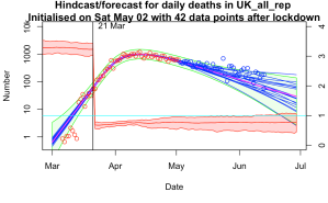
Here are a few examples where (top left) I managed to get a validation failure with a daily step of 0.01 (top right) used 0.2 per day but no explicit lockdown, just to see how it would cope (bottom left) same as top left but with a broader step of 0.03 per day (bottom right) the latest forecast.


I’m feeling a bit smug at how well it’s worked. I’m not sure what other parameter estimation method would work this well, this easily. I’ve had it working with an ensemble of 50, doing 10 iterations = 500 simulations in total though I’ve mostly been using an ensemble of 1000 for 20 iterations just because I can and it’s a bit smoother. That’s for 150 parameters as I mentioned above. The widely-used MCMC method could only do about a dozen parameters and convergence wasn’t perfect with chains of 10000 simulations. I’m sure some statisticians will be able to tell me how I should have been doing it much better…
20 comments:
I understand why you've done it, but it seems counter-intuitive to have the one "important with hindsight question" being the one thing with no room to move in your prior (the date of the lockdown).
There are interesting questions about how much R may have been changing prior to the 21st of March, insofar as the mobility data came down earlier, so the biggest changes with the official lockdown appear to be schools (technically a few days earlier, but partly a weekend) and pubs. It took at least a week or two more for a good chunk of retail and industry to actually shut up shop. So my sense is that R would have been changing gradually ... but the gradient of that change is the unknowable I suspect (at least with deaths alone).
I may well get round to trying it out. Not sure how well it will work in conjunction with the other parameters, and how much trouble to code up a non-integer lockdown date (it would be very much harder doing a discrete parameter). But fundamentally I don't believe the model has the ability to answer these questions with much precision - it's not just about data, there are other uncertainties like the time to death distribution which is estimated to be 3 days quicker (on average) in this paper:
https://smw.ch/article/doi/smw.2020.20271
I agree there were a range of measures all of which will have had some effect. When I talk of moving the lockdown date, the calculations are really best thought of as relating to moving all interventions by the same amount. It's not about that one specific intervention, it's about the whole program of measures. It wouldn't make sense to lockdown on the 16th and still have schools open until the 21st!
>I have a separate R value for each day, a sensible prior on this being Brownian motion (small independent random perturbation each day)
Isn't a trend in R quite plausible? As people see and hear about lockdown restrictions being eased so they gradually become less socially distancing conscious/conscientious? Or PPE shortages gradually easing? Obviously not near the lockdown date, but including some sort of trend expectation in the prior could be more sensible? And allow smaller Brownian deviations?
Maybe this doesn't matter?
.
> I have a separate R value for each day
With 4 parameters you can fit an elephant... Two week chunks too clunky, ok, but daily? Wouldn't one R value for 3 or 4 days be plenty? If there is a noticeably out of trend R for one day, would you believe it or think it is more likely to be a data issue? So why daily?
(Not that I am a statistician that can tell you how to do it, just curious)
Yeah, what you're possibly missing is that the consecutive R values are massively correlated (by design). The choice to have daily values rather than interpolating between fixed points (or a spline etc) is probably a matter of preference and convenience as much as anything - I don't want to impose a particular functional form more than necessary.
With the size of the daily perturbations I'm allowing, I pretty much am asserting that it's piecewise constant (look at the result!), but allowing for a just a bit of drift over time which seems pretty plausible to me.
https://www.bbc.co.uk/news/health-53009775
What data would you like to see?
I am thinking the proportion of new cases that are known to have had close contact with a known case would be interesting to know and track.
If that is trending upwards, is that a reasonable indicator that lockdown could be further eased? Or should politicians target keeping R below 0.9 or keep lockdown as strict as possible for the aim of the quickest end to lockdown or something else?
The time frame is also vitally important. Eg what proportion of new cases were self-isolating already before they first experienced symptoms? If people are already ill when they are contacted then the whole thing is a waste of time.
It seems that it's hopelessly inadequate at the moment, only getting in touch with a small proportion of new cases (if you believe the ONS estimate, which is probably the best data we have). Hard to see it taking as much as 0.1 off the overall R number. Every little helps of course but that's very little for the main flagship control system!
People are now talking about the k factor, how many people you come into contact with as the key factor. The r factor is retrospective. If you take a school, each class is full of people capable of spreading the virus, or not, amongst themselves. Then there are teachers who move from class to class, potentially spreading. Workers in a factory or office can spreadthe vvirus amongst themselves but their impact on society depends on their social lives. The mix of low k people, such as you, I surmise, and high k people such as bar staff or taxi drivers will affect the spread. The r factor assumes homogeneous population. It needs to be informed by these networking factors to be realistic. The Zoe results show that most of the UK, in terms of area, has seen very little of the virus. London and other urban centres are where it happens. Can your analysis be informed by k factor data? Some studies suggest that herd immunity could require 20 % of the population, as long as you look at high intensity places. Does this sound plausible?
I have wondered about this. I reckon it would be straightforward in principle to adjust the infection equation to account for the fact that R varies across the population and the most active people are likely to be infected first, thus the R number of the current cohort of infected people is likely to drop as the infection spreads even if behaviour does not change. Estimating the magnitude of this effect might not be trivial and R will vary over time due to behavioural changes so it might not be that critical to decent model performance.
Using deaths alone seemed odd to me before, becoming less relevant to current situation the further from lockdown we get. Now, with dexamethasone treatment that cut deaths (by 20%-33%, though not sure how many deaths without oxygen or ventilation), is your method going to soon start producing spurious falls in R? What do you intend to do about this, if anything?
I'm not sure why you think deaths are less relevant - they are still the most solid measure we have and the testing is still only catching a minority of cases. I think your estimate is quite a way off, the overall effect is around 10% from what I read. It could lead to a modest artificial lowering of R over a period while the treatment is brought in, but doesn't seem like a huge effect. Different infection rates across sectors of the population has the potential to be much larger.
If you are just interested in the modelling then that is fine and there is no real need to stay policy relevant. If instead you want to be policy relevant then I still think you need to be looking to leading indicators and deaths tend to be a trailing indicator.
Yes, there are problems with leading indicators being less reliable than deaths. More testing does mean you find more cases. Does this mean confirmed cases are totally useless?
I suggest no: Firstly I suggest it must be possible to make some adjustments according to number of test and proportion positive.
Secondly even if higher variation in projections, this could well be a price worth paying for the early indicator advantage.
Thirdly, Iran showed rise in new cases and active cases from May 3 but increase in deaths from about May 15. Sweden showed cases increasing from around May 30 but deaths did not start to increase until June 10th at earliest. How many examples do you want? US shows increase in new cases and active cases from about June 4 but deaths continue to fall so far. Do you want to predict continued falls in deaths in the US? You are annoyed about 1 week delay to shutdown, but wanting to ignore possible ~12 day advance notice of second wave for more reliable data seems rather odd to me.
Fourth any ramping up in level of tests may well be becoming less significant now compared to more shortly after lockdown so this problem with using cases may be diminishing.
.
Yes the 20% and 33% were headline figures for on ventilators and on oxygen and clearly too high as some people will die without being on either so it wasn't really an estimate. Perhaps I didn't explain that well.
If I had any confidence in the testing being consistent over time I'd agree. I just don't have any idea what they are doing. More or Less argued last week that the headline number of positive test results they publish each day is actually double counting a lot of people, and the underestimate of true cases is very large which give a lot of room for a change in processing to look like a change in prevalence. Basically if the numbers halved or doubled I'd have no idea if that was anything real.
>If .. confidence .. testing .. consistent, I'd agree.
If the numbers halved or doubled, I also would have no idea if that was anything real. But if I was a policy maker, I would rather have a possibly false warning allowing me to direct relevant expert to look into whether testing/processing had been consistent than not to have a warning until ~12 days later. Yes lots of room for inconsistency and unreliability, but to me, early indicator is far more important than reliability of projections.
Anyway, should I take your answer as saying Iran and Sweden cases rising before deaths were flukes or maybe likely to be a lot more consistent than UK? No answer on whether you expect US deaths to continue to decline? Without an answer it may seem more like you don't want to commit yourself to an answer in case it is wrong. If you are disagreeing with me, it seems like you might be getting close to asserting that it is just not possible to be able to make a prediction of whether US deaths will start rising again soon?
Maybe you just don't think you are the right person to try to make such a prediction? Perhaps that is getting worryingly close to you just prefer to model the reliable data in order to boast of your model's reliability, despite its reducing relevance?
(Shortly after lockdown, I see some considerable relevance to your modelling: seeing where R is going. Now, R about same as last few days, seems more like a no sh*t Sherlock conclusion. But perhaps you see more purpose to your modelling?)
well....ok you do have a point that a spike in cases probably means something. But on the other hand, in that sort of case, trying to assign an R number to it probably isn't necessary. I've see 1.79 and then 2.88 quoted for Germany and they seem utterly ridiculous. There are sporadic outbreaks and if they sustain then there's trouble, but that final digit doesn't have much to do with it and the rate of numerical increase almost certainly relates to a sudden spate of intensive testing in a population that's been getting ill for a week or two. Cases went up by a factor of 4 in a day according to worldometers, that's just not biologically possible.
Putting cases into the model I'd have to include a huge fudge factor relating true infections to reported, and also make up delay distributions relating test reports to infection date which I have no basis for. I really think I'm better sticking to what is published/accepted rather than making up my own stuff. My experience and skill is in the parameter estimation, not the model building itself.
I still reckon this modelling will do a better job than a simple data analysis like looking at a trend or smoothed time series. Good reliable hospital admissions data might give a quicker indication of change but then again the experts all missed the peak back in April even with their data sources. Maybe I got lucky, I dunno.
That seems much more reasonable.
Pedantry alert:
> "a spike in cases probably means something"
Don't think you mean that else you have a different meaning for 'spike':
I would suggest a spike (like Spain's negative deaths) doesn't mean much other than data issue. Similarly a step change is also likely a data change.
A point change in exponential rate could also be a data issue.
A gradual change in the exponential rate seems much less likely to be a series of data changes though some data changes might come in gradually. Random fluctuations could make a point change look a little slower. Just how gradual this needs to be isn't clear to me. Anyway, this may well reduce the circa 12 day advantage.
Seems like a need for some pre-processing to eliminate outliers and step changes and then maybe look at speed of changes in exponential rates for the case data? I wouldn't want to be responsible for deciding exactly how that should be done. Close knowledge of what is happening in data collection processes may well easily beat such analysis so it may not be worth trying.
What I am trying to get to is: If there is not enough data for huge fudge factors needed for full modelling, is some more qualitative indicator possible and useful? Maybe just looking at new case numbers graph is as good for that as any possible analysis?
23 June US deaths 863
16 June US deaths 849
Previous 2 weeks all dates had all been lower than a week before.
Far from clear yet, but maybe my posts were just in time to use US as test example.
Crandles
"Far from clear yet, but maybe my posts were just in time to use US as test example."
You can't really look at the US as a whole, IMO. Look at the plots for new cases and deaths for NY and AZ, for instance. Each state has taken its own approach to dealing with covid-19. Early on there was some loose attempt at coordination through advice for reopening criteria and the like given by the administration through the task force that was set up, but that got shut down quickly.
Also the national stats were dominated by NY (which really means NYC) stats until fairly recently.
Yes, south and west have very different timings than North East. US large enough to make different areas different.
Are you saying this affects my point, that extrapolating downward trend in deaths looks rather dodgy if new/active case numbers are shooting upwards (some time after initial rapid ramping up of testing)? If so, how?
Active cases in US reached a low on Jun 4. Deaths possibly now showing an increase from about month later (perhaps still in doubt re July 4 holiday effects). Surprisingly long delay?
Is this somehow due to different timing of peaks in different areas of US?
Or US treatments improving markedly in relevant period to keep deaths low despite increasing number of active cases?
Tempted to throw in US medical systems keeps people alive longer to extract more medical fees but that is perhaps a little unfair being unlikely to have sufficient effect to explain this.
or a combination of several different effects?
or .... ?
Possibly the recent rise was initially in the young and it took a while to filter up into the more vulnerable generations. There are also huge problems with reporting deaths in some states - I've seen stats suggesting Texas and Florida have more "pneumonia" deaths than "covid" deaths for example. It's also the case that test numbers have risen strongly which would lead to a larger increase in positives even if the number of cases was unchanged.
But, reduction in overall mortality rate may well be a factor too. It stands to reason that treatments will improve as people learn what works and what doesn't. There has been one significant improvement in the news which would probably have had a measurable impact by itself.
Post a Comment