Guayas is a region in Ecuador that has had a particularly tough time with COVID-19. Prompted by this Twitter post from Karsten Haustein I have done a bit of modelling…
Spot on. (Un)fortunately, we have a real-world example. Corresponds to ~300.000 deaths in 6 weeks in the UK. pic.twitter.com/Ruei6U0w1c— Karsten Haustein(@khaustein) May 9, 2020
The daily death totals are available from here from where I could also work out that the typical background mortality was about 60 per day. They hit a peak of over 700(!) and the total excess deaths looks like about 12k in a few weeks (out of 4.5 million, that’s over 0.25%). So that in itself puts a lower bound of that magnitude on the “infection fatality rate” or IFR in that region. (I think Karsten’s number on the tweet could be open to misinterpretation, the excess being half their annual mortality is true enough, but they are a young growing region so it’s a lower percentage of total population than 300k would be in the UK.)
But maybe modelling could shed a little more light?
It was a bit of a challenge to get the model to work well on this data set and I had to tweak it a bit. Most importantly, the time to death distribution in the model seems too broad and flat. I had to sharpen it significantly to be able to reproduce the peak. This seems intuitively reasonable as I’m sure they didn’t have thousands of people kept alive on banks of ventilators, but on the other hand I have no rigorous basis for this modification so the post is a bit handwavy. I think it’s reasonable but different choices might have resulted in different results. I also changed the way I am handling model error a bit as I wanted to really explore how well I could fit the data. There was a bit of tweaking involved to make it work ok. My aim was to see if I could fit the data with a range of different IFR values, and perhaps infer what values might be compatible with the data.
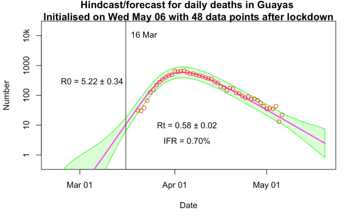
Without further ado, some results. I fixed the IFR at various different values as shown (just by using a really narrow prior centred on those values).

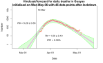


Using 0.2%, it’s a horrible fit that massively underestimates the peak. Not surprising really, given that 0.27% of the whole population died. In fact despite the tight prior, it refuses to stick at that value and drifts up to 0.21%. Even the simulation with 0.3% is not great. The logarithmic scale of the plot flatters it a bit, and it stays comfortably under the peak for quite some time. Interestingly, Rt is estimated to be significantly over 1 during the declines here (despite the attempt at control), because the herd immunity is sufficiently high to play a significant role in squashing the epidemic. IFR=0.4% gives an entirely satisfactory simulation, indistinguishable from the IFR=1% case (at which herd immunity ceases to be a significant factor). The only tell-tale difference is in the Rt values obtained. I suspect that the 0.5 value on the 1% plot is a bit optimistic, we haven’t managed that anywhere in Europe despite being much richer and not having been completely overwhelmed by the epidemic to anything like the same extent. On the other hand we all did better than Rt=0.94.
Splitting the difference, IFR =0.7% is visually indistinguishable again, with Rt = 0.58 being a bit less optimistic than the 1% run. This value for IFR (well, 0.75%) is what I’ve been using in all of my modelling.
Ecuador is a very young country compared to the UK (which would point to a lower IFR) but also much poorer and obviously healthcare was completely overwhelmed with this epidemic (which would point to a higher one). Do these factors cancel, compared to the UK? I have no idea, but I would think that epidemiological modellers might be able to draw more concrete conclusions than I am prepared to do.
If I could find daily data from Bergamo, Italy, I could play the same game there. Lombardy as a whole is only at the 0.14% fatality level which I think won’t be enough to be useful in the same way.
No comments:
Post a Comment