We refer the interested reader to Betteridge’s Law. End of post.
Ok, I will add a little more. This is the title of our latest (last?) paper, which came out a couple of months ago. The work was a long time in progress, despite being in principle a fairly run-of-the-mill application of our previously-developed methods to a new time period. While the work was underway, we got hold of a new data set (and new collaborators) which meant doing it all over again, though that’s not sufficient to explain my overall slowness. Anyway it’s done now.
The mid-Pliocene Warm Period (which could perhaps more precisely be referred to as the mid-Piacenzian Warm Period, we had some discussion with reviewers about this but argued it wasn’t our responsibility to enforce the less-widely-used name on the community, especially as we were using outputs from the Pliocene Modelling Intercomparison Projects) is the most recent period when the climate was thought to be substantially warmer than the pre-industrial state, for a significant period of time. But it was more than 3 million years ago, so data are sparse and imprecise, and boundary conditions (such as atmospheric CO2 level) are also not that well known. Nevertheless, lots of modelling groups have performed simulations of this period, and others have collected proxy data pertaining to the same time.
We basically repeated our recent(ish) work on the Last Glacial Maximum, using the model simulations and proxy data…..and as part of this, compared results obtained with different types of proxy data. Unfortunately these disagreed substantially, which led us to conclude that we really can’t provide a very confident answer. And even if we assume that one data set is correct, we still have significant uncertainty over the result generated. Our (weakly) preferred number is 3.6 +- 1C warmer than pre-industrial, but I wouldn’t claim to be too confident about that. That’s pretty much it, really. “More work is necessary” is actually true in this instance.
We did produce a bunch of pictures, such as this one, which shows the central estimate of surface air temperature anomaly across the globe. But the regional detail of the patterns isn’t reliable (such as the occasional spots of cooling). It’s just…that’s what the algorithm churned out.
I’ve mainly focussed on Vallance, partly because he was the Govt’s Chief Scientific Advisor and also co-Chair of SAGE (along with Whitty) but also because he’s had the most to say, and been the most clearly wrong in what he did say. But it’s also interesting to compare and contrast with other prominent members of SAGE. Prof John Edmunds is one such, I probably don’t need to show his horrendous TV interview of the 13th of March again but will do so anyway. It’s so endearing to see him sneering at Tomas Pueyo after the latter informs him correctly that the doubling time of the pandemic is about 3 days and a catastrophe is unfolding under out noses. No, he replies, you just don’t understand the data, the doubling time is really 5 days, and we mustn’t act too soon (go to 23:15 in the video):
In his recent testimony to the Inquiry, Edmunds says:
the surveillance system was poor, with the data being delayed and hard to interpret – so much so, that estimating the growth rate of the epidemic was difficult (estimates of the doubling time varied from about 3 days to about 5-7 days, depending on what method and data sources were used) and getting an accurate assessment of the overall size of the epidemic was also difficult. The delays and under-reporting (partly due to a lack of testing) might well have led decision-makers to conclude that they had more time to act than was the case.
It would have been more honest of him to say that his interpretation of the data was poor (along with the rest of SAGE) and this lead decision makers to believe they had more time to act. Furthermore, including the estimate of 3 day doubling in that comment above is particularly misleading, as SAGE was not acknowledging the legitimacy of such estimates at the time. Indeed he ridiculed the number when Pueyo suggested in on the evening of 13th March. But this post isn’t really about SAGE’s competence, it is just about establishing what SAGE actually did say at the time.
Edmunds then goes on to say:
Surveillance started to improve after the CHESS (‘COVID-19 Hospitalisation in England Surveillance System’) system was launched in hospitals on around 14-15th March, but it took a little while for the new data-stream to stabilise.
Here we see clear blue water between his testimony and that of Vallance. Remember, Vallance talks of SAGE members having a Road to Damascus conversion over the weekend of 14-15 March due to this new data becoming available. Edmunds does not repeat that claim, presumably because he knows it to be false. Perhaps he does not, however, contradict Vallance quite clearly enough for this contradiction to be obvious to a casual reader – or even those undertaking the Inquiry. He then rapidly passes on to the responsibility decision-makers had for deciding what to do. He admits that “It is certainly possible that had SAGE been earlier, clearer and more urgent in its advice then lockdown could have been introduced earlier.” “Earlier, clearer and more urgent” indeed. He could have added “correct“. But he didn’t.
I’ve sent the following letter to the Public Inquiry, noting the significant and repeated inconsistencies between what Vallance has recently testified about the events in mid-March 2020, and what the contemporaneous documentary evidence of that period actually says. This evidence includes, rather amusingly, Vallance himself in one of the daily PM statements and press conferences. I will of course post any response(s) received.
To: contact@covid19.public-inquiry.uk
To whom it may concern.
I have noticed a discrepancy between the witness statements made to the Inquiry by Sir Patrick Vallance concerning the events of March 2020, and documentary evidence from that period. It primarily concerns the estimation of the doubling time of the pandemic, which was of great importance in planning the policy response to it. The reason why this is important is that changing the estimate of doubling time from 5 days to 3 days would indicate that the problem was far greater, more urgent, and harder to deal with, than was previously thought. It would inevitably lead to an abrupt and urgent change in policy requirements. However, there is no evidence to support the claim made by Vallance that SAGE was calling for urgent and strict action from March 16 onwards, and that the Govt delayed action for a further week.
Vallance’s evidence to the UK Covid-19 Inquiry
To the Inquiry, Vallance stated that he, and other members of SAGE, changed their minds about the growth rate of the pandemic over the weekend of 14-15 March (bold emphasis added by me):
“I think the new understanding on the weekend of 14 and 15 March was that we were much further ahead in the pandemic than we realised, and the numbers that came in that week showed that there were many more cases, it was far more widespread, and was accelerating faster than anyone had expected.”
“We got information on 13 March which unambiguously showed that the pandemic was far more widespread and far bigger and moving faster than we had anticipated“
“The advice given on 18 March was a consequence of our concerns about the rapid doubling time and number of infections”
“A major reason SAGE did not advise earlier and more extensive interventions, for example on 10 March rather than 16 March, was that we were unaware of how widely seeded the virus was in the UK and how short the doubling time had become.”
“I am asked if the models underestimated the spread of the virus early in the pandemic. I think that they did, at least in terms of speed until shortly before the four day period of 13 to 16 March, which I discuss above. This was a function of poor and time delayed data and a consequent under-estimation of the virus’ doubling time.”
The conclusions that we are inescapably being asked to draw from these multiple statements is that (a) SAGE was underestimating the growth rate of the pandemic prior to the weekend of 14/15 March, but corrected their error at that time and (b) the correction of this error was critical in changing their advice from a measured program of mitigation to a much more urgent suppression of the pandemic.
Vallance’s evidence to the House of Commons Science and Technology Committee, July 2020
This mirrors the testimony Vallance gave previously to the House of Commons Science and Technology committee in July 2020:
“When the SAGE sub-group on modelling, SPI-M, saw that the doubling time had gone down to three days, which was in the middle of March, that was when the advice SAGE issued was that the remainder of the measures should be introduced as soon as possible.”
“The advice changed because the doubling rate of the epidemic was seen to be down to three days instead of six or seven days. We did not explicitly say how many weeks we were behind Italy as a reason to change; it was the doubling time, and the realisation that, on the basis of the data, we were further ahead in the epidemic than had been thought by the modelling groups up until that time.”
SAGE minutes of mid-March and other contemporaneous evidence
However, contrary to these claims, the minutes of the SAGE meeting on the 16th March very clearly stated:
“UK cases may be doubling in number every 5-6 days.”
and later that day, Vallance personally repeated the 5 day doubling figure live on TV:
“…the epidemic, you’d expect to double every 5 days or so…”
Two days later, the minutes of the SAGE meeting on the 18th March again stated:
“Assuming a doubling time of around 5-7 days continues to be reasonable, but this is before any of the measures brought in have had an effect; these measures are likely to slow the doubling time even if there is still an exponential curve.”
The first time 3 day doubling was hinted at in any official documentation appears to be the SPI-M-O meeting on the 20th March:
“Nowcasting and forecasting of the current situation in the UK suggests that the doubling time of cases accruing in ICU is short, ranging from 3 to 5 days.”
and this was finally endorsed in the SAGE minutes of the 23rd March:
“The doubling time for ICU patients is estimated to be 3-4 days“
It looks like Sir Patrick may have confused the weekends of 14-15 March, with 21-22 March. For example, the SPI-M meeting he referred to above as taking place prior to SAGE’s change of heart “in the middle of March” is actually documented as having taken place on the 20th March. I hope you will be able to contact him to ask him about these discrepancies.
At the very least, the documentary evidence proves that SAGE was still underestimating the growth rate of the pandemic right through their meetings of the 16th and 18th March, only finally correcting their error on the 23rd. But perhaps a more worrying implication here is that Sir Patrick’s recollection of SAGE’s approach towards mitigation and lockdown at this time is also in error. In fact, the minutes of the meetings of the 16th and 18th appear entirely supportive of the Govt actions at that time, which were to continue with the gradual extension of the measured program of (mostly voluntary) measures. On the 16th:
“SAGE cannot be certain that the measures being considered by HMG will be sufficient to push demand for critical care below NHS capacity but they may get very close under the RWC scenario.
While SAGE’s view remains that school closures constitutes one of the less effective single measure to reduce the epidemic peak, it may nevertheless become necessary to introduce school closures in order to push demand for critical care below NHS capacity. However school closures could increase the risks of transmission at smaller gatherings and for more vulnerable groups as well as impacting on key workers including NHS staff. As such it was agreed that further analysis and modelling of potential school closures was required (demand/supply, and effects on spread).”
and on the 18th:
“SAGE advises that the measures already announced should have a significant effect, provided compliance rates are good and in line with the assumptions. Additional measures will be needed if compliance rates are low.”
They even argued that the measures implemented on the 18th (including the new school closures) were probably adequate to fully suppress the pandemic:
“SAGE reviewed available evidence and modelling on the potential impact of school closures. The evidence indicates that school closures, combined with other measures, could help to bring the R0 number below 1, although there is uncertainty.”
Summary
The claims that the Govt was responsible for a week of delay at this time, and that SAGE was arguing for much more immediate and stringent action, is not supported by a reasonable reading of the evidence. Indeed, SAGE had no reason to be doing this, since they still believed (contrary to Vallance’s testimony above) that the pandemic was doubling at a rate no more rapidly than 5 days (at worst) and furthermore, as they explicitly stated on the 18th, was probably being significantly slowed beyond this figure by existing policies already introduced at that time.
All of the quotations I have given above are directly copied from official documentation available on the Govt’s own web site, other than that taken from the youtube video of the PM statement and press conference of the 16th March which is my own transcription. Please contact me if you require any help in validating the provenance or accuracy any of this evidence.
One thing that all the protagonists (myself included) agree on is that SAGE’s estimate of doubling time in mid-March was of critical importance. Vallancetestified forcefully to this effect in 2020:
When the SAGE sub-group on modelling, SPI-M, saw that the doubling time had gone down to three days, which was in the middle of March, that was when the advice SAGE issued was that the remainder of the measures should be introduced as soon as possible.
And then confirmed in this exchange with a committee member:
Sir Patrick Vallance: Knowledge of the three-day doubling rate became evident during the week before.
Q1080 [ed – this number has changed from the previous time I posted about this] Graham Stringer: Did it immediately affect the recommendations on what to do?
Sir Patrick Vallance: It absolutely affected the recommendations on what to do, which was that the remaining measures should be implemented as soon as possible. I think that was the advice given.
and again:
Sir Patrick Vallance: The advice changed because the doubling rate of the epidemic was seen to be down to three days instead of six or seven days. We did not explicitly say how many weeks we were behind Italy as a reason to change; it was the doubling time, and the realisation that, on the basis of the data, we were further ahead in the epidemic than had been thought by the modelling groups up until that time.
But why does the doubling time matter so much, and is the difference between 3 days and 5 day really important? The point of this post is to answer these questions.
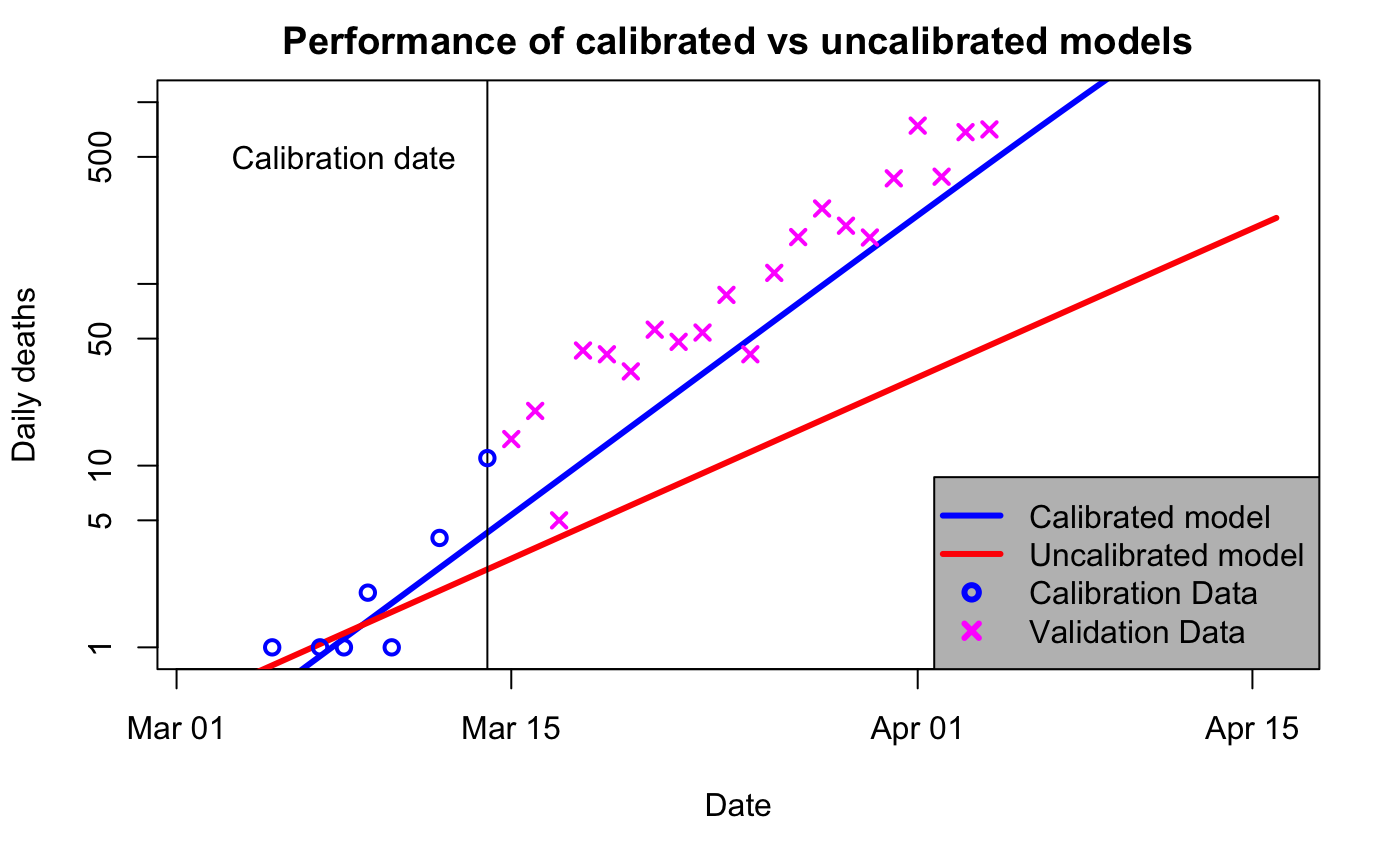
I’ll start by repeating a couple of plots I first made way back in April 2020 when it was just dawning on me what a colossal cock-up SAGE had made of it. These graphs are generated by a simple SEIR model that I’ve shown to reasonably replicate more sophisticated ones. In the below, the blue “calibrated” line uses data up to 14 March to estimate doubling time, which comes out at 3 days. The red “uncalibrated” line uses parameters from Ferguson’s March 16 paper, which has a doubling time of 5 days.
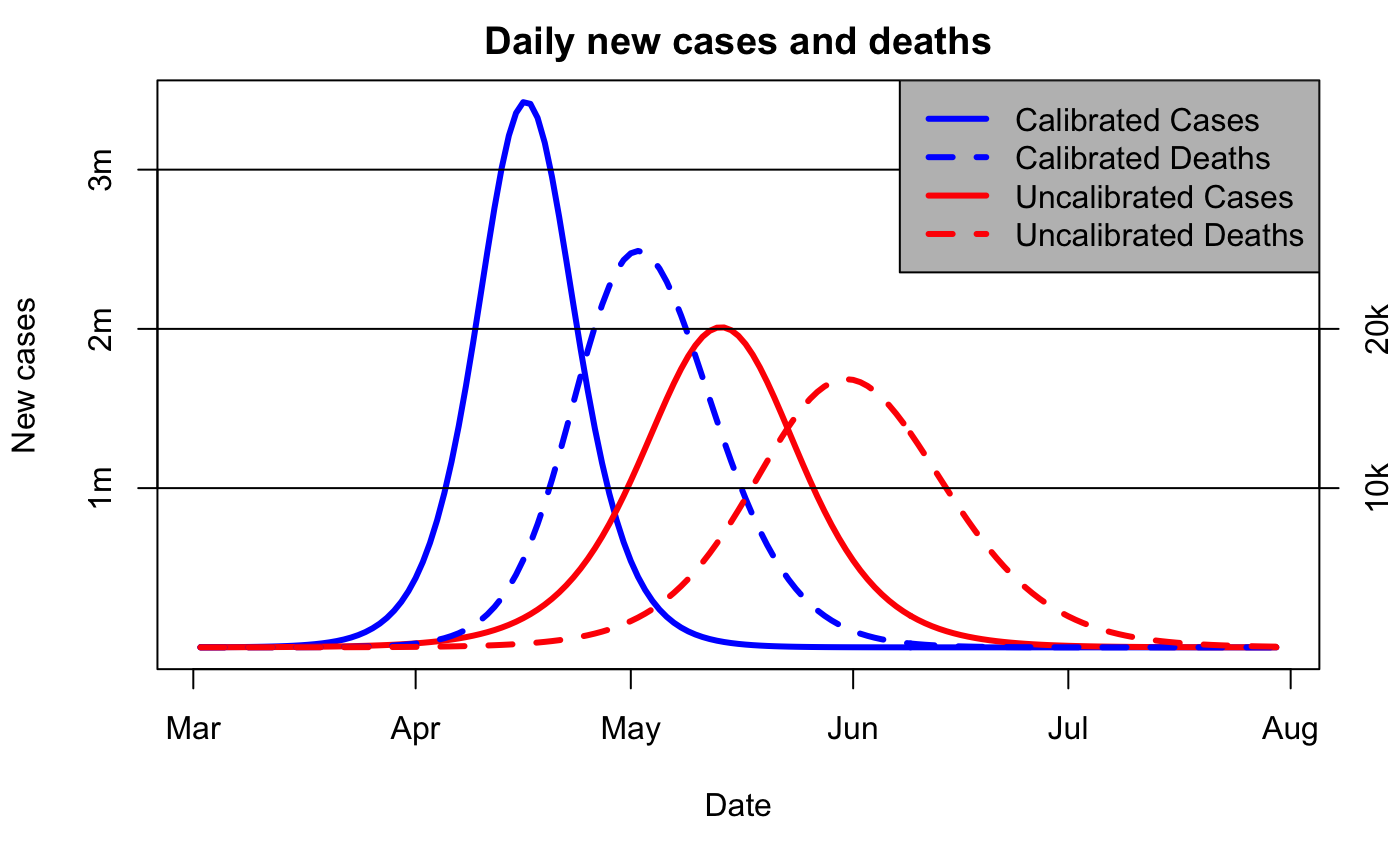
So, one obvious point is that the blue curve does a much better job of predicting what was going to happen (ie, the magenta x, which were not used to calibrate either model). But that’s not the point of this particular post. Rather, it’s just that the predictions for 3d vs 5d doubling are radically different. Here is the longer-term view, now without the logarithmic scaling on the axis:
Note the “we are here” point is mid-March, when the red and blue curves are visually indistinguishable.
There are several reasons why the doubling time matters. Firstly, the estimate of current pandemic size is based on historic data. Edmunds specifically talks of a 12 day delay from infection to illness, to testing, to finally test data reporting. So 100 cases reportedtoday means 100 infections 12 days ago, and that’s 4 doublings at 3d doubling, meaning 1,600 cases now. If the doubling time was only 5d, then the 12 day delay is just over 2 doublings, and we wouldn’t be at 1,600 cases for another 8 days (4 doublings is 20 days, so that means 12 just past and another 8 in the future). So one immediate consequence of a change in perceived doubling time is that we’ve lost just over a week in terms of pandemic progression. (These calculations all ignore the proportion of infections that are undetected, which can reasonably assume to be roughly constant and thus not affect the argument.)
Secondly, the 3d doubling means the pandemic comes much sooner, and (thirdly) reaches a much higher peak, as shown in the 2nd graph above. What was expected some time over the summer, is now happening next month, and it’s going to be a lot worse than expected – getting on for twice as many cases per day at peak.
Finally, the more rapid doubling implies a higher R0-number, and this makes it harder to control. With R0=2.4 (Ferguson’s 16 March number), a reduction of contacts to 40% of normal would control the virus, because 2.4 x 0.4 = 0.96 which is less than 1. Whereas a 3d doubling implies a rather higher R0, let’s say 3.2. This then requires much stiffer action, because 3.2 x 0.4 = 1.28 which is still greater than 1. A reduction to 30% of previous contact levels to get the R number below 1 (3.2 x 0.3 = 0.96 as before) is obviously much tougher to achieve especially given that family members, essential work etc mean we can’t really isolate perfectly. (Quibbling over the exact value of R0 to use doesn’t invalidate the general point that a higher R0 is harder to control.)
So, changing the estimate of doubling time from 5d to 3d would be a real “oh shit” moment for anyone involved in pandemic planning. It means (a) we’ve instantaneously lost 8 days of lead-time, (b) the pandemic peak is going to be coming a month sooner than expected, (c) the peak is going to be almost twice as big as expected, and (d) the control measures we were hoping to use are much less likely to be adequate. Any plan predicated on a 5d doubling time would immediately have to be revisited in the most extreme and urgent manner.
I hope I have convinced my reader that whatever plans were in place in early March under the assumption of a 5 day doubling, the new understanding that the doubling time was instead 3d would cause an abrupt and substantial change of perspective. This, from a scientific perspective, is inevitable and obvious.
Ok I’m going to do a bit of analysis of Vallance’s evidence to the UK Covid-19 Inquiry, focussing specifically on the events of the mid-March 2020 period up to the imposition of the first “lockdown” on 23rd March. On Monday 20th Nov 2023 he was interviewed by the Inquiry and also provided some written testimony. This is broadly speaking a more detailed version of the testimony he provided back in July 2020 to the House of Commons Science and Technology Committee (whichI blogged about at the time) but appears significantly inconsistent with the documentary evidence provided by the minutes of SAGE meetings and other records of that period. If you already agree with me that Vallance misled the S&TC with his testimony in 2020 then you might not find this very interesting, but I think I might as well go over it again as there’s a lot more testimony to consider (including other participants in SAGE).
I’ll break it up into sections in order to make it digestible, and also to avoid me going round in ever decreasing circles. To start with, let’s consider some background concepts…
This module will look at, and make recommendations upon, the UK’s core political and administrative decision-making in relation to the Covid-19 pandemic between early January 2020 until February 2022, when the remaining Covid restrictions were lifted. It will pay particular scrutiny to the decisions taken by the Prime Minister and the Cabinet, as advised by the Civil Service, senior political, scientific and medical advisers, and relevant Cabinet sub-committees, between early January and late March 2020, when the first national lockdown was imposed.
I’m particularly interested in this period, as it’s the time that the expert scientific analysis and advice from SAGE was so woefully inadequate. I’ve blogged about this at length, but just to recap, the scientists were mistakenly thinking that the doubling time of the pandemic was about 5-6 days (various numbers appear in the SAGE minutes) and that we shouldn’t take too stringent measures as there was a genuine risk that by doing so we’d put the pandemic off to the following winter when it would add to the normal seasonal pressures on the NHS. They were quite anxious that we should get through it over the summer of 2020 instead.
Vallance misled the Science and Technology Select Committee a while ago about this, claiming that SAGE had recommended lockdown on the 16th or 18th of March. This is contradicted by the minutes of those meetings, and even if you try to argue that the minutes may not be completely definitive on that, it is also contradicted by his accompanying statement that their change of heart was due to correcting their estimate of the doubling time (to 3 days), which the SAGE minutes document very precisely to the 23rd March. He’s due to give evidence to the UK Covid-19 Inquiry on Monday, so I await with interest to see whether he will correct the record or also mislead them.
This error was not just an inconsequential comment in a committee that no-one cares about, but has been widely reflected in press comment. For example, the usually excellent Lewis Goodall on Xitter:
Doesn’t seem to me that what @uksciencechief said earlier has received as much attention as it should, in the day’s tsunami of news. In saying that SAGE advised the govt to lockdown a week earlier than they did, yet more space is opening up between them. pic.twitter.com/cKuWXlh7vH
I can see I’m going to have to go over all this again. It’s not a task I really face with much enthusiasm, but it doesn’t seem like anyone else is prepared to do it. To say I’m disappointed at the revisionism, sleight-of-hand and downright misleading testimony from several senior scientists to the UK Covid-19 Inquiry would be an understatement. I had naively hoped there might be some element of humility, introspection and self-reflection concerning their errors at the start of the outbreak, but I’ve seen no hint of this. (If anyone wants to reassure me that lessons have been learnt internally, then I’m all ears, but would want to see evidence of this.)
Unfortunately, neither the inquisitors themselves, nor the journalists following the process, nor the array of commentators eagerly quoting the juicy messages, seem to have the will or perhaps the scientific skills to unpick the story. That’s not to say it is hugely complicated, but a basic understanding of the underlying mathematics is vital for piecing together how it all played out, and why. And it’s very clear that most people start out with an agenda and go looking for support, rather than really being interested in understanding the truth. The scientists are delighted to have found a route to blaming the politicians, and the politicians are too focussed on knifing each other to question what the scientists are now claiming the history to be.
That’s not to say I’m perfect (far from it), but on this particular topic, I happen to be correct. A more difficult question, is whether anyone else cares. Anyway, on with the show….
As you may have noticed, there hasn’t been a lot of science getting done here recently.
The basic reason for this is that we’ve decided to retire and close down Blue Skies Research Ltd. We set it up about 10 years ago, when we returned from Japan, and have had a lot of fun continuing our research in a private setting but over the last few years have been gradually winding down the research activity and increasing the other-than-research activity and want to focus on the latter from now on.
There’s a paper in the works with paper charges still to pay so the company isn’t completely shut down yet. We aren’t looking for new projects but if something exciting comes up, we might change our minds.
To be honest, we haven’t been particularly inspired by new ideas for a while and simply don’t have any burning climate science questions that we need to answer. After all, we have worked out what Equilibrium Climate Sensitivity is (actually we worked it out in 2006, but everyone else took 15 years to catch up). There are lots of other scientists quite capable of taking the field wherever they choose to, and we look forward to seeing where they go!
Many years ago, I played chess as a schoolboy. Not all that brilliantly, but good enough for the school team which played in various competitions. This fell by the wayside when I went to university, and I'd never had the time or energy to re-start though kept on playing against my uncle when we met. A couple of years ago during covid lockdowns I started playing on-line on chess.com, and then more recently someone started a chess club in Settle where a small bunch of us have been playing fairly informal and quick games. Last weekend was my first proper over-the-board competition, at the very conveniently located Ilkley Chess Festival. I'd naively assumed this would be a local event for local people, but my opponents came from all over, hailing from Portsmouth, Nottingham, Shrewsbury, and even Scarborough. There were also some Scots on the entry list that I didn't meet.
I've blogged the event on the chess.com site (here and here) as that allows for embedding of games. Spoiler alert: after losing the first game, I won the next 4, ending in 4th place. In the “Intermediate” section, which means under-1750 rated. (I don't have a current rating for OTB chess, so had to guess which section to enter. At school I was about 1450.)
Someone was taking pictures, so here is a picture of the main hall:
I haven’t blogged in ages but have actually done a bit of work. Specifically, I eventually wrote up my new reconstruction of the Last Glacial Maximum. We did this back in 2012/3 (see here) but since then there have been lots more model simulations, and then in 2020 Jessica Tierney published a new compilation and analysis of sea surface temperature proxy data. She also produced her own estimate of the LGM temperature anomaly based on this data set, coming up with -6.1±0.4C which seemed both very cold and very precise compared to our own previous estimate of -4.0±0.8C (both ranges at 95% probability).
We thought there were quite possibly some problems with her result, but weren’t a priori sure how important a factor this might have been, so that was an extra motivation to revisit our own work.
It took a while, mostly because I was trying to incrementally improve our previous method (multivariate pattern scaling) and it took a long time to get round to realising that what I really wanted was an Ensemble Kalman Filter, which is what Tierney et al (TEA) had already used. However, they used an ensemble made by sampling internal variability of a single model (CESM1-2) and a few different sets of boundary conditions (18ka and 21ka for LGM, 0 and 3ka for the pre-industrial), whereas I’m using the PMIP meta-ensemble of PMIP2, PMIP3, and PMIP4 models.
OK, being honest, that was part of the reason, the other part was general procrastination and laziness. Once I could see where it was going, tidying up the details for publication was a bit boring. But it got done, and the paper is currently in review at CPD. Our new headline result is -4.5±1.7C, so slightly colder and much more uncertain than our previous result, but nowhere near as cold as TEA.
I submitted an abstract for the EGU meeting which is on again right now. It’s fully blended in-person and on-line now, which is a fabulous step forwards that I’ve been agitating for from the sidelines for a while. They used to say it was impossible, but covid forced their hand somewhat with two years of virtual meetings, and now they have worked out how to blend it. A few teething niggles but it’s working pretty well, at least for us as virtual attendees. Talks are very short so rather than go over the whole reconstruction again (I’ve presented early versions previously) I focussed just on one question: why is our result so different from Tierney et al? While I hadn’t set out specifically to critique that work, the reviewers seemed keen to explore, so I’ve recently done a bit more digging into our result. My presentation can be found via this link, I think.
One might assume a major reason might be that the new TEA proxy data set was substantially colder than what went before, but we didn’t find that to be the case. In fact many of the gridded data points coincide physically with the MARGO SST data set which we had previously used, and the average value over these locations was only 0.3C colder in TEA than MARGO (though there was a substantial RMS difference between the points, which is interesting in itself as it suggests that these temperature estimates may still be rather uncertain). A modest cooling of 0.3 in the mean for these SST points might be expected to translate to about 0.5 or so for surface air temperature globally, not close to to the 2.1C difference seen between our 2013 result and their 2020 paper. Also, our results are very similar when we switch between using MARGO and TEA and both together. So, we don’t believe the new TEA data are substantially different from what went before.
What is really different between TEA and our new work is the priors we used.
Here is a figure summarising our main analysis, which follows the Ensemble Kalman Filter approach, which means we have a prior ensemble of model simulations (lower blue dots, summarised in the blue gaussian curve above) each of which is updated by nudging towards observations, generating the posterior ensemble of upper red dots and red curve. I’ve highlighted one model in green, which is CESM1-2. Under this plot I have pasted bits of a figure from Tierney et al which shows their prior and posterior 95% ranges. I lined up the scales carefully. You can see that the middle of their ensembles, which are entirely based on CESM1-2, are really quite close to what we get with the CESM1-2 model (the big dots in their ranges are the median of their distributions, which obviously aren’t quite gaussian). Their calculation isn’t identical to what we get with CESM1-2, because it’s a different model simulation, with different forcing, we are using different data and there are various other differences in the details of our calculation. But it’s close.
Here is a terrible animated gif. It isn’t that fuzzy in the full presentation. What it shows is the latitudinal temperatures (anomalies relative to pre-industrial) of our posterior ensemble of reconstructions (thin black lines, thick line showing the mean), with the CESM-derived member highlighted in green, and Tierney et al’s mean estimate added in purple. The structural similarity between those two lines is striking.
A simple calculation also shows that the global temperature field of our CESM-derived sample is closer to their mean in the RMS difference sense, than any other of our ensemble members. Clearly, there’s a strong imprint of the underlying model even after the nudge towards the data sets.
So, this is why we think their result is largely down to their choice of prior. While we have a solution that looks like their mean estimate, this lies close to the edge of our range. The reason they don’t have any solutions that look like the bulk of our results is simply that they excluded them a priori. It’s nothing to do with their new data or their analysis method.
We’ve been warning against the use of single model ensembles to represent uncertainty in climate change for a full decade now, it’s disappointing that the message doesn’t seem to have got through.
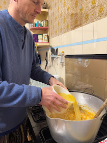
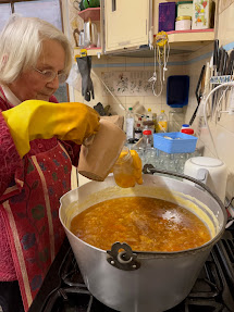
A trip to Scotland last weekend to learn the ancient art of Victorian Marmalade Making from marmalade sensei, the Mother in Law. It turned our to be less art and more chemistry! I still don't quite understand how it worked, but it did. Maybe it is actually magic. It was great weather for the project; continuous rain for 3 days.
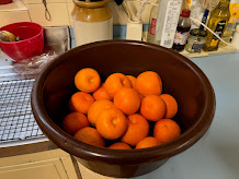
Step 1. Get Seville oranges, and the same mass of lime and lemons. These kind of oranges are mostly pith and pips, taste very bitter, and can only be found in January, although not only in Scotland. Wash and remove the ends, and any nasty ones.
Step 2. Juice fruits! An acceptable diversion from Victorian tradition is to use an electric juicer. The juice goes into the juice pot, the pith and pips into the pith and pits pot, and the shells of rind go to the slicer. The slicer is a large heavy metal thing that clamps to the table, a handle is turned and sliced peel comes out of the bottom. A non-Victorian alternative to the slicer is unknown.
Step 3. Add water to the pith and pips bowl and to the rind. pints of water = 1.1 x weight of fruit in lbs, with about 0.1 going into the pith.
Step 4. Soaking the fruit is neither here not there as far as the chemistry/magic is concerned, apparently. But by now you will be tired, so you can take a break ... overnight if you like.
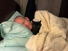
Don't forget your cat!
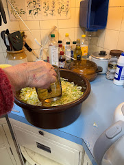
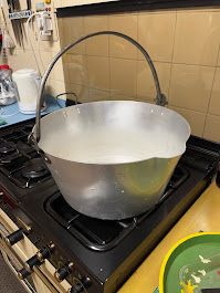
Step 5. Find cauldron! Put rind-marinade into cauldron.
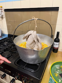
Step 6. Manufacture a bag from cloth and string that contains the pith and pips, and suspend in cauldron. This bag contains the magical carbohydrate pectin which is required to make the marmalade set. Bring to boil and cook for an hour (the internet suggests 2-3 hours for bright, tender marmalade. The internet might be wrong.). Apparently the acid from the fruit helps get the pectin out, but I don't understand this, becuase the juice is not yet added at this stage.
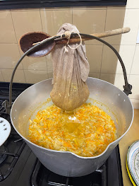
Step 7. Turn off the heat. Extract bag from cauldron and squeeze it hard to get out all the pectin.
Step 8. Add juice.
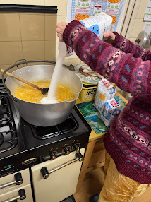
Step 9. Add sugar
Step 10. Add more sugar
Steps 11-13. Add yet more sugar. About 1.6x weight of fruit in total!!!!
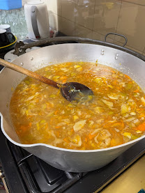
Step 14. Bring slowly to a rolling boil.
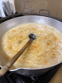
Step 15. Excitedly test every 5 seconds to see if it is done yet. It is done when it sets. This is the magic/chemistry bit. Pectin and acid and heated up sugar and do something or other that makes - jelly. But this isn't the same as caramalisation that you use to make toffee, which is more like burning sugar. In fact you want as little caramalisation as possible, because marmalade shouldn't taste like toffee. This is why the internet says boil for 15-20mins. The internet also says too much boiling at this stage make the rind tough. It was more like an hour for us, but our marmalade is still pretty and the rind very nice. Maybe internet people want the rind to melt in their mouths or something weird?
Anyway, you can test by cooling a small spoonful on a plate and when it starts to set it is done, or use a Victorian thermometer. Not sure what the markings on the thermometer engraved by ancestors mean, but when the brass holder gets all sticky with globs of marmalade, it is done.
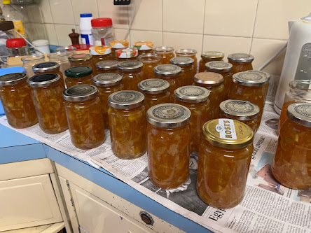
Step 16. Remove from heat and quickly fill up all your jars (which, hopefully, appear beside you by magic) and screw the lids on ASAP.
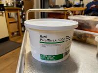
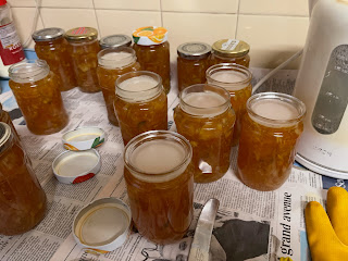
Optional Step. Next day, if some of your jars are not screw top, or they are screw top but the button on the lid didn't go down as the marmalade cooled, or you don't have lids... melt paraffin wax (in a jug in boiling water) and pour over the top and slap on some kind of lid! Marmalade will stay good for ... 3 years or so?
It occurred to me that the talk of perhaps bringing in restrictions some time in the future was probably poorly timed, in that we are probably pretty close to the peak right now and if action is going to be worthwhile, it needs to be pretty much immediate. Having made a few comments to that end on twitter, I thought I should check out my intuition with some calculations. So here they are.
My starting point is that the Omicron variant represented 22% of tests on the 11th Dec (link) and we had about 40k positive tests on that day (link - but see additional note at bottom of post) meaning 9k tested cases which I will assume represents 18k real infections (ie 50% of infections are actually observed) and furthermore I'll assume that these infections happened on the 8th as it must take a little while to feel ill and get tested.
I'm using a doubling time of about 2 days with an underlying R0 number of 6, and another assumption I'm making is that the population is about 50% immune. I'm ignoring the Delta infection which is small in comparison and carries on largely in parallel with Omicron.
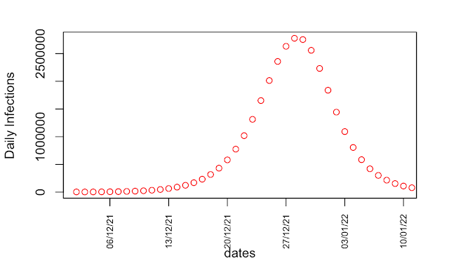
So I initialise the model to hit 18k infections on the 8th, and ran it forwards. This is what I get with no action at all, just the natural infection profile of an uncontrolled epidemic:
32 million infections in total, with a daily peak of 2.7 million on the 27th.
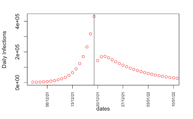
If instead we were to introduce severe restrictions now, such that the underlying R0 dropped from 6 to 1.5, the epidemic would be much smaller:
A daily max of about 430k infections and only 4 million in total. Note that the underlying R0 dropping to 1.5 means the effective R value drops to about 0.75 as the population is half immune.
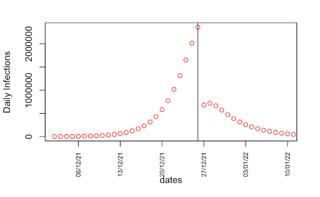
However the Govt seems to be slowly meandering towards the possibility of some restrictions in about a week. If we were to say Boxing Day instead, then we get:
The daily max here is 2.4 million, with the total about 16 million. So even this delayed action does cut the epidemic in half, by shutting it down rapidly from the peak. That's a bit better than my intuition had suggested to me.
The details of these calculations are sensitive to the timing of the peak of course, which depends on all the assumptions I've made. What is not in doubt is that every day makes quite a big difference to the outcome.
Edit: In the time it took me to write this post, the number of cases by specimen date on the 11th has been updated to 46k!
Posting this mostly because some people seem to be under the misapprehension that the UK is doing really well at coping with COVID, at least in comparison to our European neighbours. It's simply not true, though it's hard to discern quite how poorly we are doing from most of the media including the BBC. This article in the FT presents some of the data, and I'll take some more from OWID.
While the rapid start of the vaccination campaign was certainly impressive and genuinely superior to the rest of the EU, we have now been overtaken by many of our neighbours.
That's us 2nd from bottom on that chart of major European nations.
Vaccination of children has been abysmal, both with the stupid delay due to JCVI's shilly-shallying, and then the slow roll-out. Boosters are running at about half the rate that the original vaccination was, so the backlog is growing rapidly.
Our own volunteer-run vacc centre was mothballed a while back, we could be doing a thousand a day no problem, but it's apparently not part of the plan.
Case numbers are far higher here than just about anywhere else in Europe. USA is comparable, which is hardly an endorsement.
And of course plenty of deaths too:
Yes, both France and Spain had a bit of bump in the late summer, but quickly got on top of it, which we haven't bothered to do. There's no sign of any improvement and in fact the recent case numbers are ticking up quite firmly, so we can probably expect deaths to follow. The deaths aren't really the only problem of course, the knock-on effect of pressure on the hospitals affects a much broader range of people who aren't even infected.
In case you are thinking optimistically that just about everyone must have had it by now and the numbers must be about to go down, I've seen it said that some regions of Iraq, the total number of cases to date is substantially higher than the population, i.e. many people have had it twice or more. Immunity doesn't last. Of course the severity of the disease is far lower after vaccination, and hopefully will also drop with prior infection. But it's not going to go away and the reluctance of the govt to take any action to help control the disease probably means we'll be stuck with very high levels for the foreseeable future.
This may be of interest to a relatively small number of readers, but it seems worth documenting that the relationship between power and equilibrium flat speed in the cycling simulator Zwift can be quite accurately summarised via
where v is the velocity in kph, w is the rider weight in kg, and h is the rider height in cm.
The linear term in v can be thought of as arising through rolling resistance (which also varies with w), with the three cubic terms due to air resistance. These cubic terms can be thought of as the dominant terms in a Taylor series expansion of a single term that looks like A.f(w,h).v^3 where f is a function of weight and height that modifies the resistance (eg though changing the cross sectional area). At first I was trying to work out what f was, but an important realisation that only came to me while doing this analysis is that I don't actually need to know its form as the values of w and h only deviate moderately from their mean values for the practical range of riders I'm interested in (ie ± 10% the most part, 20% at worst). Therefore this linearisation approach (with coefficients fitted through linear regression) is plenty good enough and I don't need any of my model-fitting tricks. More engineering than science but nevertheless useful!
To do the model fitting, I did a bunch of flying laps of the volcano circuit at constant power, with different physical parameters and varying power level each time. This route is fairly flat but not perfectly so, which means the average speed here will be a little bit lower than that achieved on truly flat ground, but probably typical of many flattish routes on Zwift such as Watopia's Waistband or Greater London Flat. I estimate the elevation/disequilibrium effect here to be around 0.5kph, so speeds achieved on Tempus Fugit may be about that much quicker than indicated here (or conversely, you'll hit a target pace with a bit less power than this formula suggests). Some of the riders in my data set are real, others imaginary. I've focussed mostly on women, first because I've been DS for my wife's team for a while, and also because through being a large reasonably fit man I can generate their racing power fairly comfortably for long enough to get a fix on their speeds. (Yes, I know there are software approaches to simulating the power. But it's something else to set up, and I don't really want to get into the world of power bots, you never know where it might lead...) Calculating the power needed for a large rider at high speed requires a bit of an extrapolation and may get less reliable. Bike is the Tron, I started out testing different bikes (to check on what zwiftinsider says) but the differences were too trivial to pursue. Specifically, the Canyon Aeroad 2021 with Zipp 808 wheels which I used to use a lot was just one second slower than the Tron. That's 0.1kph, equivalent to less than 2W.
The black lines in the plot below are the model predictions for each rider, with the crosses marking the data points that I used to fit the model. Each line has 3 data points except for the top one which is my own physics. If someone wants to do a flying lap of the volcano at 450W (using my physical parameters) I'd love to know the result :-) The rest are mostly based around a women's team with jules being the bottom line. Few cyclists of either gender lie outside the range of our parameters! The model-data residuals are about 1.5W on average (RMS error) which is basically the magnitude of measurement error on the speed which is only precise to 0.1kph. This level of precision is plenty good enough for practical use, it's difficult to hit a power target more closely than about 5W anyway.
A conclusion that may be drawn is that for a medium-sized cyclist riding around 42kph, an extra 1kg of weight requires 2.5W more power to maintain the same speed (or alternatively, 1kg less saves 2.5W of power). For an additional 1cm of height, it's around 1W. These numbers aren't far from what I'd estimated through experience, it's nice to have them confirmed in a more careful calculation.
One year on and there's been a slew of articles revisiting the events of the past year. I was going to ask what has prompted this little flurry, but it's obviously the anniversary thing. With increasing pressure for a public inquiry, it seems that some of the key players have been trying to position themselves favourably, so let's have a look at what's been written, versus what the contemporaneous documentation actually says. SAGE minutes can be found here, I think (I downloaded the relevant docs a while back).
“13 March, the government's Scientific Advisory Group for Emergencies (Sage) committee concluded the virus was spreading faster than thought.
But it was Downing Street "modellers in the building", according to one current official, who pored again over the numbers, and realised the timetable that had only just been announced was likely to result in disaster.
The next morning, a small group of key staff got together. Simple graphs were drawn on a whiteboard and the prime minister was confronted with the stark prediction that the plan he had just announced would result in the NHS collapsing under the sheer number of cases.
Several of those present tell me that was the moment Mr Johnson realised the urgency - that the official assumptions about the speed of the spread of this new disease had been wrong.
[...]
On 16 March, the public were told to stop all unnecessary social contact and to work at home if possible.
[...]
For many inside government, the pace of change that week was staggering - but others remain frustrated the government machine, in their view, had failed to move quickly enough.”
The narrative being presented here of ponderous government is significantly misleading.
The govt claimed at the time to be paying close attention to the scientific advice from SAGE, and the specific change to SAGE's assessment on the 13th March was not that the disease was spreading any more rapidly, but merely that the number of infections was higher than previously thought (due to greater importation from abroad). This is a key distinction that anyone numerate should be able to grasp readily. To quote from SAGE minutes on the 13th:
“Owing to a 5-7 day lag in data provision for modelling, SAGE now believes there are more cases in the UK than SAGE previously expected at this point, and we may therefore be further ahead on the epidemic curve, but the UK remains on broadly the same epidemic trajectory and time to peak.
[...]
SAGE was unanimous that measures seeking to completely suppress spread of Covid- 19 will cause a second peak.”
Changing the estimate of the number of cases just brings the peak forward by a few days. Even a factor of 2 is only a single doubling time which they thought to be about 5-7 days at that time. Changing the estimate of the growth rate could (and in fact did) change the timetable and urgency much more significantly, but this didn't happen for another week and a half.
It is not clear who “the modellers in the building” refers to in Kuenssberg's piece, but they are clearly not SAGE. Maybe Cummings had run a few numbers on a spreadsheet but since SAGE was supposed to be an assembly of world-leading experts, it would hardly be appropriate to discard their analyses in favour of his. For that matter, I had also blogged that the mitigation plan was likely to overwhelm the NHS (a conclusion that I reached around the 9th March based on some very simple calculations) but I wouldn't expect Johnson to listen to me either. SAGE minutes are very clear that they still believed the doubling rate to be 5-7 days right up to the 18th March and had described any overload on the NHS as being some way off (albeit a looming problem that would need addressing at some time in the future). They were unanimously (see above) opposed to suppression at this point.
On the 16th, the SAGE meeting changed its advice somewhat and suggested that some social distancing measures (but not school closures) should be implemented promptly:
“SAGE advises that there is clear evidence to support additional social distancing measures be introduced as soon as possible.
[...]
SAGE will further review at its next meeting whether, in the light of new data, school closures may also be required to prevent NHS capacity being exceeded.”
Clearly there was some increased urgency here but NOT any indication that the NHS was under immediate threat, in direct contradiction to Kuenssberg's unattributed claim above that “the prime minister was confronted with the stark prediction that the plan he had just announced would result in the NHS collapsing under the sheer number of cases.” I'm not saying it is impossible that anyone said such a thing, but if they did, they were an isolated voice and certainly not representative of SAGE as a whole.
Immediately following the SAGE meeting on the 16th, the Govt did of course request that people avoid all unnecessary social contact. Admittedly, this instruction had neither legal force nor economic support at that point but SAGE was obviously reasonably satisfied with the adequacy of this plan as can be seen from their minutes of the 18th (at which time they also recommended school closures):
“SAGE advises that the measures already announced should have a significant effect, provided compliance rates are good and in line with the assumptions. Additional measures will be needed if compliance rates are low.”
So it was only in the case of poor compliance that additional measures would be required.
There was no SAGE meeting between 18th and 23rd, which was unfortunate in the circumstances (21-22 being a weekend). On the 23rd, SAGE finally realised that they had got the R number wrong and that as a result the doubling time was much shorter than had been previously believed, making the situation quite desperate. Specifically, the SAGE meeting of the 23rd concluded: “Case numbers could exceed NHS capacity within the next 10 days on the current trajectory” and this statement must be understood in the context of the immediately preceding 20th March SPI-M meeting which noted both: “Any measures enacted would take 2-3 weeks to have an impact on ICU admissions” and also: “If the higher reproduction number is representative of the longer term, then it is likely that additional measures will be required to bring it below one”.
Thus SAGE's underestimate of the R number didn't just mean that the epidemic was coming faster and harder than previously thought: another consequence is that actions that would have been adequate for R=2.4, might not be adequate for R=3. It is quite understandable that this caused alarm within SAGE, but it only happened on the 23rd.
The Govt imposed a legally-enforceable lockdown with much more far-reaching restrictions immediately that evening (23rd March).
Moving on to the next article, in the Guardian, a hagiography of Patrick Vallance:
“But it now seems clear that Boris Johnson, and his advisers, were slow to heed Vallance’s early advice.
Before the 16 March press conference, Vallance chaired a meeting of the Scientific Advisory Group for Emergencies (Sage) in which a collection of experts had advised that the first lockdown should begin immediately.
Johnson did not announce the unprecedented national lockdown until a week later on 23 March in a primetime TV address to the nation.”
This is simply not true as documented above. SAGE asked for relatively modest action around the 16-18th, and the Govt responded promptly. SAGE explicitly assessed on the 18th that the actions were probably adequate and it was only on the 23rd when they realised that they had got the doubling time wrong, that they suddenly realised they had a much larger and more urgent problem on their hands. Vallance also got this wrong in his appearance before the House of Commons Select Committee on Science and Technology.
Most recently, a podcast on the Guardian consisting of an interview of Neil Ferguson. He points very firmly to the data about higher case numbers due to greater importation being what drove the accelerated decision making in mid-March (NB this view is very different from Vallance who very emphatically linked the change in policy advice to the revision of the estimated doubling time - it is simply not possible for both Ferguson and Vallance to both be correct about this). Ferguson mentions this being discussed in the “first weekend in March” which I'm sure must be a simple slip as this would be 7-8th March whereas on the 10th and even 13th SAGE seems pretty sanguine about the situation and does not suggest any need to take immediate action. Assuming he meant the 14-15th March instead, this is far more consistent with SAGE as the minutes of the 16th do certainly suggest some some action should be taken in the light of the new data:
“The science suggests additional social distancing measures should be introduced as soon as possible.”
When asked specifically (at 11m20 in the podcast) “were scientists telling ministers to go earlier?” Ferguson firstly points again to the surveillance data as escalating the decision making process, and then coyly says it was entirely in the Govt's hands as to what actions they took. He could have said, but chose not to, that the Govt followed SAGE's advice promptly and to the letter. And the interviewer didn't pursue the point. While the improved surveillance data undoubtedly played a role in the process, the urgent advice for the most stringent controls only came on the 23rd as a result of the revised estimate of doubling time. You only have to glance at the SAGE minutes to see that they were not shy about offering policy advice throughout the outbreak.
At 16m40 onwards the interviewer says, with reference to the situation in September after schools reopened:
“...once again the advice from scientists was to lock down. But that advice was not heeded. Did that delay once again lead to a higher death rate than we might have seen?”
Without getting into the September story here, any delayed response from the Govt (which I don't dispute was evident in the autumn) could only “once again” have resulted in a higher death rate if there had also been a delayed response to advice to lock down in March. Which there was not, according to the evidence I have outlined.