I’ve grumbled for a while about the ONS analyses of their infection survey pilot (pilot? isn’t it a full-blown survey yet?) without doing anything about it. The purpose of this blog is to outline the issue, get me started on fixing it (or at least presenting my own approach to an analysis) and commit me to actually doing it this time. There are a couple of minor obstacles that I’ve been using as an excuse for several weeks now and it’s time I had a go.
The survey itself seems good – they are regularly testing a large "random" cohort of people for their infection status, and thereby estimating the prevalence of the disease and how it varies over time. The problem is in how they are doing this estimation. They are fitting a curve through their data, using a method know as a "thin plate spline." I am not familiar with this approach but it’s essentially a generic smooth curve that attempts to minimise wiggles.
There are two fundamental problems with their analysis, which may be related (or not) but are both important IMO. The first is that this smooth curve isn’t necessarily a credible epidemic curve. Epidemics have a particular dynamical form (you can think of them as locally exponential for the most part, though this is a bit of an oversimplification) and while variation in R over time gives rise to some flexibility in the outcome of this process, there are also inevitably constraints due to the way that infections arise and are detected. In short, the curve they are fitting has no theoretical foundation as the model of an epidemic. In practice it has often appeared to me that the curves have looked a bit unrealistic though of course I don’t claim to have much experience to draw on here!
The second fundamental problem is the empirical observation that their analyses are inconsistent and incoherent. This is illustrated in the following analysis of their Sept 4th results:
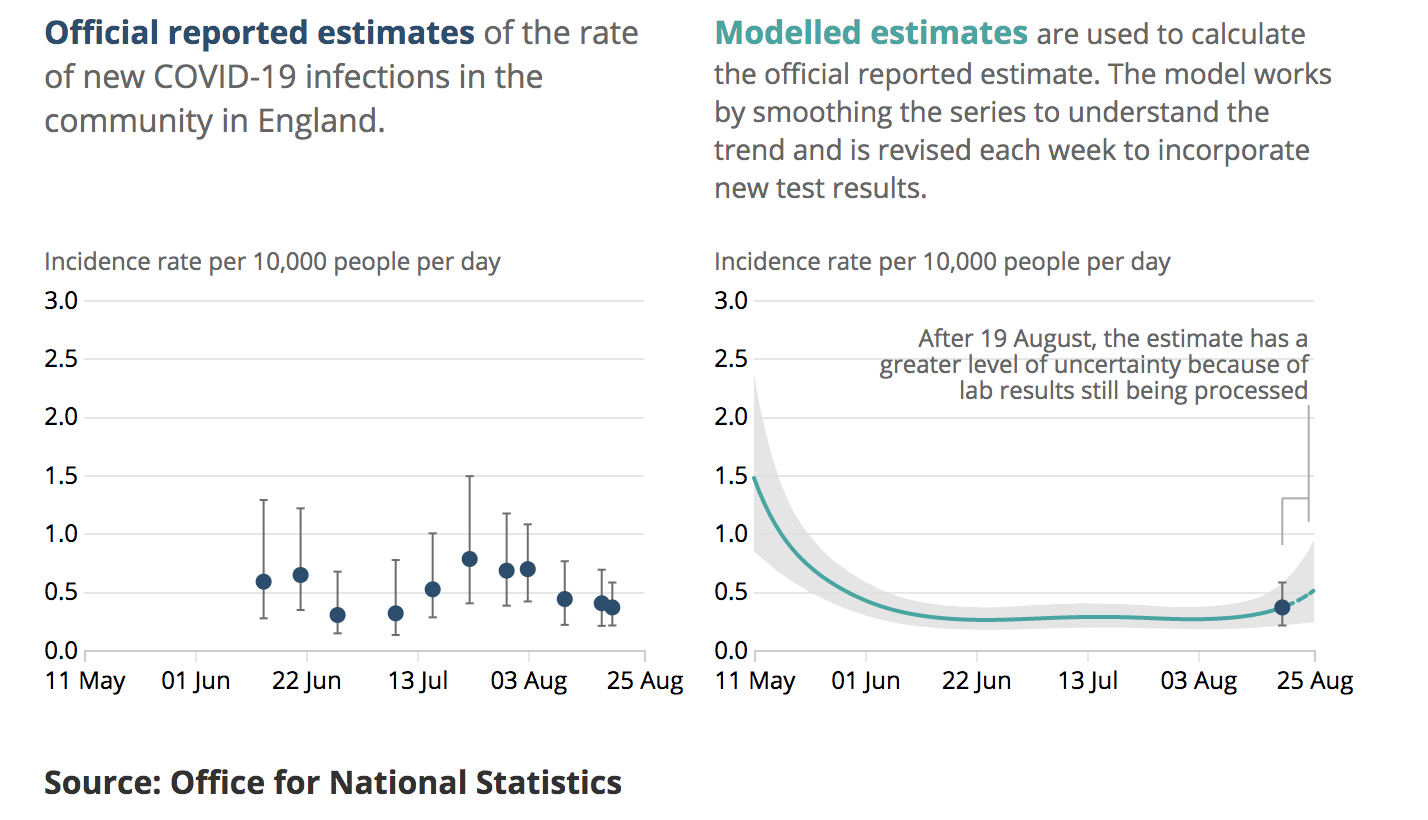
Here we see their on the right their model fit (plume) to the last few months of data (the data themselves are not shown). The dot and bar is their estimate for the final week which is one of the main outputs of their analysis. On the left, we see the equivalent latest-week estimates from previous reports which have been produced at roughly weekly intervals The last dot and bar is a duplicate of the one on the right hand panel. It is straightforward to superimpose these graphics thusly:

The issue here is that (for example) their dot and bar estimate several reports back centred on the 3rd August, has no overlap with their new plume. Both of these are supposed to be 95% intervals, meaning they are both claimed to have a 95% chance of including the real value. At least one of them does not.
While it’s entirely to be expected that some 95% intervals will not contain reality, this should be rare, occurring only 5% of the time. Three of the dot and bar estimates in the above graphic are wholly disjoint with the plume, one more has negligible overlap and another two are in substantial disagreement. This is not just bad luck, it’s bad calibration. This phenomenon has continued subsequent to my observation, eg this is the equivalent from the 9th Oct:

The previous dot and bar from late Sept is again disjoint from the new plume, and the one just after the dotted line in mid-August looks to be right on the limit depending on graphical resolution. In the most recent reports have changed the scaling of the graphics to make this overlaying more difficult, but there is no suggestion that they have fixed the underlying methodological issues.
The obvious solution to all this is to fit a model along the lines of my existing approach, using a standard Bayesian paradigm, and I propose to do just this. First, let’s look at the data. The spreadsheet that accompanies the report each week gives various numerical summaries of the data and the one that I think is most usable for my purposes is the weighted fortnightly means in Table 1d which take the raw infection numbers and adjust to represent the population more accurately (presumably, accounting for things like different age distributions in the sample vs the national population). Thanks to the weekly publication of these data, we can actually create a series of overlapping fortnightly means out of two consecutive reports and I’ve plotted such a set here:

It’s not quite the latest data, I’m not going to waste effort updating this throughout the process until I’ve got a working algorithm at which point the latest set can just slot in. The black circles here are the mean estimates, with the black bars representing the 95% intervals from the table.
Now we get to the minor headaches that I’d been procrastinating over for a while. The black bars are not generally symmetric around the central points as they arise from a binomial (type) distribution. My methods (in common with many efficient approaches) require the likelihood P(obs|model) to be Gaussian. The issue here is easy illustrated with a simple example. Let’s say the observations on a given day contain 10 positives in 1000 samples. If the model predicts 5 positives in a sample of 1000, then it’s quite unlikely we would obtain 10: P(O=10|m=5) = 1.8%. However if the model predicts 15 positives, the chance of seeing 10 is rather larger: P(O=10|m=15) = 4.8%. So even though both model predictions are an equal distance from the observation, the latter has a higher likelihood. A Gaussian (of any given width) would assign equal likelihood to both 5 and 15 as the observations are equally far from either of these predictions. I’ve wondered about trying to build in a transformation from binomial to Gaussian but for the first draft I’ll just use a Gaussian approximation which is shown in the plot as the symmetric red error bars. You can see a couple of them actually coincide with the black bars, presumably due to rounding on the data as presented in the table. The ones that don’t, are all biased slightly low relative to the consistent positive skew of the binomial. The skew in these data is rather small compared to that of my simple example but using the Gaussian approximation will result in all of my estimates being just a fraction low compared to the correct answer.
Another issue is that the underlying sample data contribute to two consecutive fortnightly means in these summaries. A simple heuristic to account for this double-counting is to increase uncertainties by a factor sqrt(2) as shown by the blue bars. This isn’t formally correct and I may eventually use the appropriate covariance matrix for observational uncertainties instead, but it’s easier to set up and debug this way and I bet it won’t make a detectable difference to the answer as the model will impose strong serial correlation on this time scale anyway.
So that’s how I’m going to approach the problem. Someone was previously asking for an introduction to how this Bayesian estimation process works anyway. The basic idea is that we have a prior distribution of parameters/inputs P(Φ) from which we can draw an ensemble of samples. In this case, our main uncertain input is a time series of R which I’m treating as Brownian motion with a random daily perturbation. For each sample of Φ, we can run the model simulation and work out how likely we would be to observe the values that have been seen, if the real world had been the model – ie P(Obs|Φ). Using these likelihood values as weights, the weighted ensemble is directly interpretable as the posterior P(Φ|Obs). That really is all there is to it. The difficulties are mostly in designing a computationally efficient algorithm as the approach I have described may need a vast ensemble to work accurately and is therefore sometimes far too slow and expensive to apply to interesting problems. For example, my iterative Kalman smoother doesn’t actually use this algorithm at all, but instead uses a far more efficient way of getting to the same answer. One limitation that it requires (as mentioned above) is that the likelihood has to be expressed in Gaussian form.
3 comments:
Hello. Blogwalking & followed here :) Have a nice day!
Now you've put some results up (https://twitter.com/jamesannan/status/1325717106067988480?s=20) I thought I'd ask the question I wanted to put, but will put here cos Twitter is annoying: how would that look in "forecast" mode? Suppose you start running the model with data up to July, then Aug, and so on?
That's certainly on the to-do list, but I have to deal with a bit more paid work first (it's more the deadline than the pay). I assume it will work similarly well to the usual covid modelling, which is pretty reliable. In fact I have some plots of that I did just recently for the Lancaster talk, maybe I will post those too.
Post a Comment