Tuesday, April 09, 2013

[jules' pics] Red and Blue

Flight to Vienna. Austrian Air goes in for scarlet in a big way.


In aeroplane food horror desperation PTSD, James clicked on a special meal for both of us: not vegetarian, vegan, kosher, halal, fruitarian, but he went the whole way and went for "raw vegetables", and it was the best ever.

--
Posted By Blogger to jules' pics at 4/09/2013 12:49:00 PM

Friday, April 05, 2013

[jules' pics] Probability

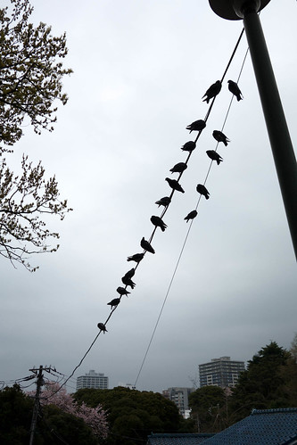
Wot's the probability of not getting poo'ed on if you walk under 19 pigoens?
Yokohama birdies


--
Posted By Blogger to jules' pics at 4/05/2013 04:04:00 PM

Thursday, April 04, 2013

Decadal prediction part 3

The first one isn't really a decadal prediction, but having finally got round to downloading the HadCRUT4 data and plotting it out, it seemed an obvious comparison to make. The pic is the famous IPCC AR4 (CMIP3) model hindcast and projections from the AR4 (it's Fig 5 in the SPM), with real data plotted on top (appropriately anomalised). I've blown up the relevant portion on the left:


As you can see, it looks pretty good up to about 2000. In fact, it looks ok up to about 2007, but since then has perhaps started to go a little bit pear-shaped. The yellow line should be ignored, of course - it's from the "constant composition" integrations, which hold the atmospheric composition fixed at year 2000 values. The other colours refer to three main projections, all of which give basically indistinguishable results over this time scale. The shaded region only covers ±1σ of the ensemble, and more importantly, I must point out quite clearly that the IPCC explicitly state that this analysis is not intended as a probabilistic prediction, so the fact that reality lies quite clearly outside this shaded areas for the last couple of years does not invalidate or falsify any particular prediction. On the other hand, it does suggest that the models are generally warming up a bit too fast. I make that statement here without prejudice as to whether this is due to errors in physics, or forcing, or just blind luck. Of course, I'm sure most of you will have also seen the equivalent with the CMIP5 models on Ed Hawkins' blog, but in that case it is more of an open question as to how much they might have been tuned to recent data. In the case of CMIP3, the "historical" scenario ended in 2000, so even if this was used to some extent (and there are strong arguments that it was), data subsequent to that is much less likely to have been used.

As Ed shows, the CMIP5 models are running a little hot too. More amusing, is to do a similar evaluation on the latest forecast from Stott et al (inc Hawkins), as published in ERL just recently. These authors did another D&A-type of analysis and concluded that "The upper end of climate model temperature projections is inconsistent with past warming". They also generated their own probabilistic predictions, based on data up to 2010. Since (in contrast to Allen et al's decadal means) their forecasts were explicitly provided for annual temp, we can already evaluate against the two years of 2011 and 2012. As Paul S pointed out in the comments, the prediction is again for decadally averaged temperatures, so we can't yet evaluate a true forecast, but we can still see how it is looking based on another 2 years of data:


Blue is HadCRUT4, showing the latest 2 years, and red is the decadal average (up to the latest available 2003-2012 interval, therefore plotted at year 2007.5). Even though they downscaled the model projections, both years since 2010 already lie outside the 5-95% range of the decadal mean prediction (though not by a huge margin). The decadal average is bumping along near the bottom of their forecast range and looks quite like likely to lie outside the CMIP5 spread, even though this is already normalised to 1986-2005.

 It's not really that surprising in hindsight, since the last year they used (2010) was an El Nino year, and yet they still managed to forecast more warming immediately following. Furthermore, their lower 5th percentile line seems to have a slope of about 0.2C per decade, implying high confidence in at least a maintenance of the recent warming rate

Incidentally, there is no sign of any El Nino on the horizon, so 2013 isn't likely to be particularly warm either (quite possibly below 2003, meaning the new decadal mean would drop). The current 2-month anomaly has it running a bit above 2012's result but still probably just outside the 5th percentile line in the above pic, though that could easily change. Anyone want to take bets on when (if?) we'll see a year inside the forecast range?

Wednesday, April 03, 2013

Winging it

These days, my spoken Japanese hardly gets used beyond the "tall cappuccino" level (for which, should you ever find yourself needing to know, the Japanese version is, "tall cappuccino" spoken in a vaguely Japanese accent), so ordering a whole duck to pick up at the weekend for Easter dinner was a bit of an adventure. It was all going fairly well, I thought I'd convinced the butcher that I really did want a whole duck, and then he came back with something like "ok, that's one wing to pick up on Saturday then?" Huh? Cue brain whirring furiously, wondering whether he had really said that, and if so, how had he got the idea I only wanted wings, and a single one at that...or maybe he was offering a single-winged duck? Or, well, what? Then somewhere in the distant recesses of my memory a bell faintly rang....ah, "wing" is probably the Japanese counter for birds. Phew. "Yes, a wing of duck will be fine, thanks".

And here is the proof, wings, legs, and the rest of it.


The counter thing is sometimes presented as a particular quirk of Japanese, but the basic idea isn't that hard once you get used to it - after all, in English we might also refer to N head of cattle, sheets of paper, cups of tea (which in these cases are directly equivalent to the appropriate Japanese counters) - but there are a whole lot of them to learn, as the Wikipedia page shows. In practice there is also a generic counter that can be used for just about everything, but that's little help when someone else comes out with a relatively obscure (to me, though not to a butcher) one!

How to order a portion of chicken wings - and not end up with a crate full of birds - is left as an exercise for the daring...

Tuesday, April 02, 2013

[jules' pics] sakura

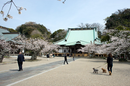
Last year the ume blossom was very late and the cherry quite late, but this year the cherry flowered very early. The magnolia like to wait until after the ume, but this year had barely time to shoot out their flowers before the cherry appeared. The weather has been a bit cold and rainy and the blossom a bit sparse. I find it quite interesting, as the trees clearly don't only respond to today's weather, but the character of the preceeding seasons.

Anyway, flowers this year were a bit sparse at most of the main sites in Kamakura, but at least the poodles remain genki. Komyoji is one of relatively few temples that are sufficiently open access that you can take your dog through.
Komyoji
Up the hill in east Kamakura, some of the tree-lined avenues were looking good. This one is on the way back to Kamakura from a mountain bike ride. The green traffic lights are almost lost in the excess of pink blossom.
cherry blossom road
Although the blooms may not be thw best ever, all the trees flowering fast and together makes the effect on the forested hillsides more dramatic as they turn quite white (for once, I seem to have forgotten to take a photograph). Last night I cycled home through the forest under a rain of petals.

--
Posted By Blogger to jules' pics at 4/02/2013 10:11:00 AM

Sunday, March 31, 2013

Decadal prediction stuff part 2

Ok, having got various things out of the way, on with the show.

I liked this letter which appeared in Nature recently. Not just because I'd done something similar myself with the earlier Hansen forecast :-) In general, I think it's important to revisit historical statements to see how well they held up. Allen et al have gone back to a forecast they made about 10 years ago, and checked how well it matches up to reality. The answer is...


really well. On the left, is the original forecast with new data added, and the right is the same result re-expressed relative to a 1986-96 baseline. The forecast was originally expressed in terms of decadal means, so I don't think there is anything untoward in the smoothing. The solid line black in the left plot is the original HadCM2 output, with the dashed line and grey region representing the adjusted result after fitting to recent (at that time) obs using standard detection and attribution tchniques.

They also compared their forecast to a couple of alternative approaches:


This plot shows the HadCM2 forecast (black), CMIP5 models (blue) and another possible forecast of no forced trend, just a random walk (green). The red line is the observed temperature. They point out that their forecast performed better than the alternatives, in the sense that it assigned higher probability (density) to the observations.

So far, so good. However, I disagree with their statement that "the CMIP5 forecast also clearly outperforms the random walk, primarily because it has better sharpness" (my emphasis). Actually, the CMIP5 forecast outperforms the random walk simply because it is clearly much closer to the data. The CMIP5 mean is about 0.41 in these units (all these numbers are just read off the graph, and may not be precise), the random walk is of course 0, and the observed anomaly is 0.27. The only ways a forecast based on the CMIP5 mean could have undererformed the random walk would have been if it was either so sharp that it excluded the obs (which in practice would mean a standard deviation of 0.06 or less, resulting in a 90% range of 0.31-0.51), or so diffuse that it assiged low probability across a huge range of values (ie, a standard deviation of 0.75 or greater, with associated 90% range of -0.8 to 1.6). The actual CMIP5 width here seems to be close to 0.1, well within those sharpness bounds.

I do think I know what the authors are trying to say, which is that if you are going to be at the 5th percentile of a distribution, it's better to be at the 5th percentile of a sharp forecast than a broad one. But changing the sharpness of the forecast based on CMIP5 would obviously mean the obs were no longer at the 5th percentile! In fact, despite not quite hitting the obs, the CMIP5 forecast is not that much worse than the tuned forecast (black curve), thanks to being quite sharp. And according to the authors' own estimation of how much uncertainty they had in their original forecast, they obviously got extraordinarily lucky to hit the data so precisely. With their forecast width, it would have been almost impossible to miss the 90% interval - this would have required a very large decadal jump in temperature. I don't think it is reasonable to say that one method is intrinsically better than the other, on the basis of a single verification point that both methods actually forecast correctly. If the obs had come in at say 0.4 - which they forecast with high probability - I hardly think they would have been saying that the CMIP5 ensemble of opportunity was a superior approach.

(For what it's worth, I think the method used in this forecast intrinsically has exaggerated uncertainty, but that's another story entirely.)

Friday, March 29, 2013

Economist in making sense shocker

Via Stoat, I find the Economist has been saying stuff about climate sensitivity. Somewhat to my surprise given my recent experience of the media, it seems to make a lot of sense. That could just be because it says
"Work by Julia Hargreaves of the Research Institute for Global Change in Yokohama, which was published in 2012, suggests a 90% chance of the actual change being in the range of 0.5-4.0°C, with a mean of 2.3°C"
which is referring to this, but the rest of the article seems mostly pretty good too. I do wonder about: "Nic Lewis, an independent climate scientist, got an even lower range in a study accepted for publication: 1.0-3.0°C, with a mean of 1.6°C." I've not heard anything from him for some time, and I wasn't convinced last time. But the overall message of a lowering probability of a high sensitivity is hard to deny. Unless you are Reto Knutti, that is, in which case "my personal view is that the overall assessment hasn’t changed much". Of course he was only speaking personally there, and what matters in his role as IPCC lead author, is what the (credible) literature actually says.

Sham journals scam authors

update - read the comments before clicking the links...

Jules pointed me to this article. Someone should warn BEST :-) 

(Yes, I know that technically it's not quite the same thing. Actually, a few years ago a colleague published something in a Hindawi journal, presumably a naive victim of a spam email. See also this article.)

Oh noes - on clicking through to the BEST paper, I see they have a second paper in the same journal! It's about the urban heat island, and according to the abstract, it concludes....drum-roll....that there isn't a significant contamination of the global temperature record. Phew. Somehow they failed to cite our magnum opus on that topic :-)

Rumour has it, their third paper addresses the defecatory habits of ursines in arboreal environments.

We-who-must-not-be-named

Let's face it: pay-to-view scientific publishing is dead, even though its zombie corpse is still staggering around, thrashing around aimlessly.

There's another article in Nature about open access (and at least this one isn't hidden behind a paywall). Actually, it's not that bad, and certainly doesn't seem to be agitating shamelessly in the way that some past articles appeared to be. Among the open access publishers they discuss, there is however one notable absentee: the entire EGU family of journals is conspicuous by its absence. Of course this is only one publishing house operating in a particular field of research, but it's a very big one, and within that area, certainly ACP, BG, CP and probably TC (I don't really know the latter) are important within their fields. It may be worth emphasising that as well as being economically viable (indeed comfortably profitable), the costs of the EGU journals are extremely low, often lower than the publication charges imposed by paywalled journals even before you consider what they are raking in through subscription fees. That makes the excuses of for-profit publishers hard to take seriously. What are they actually adding for their fees?

Although I recently pointed to some dodgy papers in EGU journals, I don't think they are any worse than the AGU or other publishers who use a paywall paradigm - rather, my concern is that I expect them to be better, given the open review and opportunity for additional unsolicited comments. But even Nature, with it's $30-40,000 of investment in every paper, manages to come up with its share of stuff that is known to be wrong before the ink is dry. One nice feature of the EGU system is that you can see the reviews, and in the cases I mentioned, it seems that the problem (if there is one) is that the eds are bending over backwards to be generous towards papers that have been roundly rubbished in review. It is important to maintain some sort of standards, if reviewers are going to be expected to donate their time and energy. It might be useful to see the second and subsequent rounds of reviews, and I'm not sure why this bit is kept secret.

Incidentally, something I have been agitating for over recent years has recently come to pass: there is now a "subscribe to comments" button on each discussion page! So if you spot an interesting manuscript under review, you can easily keep an eye on what the reviewers are saying. I hope this will lead to an increase in non-invited comments. There are also RSS feeds for both the discussion and final publication phases of the journals.

Of course, Nature aren't stupid, and while trying to defend their cash cow for as long as possible, are also increasingly buying in to the open access model. It's just a matter of time. If they can persuade either authors, or funding bodies, that they add up to $40,000 of value to every paper they publish, then maybe they get their money in other ways, and good luck to them. It's time to stop gouging readers who have already paid for the research with their taxes.

Thursday, March 28, 2013

Decadal prediction stuff part 1

I've been meaning to write about decadal prediction for some time, but kept on procrastinating, and the number of relevant papers has increased beyond the scope of a single post. So I'll do a number of short posts instead, until I run out of things to say, or interest, or readers...

First off the bat is this new paper from Geert Jan van Oldenborg et al. I remember meeting Geert Jan way back when I was first learning about data assimilation (with the help of google, I believe it was here) and he was scarily clever back then, but his primary focus has been on shorter-term prediction, so our paths only cross occasionally. Some readers may know of him through his Climate Explorer web portal thingy. In this paper he looked at the reliability of the trends of the CMIP5 ensemble over the last 60 years. We actually did something similar in a rather perfunctory way as part of this paper for CMIP3 (eg Fig 1) and also more recently here for CMIP5 (see Fig 2) but these papers were looking more at equilibrium climatologies and also single (perturbed parameter) versus the multi-model ensembles. When looking at the raw temperature trends from the models, this new paper gets a similar result to us, that the rank histogram is near enough flat to be called reliable, though there's a moderate tendency towards the models warming too much:


(The red line shows the histogram of the rank of the observed trend at each grid point, within the CMIP5 ensemble spread - ideally, it would be flat, and the slope up to the left means that there are relatively more obs in the low end of the model range than at the top end.)

But they then tried an additional step, to look at the regional trend relative to the global mean temperature for each model and obs. And in this case, the obs frequently lie outside the model (ie, the big bins at each end of the red histogram below):


The implication of this different result is that the models have insufficient spatial variability in their regional trends (which is consistent with what others have shown too) - broadly speaking, the models that matched the highest observed regional trends in the previous analysis, did so by warming a lot globally, and those that matched the lowest observed trends, warmed only a little everywhere. So, to the extent that the models did get the right results overall (in the first analysis), they did it by having a wide range in global responses which makes up for their unrealistically low spatial variability. The precipitation trends, however, are poor even without this extra normalisation step. There are a number of possible explanations for this behaviour, but the result is, as they say, "This implies that for near-term local climate forecasts the CMIP5 ensemble cannot simply be used as a reliable probabilistic forecast."

One thing I'd have liked to see is an investigation of the robustness of their result with respect to observational errors, which they don't seem to account for. There are some places where the observed trend seems to vary wildly between adjacent grid boxes, which seems physically unlikely. If not corrected for, obs errors will tend to increase the end bins of the histogram. It would be unreasonably optimistic to expect the ensemble to be perfectly reliable in all respects so I don't doubt the overall conclusion. But it would be interesting to see.