One thing that all the protagonists (myself included) agree on is that SAGE’s estimate of doubling time in mid-March was of critical importance. Vallance testified forcefully to this effect in 2020:
When the SAGE sub-group on modelling, SPI-M, saw that the doubling time had gone down to three days, which was in the middle of March, that was when the advice SAGE issued was that the remainder of the measures should be introduced as soon as possible.
And then confirmed in this exchange with a committee member:
Sir Patrick Vallance: Knowledge of the three-day doubling rate became evident during the week before.
Q1080 [ed – this number has changed from the previous time I posted about this] Graham Stringer: Did it immediately affect the recommendations on what to do?
Sir Patrick Vallance: It absolutely affected the recommendations on what to do, which was that the remaining measures should be implemented as soon as possible. I think that was the advice given.
and again:
Sir Patrick Vallance: The advice changed because the doubling rate of the epidemic was seen to be down to three days instead of six or seven days. We did not explicitly say how many weeks we were behind Italy as a reason to change; it was the doubling time, and the realisation that, on the basis of the data, we were further ahead in the epidemic than had been thought by the modelling groups up until that time.
But why does the doubling time matter so much, and is the difference between 3 days and 5 day really important? The point of this post is to answer these questions.
I’ll start by repeating a couple of plots I first made way back in April 2020 when it was just dawning on me what a colossal cock-up SAGE had made of it. These graphs are generated by a simple SEIR model that I’ve shown to reasonably replicate more sophisticated ones. In the below, the blue “calibrated” line uses data up to 14 March to estimate doubling time, which comes out at 3 days. The red “uncalibrated” line uses parameters from Ferguson’s March 16 paper, which has a doubling time of 5 days.
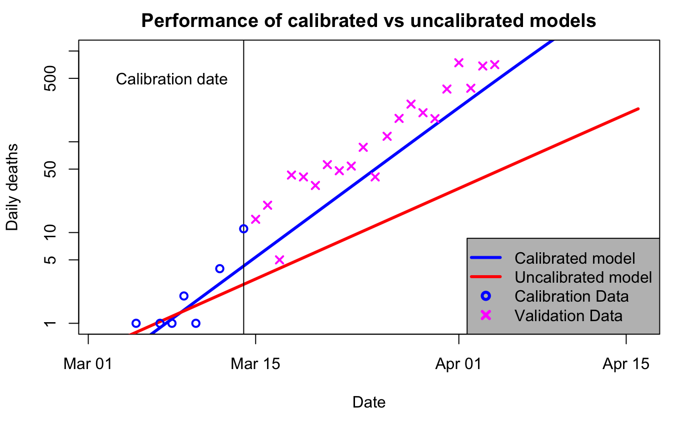
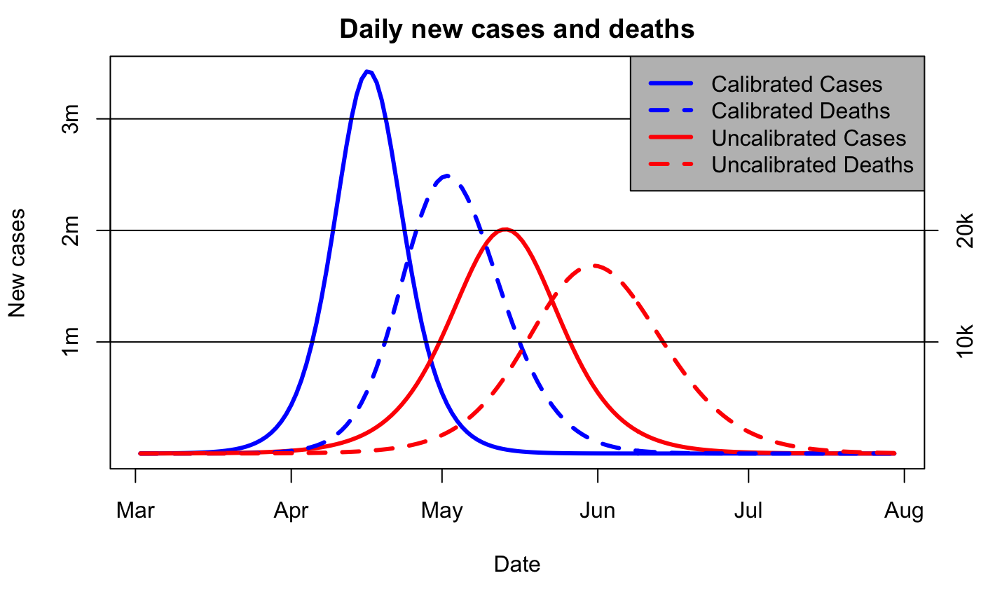
So, one obvious point is that the blue curve does a much better job of predicting what was going to happen (ie, the magenta x, which were not used to calibrate either model). But that’s not the point of this particular post. Rather, it’s just that the predictions for 3d vs 5d doubling are radically different. Here is the longer-term view, now without the logarithmic scaling on the axis:
Note the “we are here” point is mid-March, when the red and blue curves are visually indistinguishable.
There are several reasons why the doubling time matters. Firstly, the estimate of current pandemic size is based on historic data. Edmunds specifically talks of a 12 day delay from infection to illness, to testing, to finally test data reporting. So 100 cases reportedtoday means 100 infections 12 days ago, and that’s 4 doublings at 3d doubling, meaning 1,600 cases now. If the doubling time was only 5d, then the 12 day delay is just over 2 doublings, and we wouldn’t be at 1,600 cases for another 8 days (4 doublings is 20 days, so that means 12 just past and another 8 in the future). So one immediate consequence of a change in perceived doubling time is that we’ve lost just over a week in terms of pandemic progression. (These calculations all ignore the proportion of infections that are undetected, which can reasonably assume to be roughly constant and thus not affect the argument.)
Secondly, the 3d doubling means the pandemic comes much sooner, and (thirdly) reaches a much higher peak, as shown in the 2nd graph above. What was expected some time over the summer, is now happening next month, and it’s going to be a lot worse than expected – getting on for twice as many cases per day at peak.
Finally, the more rapid doubling implies a higher R0-number, and this makes it harder to control. With R0=2.4 (Ferguson’s 16 March number), a reduction of contacts to 40% of normal would control the virus, because 2.4 x 0.4 = 0.96 which is less than 1. Whereas a 3d doubling implies a rather higher R0, let’s say 3.2. This then requires much stiffer action, because 3.2 x 0.4 = 1.28 which is still greater than 1. A reduction to 30% of previous contact levels to get the R number below 1 (3.2 x 0.3 = 0.96 as before) is obviously much tougher to achieve especially given that family members, essential work etc mean we can’t really isolate perfectly. (Quibbling over the exact value of R0 to use doesn’t invalidate the general point that a higher R0 is harder to control.)
So, changing the estimate of doubling time from 5d to 3d would be a real “oh shit” moment for anyone involved in pandemic planning. It means (a) we’ve instantaneously lost 8 days of lead-time, (b) the pandemic peak is going to be coming a month sooner than expected, (c) the peak is going to be almost twice as big as expected, and (d) the control measures we were hoping to use are much less likely to be adequate. Any plan predicated on a 5d doubling time would immediately have to be revisited in the most extreme and urgent manner.
I hope I have convinced my reader that whatever plans were in place in early March under the assumption of a 5 day doubling, the new understanding that the doubling time was instead 3d would cause an abrupt and substantial change of perspective. This, from a scientific perspective, is inevitable and obvious.
3 comments:
Regrettably it is hard to convey such subtleties to politicians with PPE degrees.
In your second figure, why is the difference in deaths less than the difference in cases? Changing the doubling time for cases shouldn’t affect the IFR.
It's a bit of an illusion, the 3-day curve for cases is taller but also much narrower than the 5d one, so the total number of deaths is more similar than the peak would suggest. The death curves are are more similar in width to each other, due to the smoothing out of a random time to death.
Post a Comment