I've tweaked the method just a little since my earlier forecasts.
You may have noticed that the initialisation of my short-term forecasts was fairly poor. This is an inevitable consequence of naively fitting parameters in a simple imperfect deterministic model using a long time series. It gives good overall parameter estimates but the inevitable limitations of the model mean that the final state (from which we look ahead in a forecast) isn't truly a realistic estimate. This can easily be seen in my very first forecast for the UK for example. The spread of model trajectories is quite wide and biased high compared to the last few data points:
A consequence is that even if the trend is perfect, the one-day forecast will be quite poor. We weren't really going to jump from the observed 621 to 1900 deaths in a single day for example, but the day-ahead forecast spread reached that high a value. Various fudges can be used to address this problem, using anomalies is one but that's problematic during exponential growth and won't satisfy the nonlinear model dynamics. The route I have chosen is to weight the more recent data more highly in the fit. The justification for this is that it is a reasonable approximation to allowing the model to forget older data as would happen automatically if I used a stochastic model with sequential updating, or otherwise represented dynamical model error in a more explicit manner. It clearly works at a heuristic level and I'm working on how best to calibrate the effect and implement it in a more technically justifiable manner. I suppose I may end up publishing this somewhere, so I ought to make sure it is defensible.
Last week I looked at Lombardy, and argued that the lockdown was probably working. Here is a re-run of my forecast, withholding the last 7 data points, using a version of the updated method.

You see those cyan flashing circles? They are the 7 latest data points, which were not used in any way in this estimation. Promise!
For giggles, have a look at what IC forecast for Italy last week, and how well that turned out. Each of their forecasts run from Monday to Sunday, the last 4 weeks of experimental forecasts have obs plotted alongside (under!) them and the pink plume is what they forecast just a few days ago for this week. That last one might be just about ok.

Here is what my method predicted for all of Italy starting from the same Sunday as their most recent failed forecast, again with validation data plotted:

I must admit I am impressed as to how well it has worked, though it should be noted that at the heart of it, it's basically a 3 parameter fit for a model that generates two straight lines (in log-space) with a bend joining them so not a terribly difficult problem. If you know the shape of the bend and how it is formulated, there's a good chance you can predict roughly where and when it's going to stop bending. The remarkable thing is that the experts at IC haven't managed to achieve this. I find it baffling that they are quite so hopeless. There are about 50 or 60 of them co-authoring that report, and they do it for a living.
Here is another example, my forecast for Spain, initialised a week last Sunday, versus the IC group forecast at the same date (the rightmost greenish plume with dots below was initialised at the same date).


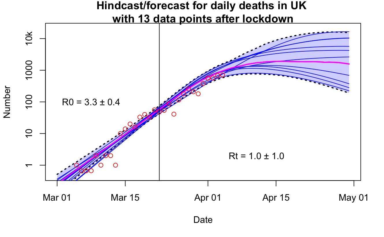
And here is the current UK forecast...before today's figure comes out.

This is the IC forecast for the UK for this week again (pink plume again, below). The data were already outside their range by yesterday. What on earth were they thinking?

5 comments:
Fascinating work,James. Will be interested to see the validation continuing in the next few days.
Chris Hope
Remember to always use your turn signal when changing lanes, lest the epidemiological police ticket you for so-called swerving in traffic.
Been wanting to use that line since ATTP's post ... Stay in your own lane?
James, I encourage publication, ASAP.
Or as we say in these parts, Pronto!
I would be intereted in what mathematical model you are using. Is it a generalized logistic function, a polynomial, something else?
I saw this Imperial College COVID-19 team document (pdf) linked elsewhere, which includes forecasts with and without interventions.
It's out of date now, published on 30 March, but the thing which confuses me is that the intervention forecasts in that document seem to be completely different from the forecasts you've shown here, also from the IC COVID-19 team. Their intervention-included UK forecast for 30 March to 6 April in that document expected a clear reduction in growth rate of deaths-per-day over the week. It's on a log plot so not so easy to see, but the median for 6 April appears to be around 800-900, which is about right.
It looks to me like they do have the ability to forecast with interventions reasonably well but for some reason the IC weekly forecasts are being produced using a model setup assuming non-intervention.
Post a Comment