Tuesday, December 22, 2020

The new variant

The summary is, yes it's real, yes it's serious, and the early signs are that it could be very difficult to maintain any semblance of suppression in the next month or two. Vulnerable people would be well advised to put off and/or cut down any risky activities at least for now, especially with vaccination just around the corner. It's not necessarily any worse if you catch it, but it is spreading rapidly and will be much more likely to infect you. The one glimmer of good news is that the vaccination seems to be progressing smoothly and at a decent pace, though obviously the sooner we can get more supplies of them, the better.


When the new variant was announced last week, I assumed (along with many others, I think) that its impact was probably exaggerated to cover up the govt's embarrassment over the Christmas U-turn. It was only a couple of days previously that Johnson had derided Starmer for suggesting that the Plaguefest plans should be reconsidered. Starmer had been the Grinch that wanted to Cancel Christmas! And now....it was Johnson doing the cancelling. Such is the effect of the torrent of lies and excuses and u-turns that we've been subjected to over recent months and even years. But....there is a new variant, and it is growing.

It has been traced back to September - one thing the UK actually can legitimately claim to be good at is genetic sequencing a sizeable proportion of samples - and has been getting more and more common since then. Here's an assessment from the ECDC on the 20th Dec. The blue line on this figure shows the proportion of samples containing the new variant, over several weeks (right hand scale).


It's been doubling every week over the second half of this period, a little quicker than that in fact. This isn't itself enough to tell us how fast is is growing in absolute terms, but the total number of positive cases was fairly flat over the relevant portion of this interval, maybe declining a little at the very end (the last week, number 47, is probably around 16-22 Nov). So that means it's close to doubling every week in absolute terms, which would work out at an R number of about 1.7, over a period of lockdown when the underlying R number for general infections was close to 1. Another set of data generates a somewhat lower estimate, but it's still clearly higher for the new variant than the old one:


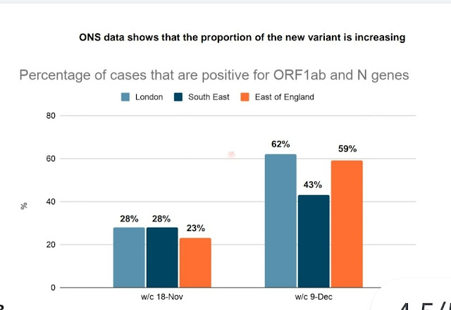
The proportion of new variant roughly doubled in three weeks, but the total number of new cases was also well up over this period, meaning that the absolute growth rate for the new variant was faster than this.

A more comprehensive analysis was published last night by PHE and this is the key figure:


Each dot is the ratio of weekly growth rates for the new variant versus older type, over several weeks (colour coded) and different regions. The blue line is a fitted mean and it's clearly above 1. The scale is supposed to represent the ratio of R numbers for the two variants and they have made a slightly embarrassing error on this calculation which they may excuse as a reasonable approximation though there's no real reason to have done it as it's not really much harder to have done it correctly. It doesn't really matter so long as no-one considers the numerical result to be some precise truth. The point is that the new variant has a substantially larger growth rate, sufficient for case numbers to have actually been rising in absolute numbers during the latter part of the last "lockdown" in London. They get a typical advantage of about 0.5 in additive terms, or you could call it 1.7 as a multiplicative factor (these data mostly relate to during lockdown when R<1 was a reasonable assumption for the old variant). How the different R numbers relate may depend in part on the background restriction in place, it's not something really amenable to precision.

So the exact answer is uncertain, but it's quite plausible that the R number for this new variant could currently be as high as 1.5 now nationally or even higher, which suggests that it might be very hard to get it below 1 on any sort of sustainable basis. We certainly have a race against time to get as far through the vaccination list as quickly as possible. This calculator suggests that a 70 year old person with no additional health conditions might get vaccinated as early as Feb (though the estimate of 1 million per week is surely a bit of a guess). 80 year olds by late Jan. Even getting that far could cut total deaths in half:


(from ActuaryByDay who is pretty reliable though this figure assumes 100% effectiveness which is obviously a generous estimate, scaling the values by 0.9 to account for this would be an improvement and maybe another 0.8(??) to account for incomplete take-up.)

While we roll out the vaccine, it's surely worth re-emphasising the one obvious lesson of the last 9 months - that it's better to act quickly than to hope in vain that it's all going to turn out fine. If this new variant turns out to be anywhere near as bad as these data suggest, we should be acting with extreme urgency to buy ourselves as much time as possible. If it turns out to not be as bad as I'm suggesting, we can drop the restrictions quickly and the additional harm will be modest. Evidence is coming in quickly but the cost of delay is rising exponentially.

BlueSkiesResearch.org.uk: Science breakthrough of the year (runner-up)

Being only a small and insignificant organisation, we would like to take this rare opportunity to blow our own trumpets.

Blue Skies Research contributed to one of the runners-up in Science Magazine’s “Breakthrough of the year” review! Specifically, the estimation of climate sensitivity that I previously blogged about here.

Obviously, were it not for the pesky virus, we would have won outright.

Monday, November 09, 2020

BlueSkiesResearch.org.uk: Modelling the ONS COVID data

I’ve grumbled for a while about the ONS analyses of their infection survey pilot (pilot? isn’t it a full-blown survey yet?) without doing anything about it. The purpose of this blog is to outline the issue, get me started on fixing it (or at least presenting my own approach to an analysis) and commit me to actually doing it this time. There are a couple of minor obstacles that I’ve been using as an excuse for several weeks now and it’s time I had a go.

The survey itself seems good – they are regularly testing a large "random" cohort of people for their infection status, and thereby estimating the prevalence of the disease and how it varies over time. The problem is in how they are doing this estimation. They are fitting a curve through their data, using a method know as a "thin plate spline." I am not familiar with this approach but it’s essentially a generic smooth curve that attempts to minimise wiggles.

There are two fundamental problems with their analysis, which may be related (or not) but are both important IMO. The first is that this smooth curve isn’t necessarily a credible epidemic curve. Epidemics have a particular dynamical form (you can think of them as locally exponential for the most part, though this is a bit of an oversimplification) and while variation in R over time gives rise to some flexibility in the outcome of this process, there are also inevitably constraints due to the way that infections arise and are detected. In short, the curve they are fitting has no theoretical foundation as the model of an epidemic. In practice it has often appeared to me that the curves have looked a bit unrealistic though of course I don’t claim to have much experience to draw on here!

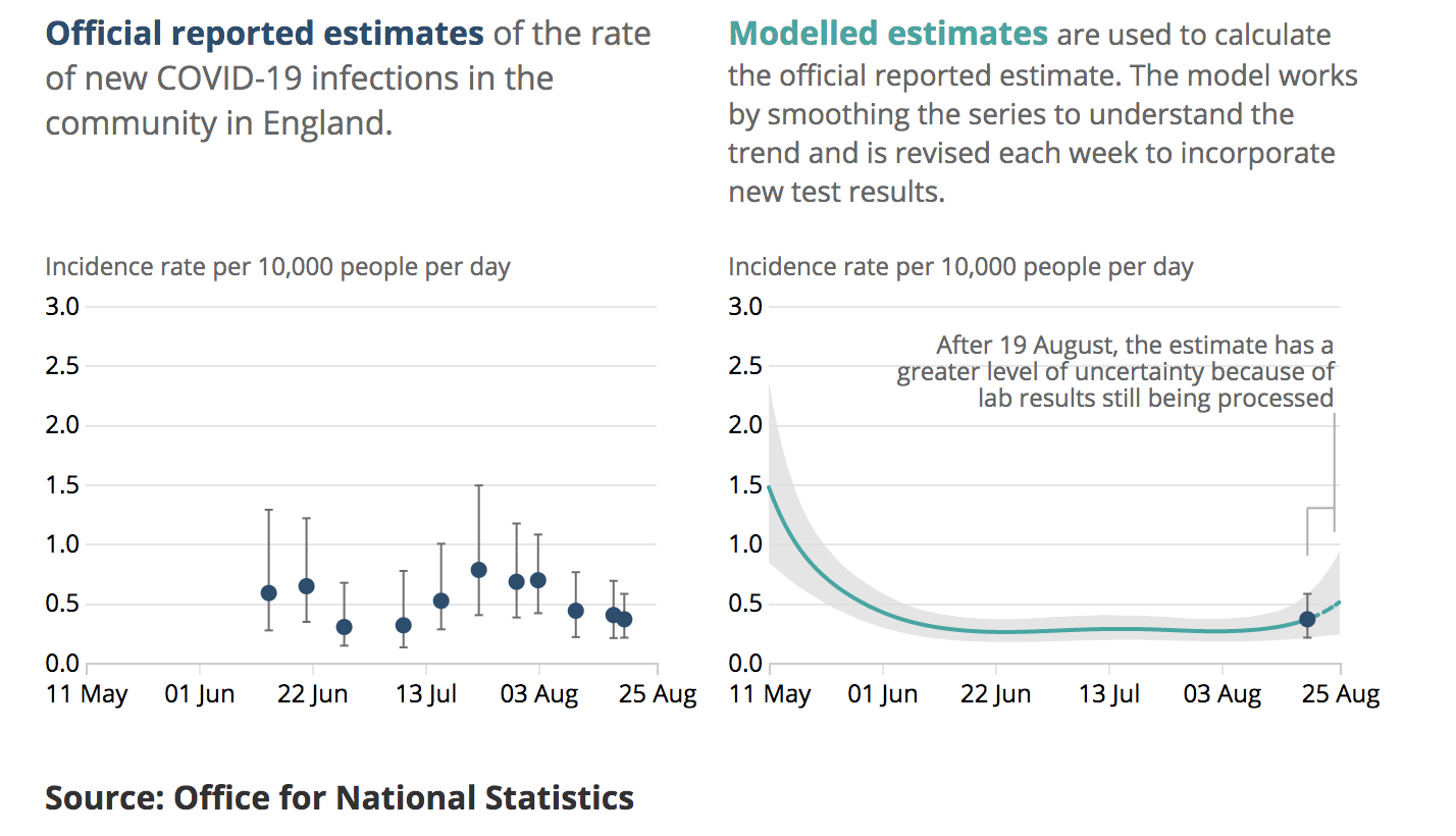
The second fundamental problem is the empirical observation that their analyses are inconsistent and incoherent. This is illustrated in the following analysis of their Sept 4th results:

Here we see their on the right their model fit (plume) to the last few months of data (the data themselves are not shown). The dot and bar is their estimate for the final week which is one of the main outputs of their analysis. On the left, we see the equivalent latest-week estimates from previous reports which have been produced at roughly weekly intervals The last dot and bar is a duplicate of the one on the right hand panel. It is straightforward to superimpose these graphics thusly:

The issue here is that (for example) their dot and bar estimate several reports back centred on the 3rd August, has no overlap with their new plume. Both of these are supposed to be 95% intervals, meaning they are both claimed to have a 95% chance of including the real value. At least one of them does not.

While it’s entirely to be expected that some 95% intervals will not contain reality, this should be rare, occurring only 5% of the time. Three of the dot and bar estimates in the above graphic are wholly disjoint with the plume, one more has negligible overlap and another two are in substantial disagreement. This is not just bad luck, it’s bad calibration. This phenomenon has continued subsequent to my observation, eg this is the equivalent from the 9th Oct:

The previous dot and bar from late Sept is again disjoint from the new plume, and the one just after the dotted line in mid-August looks to be right on the limit depending on graphical resolution. In the most recent reports have changed the scaling of the graphics to make this overlaying more difficult, but there is no suggestion that they have fixed the underlying methodological issues.

The obvious solution to all this is to fit a model along the lines of my existing approach, using a standard Bayesian paradigm, and I propose to do just this. First, let’s look at the data. The spreadsheet that accompanies the report each week gives various numerical summaries of the data and the one that I think is most usable for my purposes is the weighted fortnightly means in Table 1d which take the raw infection numbers and adjust to represent the population more accurately (presumably, accounting for things like different age distributions in the sample vs the national population). Thanks to the weekly publication of these data, we can actually create a series of overlapping fortnightly means out of two consecutive reports and I’ve plotted such a set here:

It’s not quite the latest data, I’m not going to waste effort updating this throughout the process until I’ve got a working algorithm at which point the latest set can just slot in. The black circles here are the mean estimates, with the black bars representing the 95% intervals from the table.

Now we get to the minor headaches that I’d been procrastinating over for a while. The black bars are not generally symmetric around the central points as they arise from a binomial (type) distribution. My methods (in common with many efficient approaches) require the likelihood P(obs|model) to be Gaussian. The issue here is easy illustrated with a simple example. Let’s say the observations on a given day contain 10 positives in 1000 samples. If the model predicts 5 positives in a sample of 1000, then it’s quite unlikely we would obtain 10: P(O=10|m=5) = 1.8%. However if the model predicts 15 positives, the chance of seeing 10 is rather larger: P(O=10|m=15) = 4.8%. So even though both model predictions are an equal distance from the observation, the latter has a higher likelihood. A Gaussian (of any given width) would assign equal likelihood to both 5 and 15 as the observations are equally far from either of these predictions. I’ve wondered about trying to build in a transformation from binomial to Gaussian but for the first draft I’ll just use a Gaussian approximation which is shown in the plot as the symmetric red error bars. You can see a couple of them actually coincide with the black bars, presumably due to rounding on the data as presented in the table. The ones that don’t, are all biased slightly low relative to the consistent positive skew of the binomial. The skew in these data is rather small compared to that of my simple example but using the Gaussian approximation will result in all of my estimates being just a fraction low compared to the correct answer.

Another issue is that the underlying sample data contribute to two consecutive fortnightly means in these summaries. A simple heuristic to account for this double-counting is to increase uncertainties by a factor sqrt(2) as shown by the blue bars. This isn’t formally correct and I may eventually use the appropriate covariance matrix for observational uncertainties instead, but it’s easier to set up and debug this way and I bet it won’t make a detectable difference to the answer as the model will impose strong serial correlation on this time scale anyway.

So that’s how I’m going to approach the problem. Someone was previously asking for an introduction to how this Bayesian estimation process works anyway. The basic idea is that we have a prior distribution of parameters/inputs P(Φ) from which we can draw an ensemble of samples. In this case, our main uncertain input is a time series of R which I’m treating as Brownian motion with a random daily perturbation. For each sample of Φ, we can run the model simulation and work out how likely we would be to observe the values that have been seen, if the real world had been the model – ie P(Obs|Φ). Using these likelihood values as weights, the weighted ensemble is directly interpretable as the posterior P(Φ|Obs). That really is all there is to it. The difficulties are mostly in designing a computationally efficient algorithm as the approach I have described may need a vast ensemble to work accurately and is therefore sometimes far too slow and expensive to apply to interesting problems. For example, my iterative Kalman smoother doesn’t actually use this algorithm at all, but instead uses a far more efficient way of getting to the same answer. One limitation that it requires (as mentioned above) is that the likelihood has to be expressed in Gaussian form.

Tuesday, September 15, 2020

SAGE versus reality

Something I've been meaning to do for a while is look at how well the SAGE estimates of the growth rate of the epidemic have matched up to reality over the long term. For the last 3 months now, SAGE have published a weekly estimate not only of R but also the daily growth rate, which is actually a more directly interpretable number (as well as being provided to a higher degree of precision). What I have done is taken their estimate of daily growth rate and integrated it over time. And plotted this against the number of cases actually reported.

Here we are:

The solid blue line is the central estimate from SAGE, with the dashed lines calculated using the ends of the range they published each week. Red is the weekly mean number of cases over this time period, with this line scaled to start at the same place in week 1 (ending on Friday 19 June). Latest SAGE estimate in this plot is from Friday 11 Sept.

Agreement was very good for the first few weeks, with case numbers going down at the rate described by SAGE of about 3% per day. But then the case numbers started to drift up in July...and SAGE continued to say the epidemic was getting smaller. Over the last few weeks the discrepancy has grown sharply. Note that the dashed lines assume the extreme edge of the range presented by SAGE, week after week - so this would require a consistent bias in their methodology, rather than just a bit of random uncertainty.

Honesty compels me to point out that the comparison here is not completely fair, as the number of cases may not be a consistent estimate of the size of the outbreak. Some of the rise in cases may be due to increased testing. However the discrepancy between case numbers and the mean SAGE estimate is now a factor of 10 compared to the starting point of this analysis. That's not due to better testing alone!

Saturday, September 12, 2020

Weekly RRRRRRReport

A lot of different estimates of the growth rate (R) of the epidemic have come out in the last couple of days, so here's a summary of which ones are wrong (and why) and which ones you can believe. And who am I to do this, you might reasonably ask? While not an epidemiologist, my professional expertise is in fitting models to data, which is precisely what this question demands. And the available evidence suggests I'm rather better at it than many epidemiologists appear to be.

As you may recall, a month ago I posted an argument that R really couldn't be under 1 any longer, and the epidemic was starting to grow again. At the time, the "experts" of SAGE were still insisting that R was less than 1, and they kept on claiming that for a while, despite the very clear rise in reported case numbers. The rise has continued and indeed accelerated a bit, other than for a very brief hiatus in the middle of last month. Part of this steady rise might have be due to a bit more testing, but it's been pretty implausible to believe that all of it was for a while now. I'll come back to SAGE's ongoing incompetence later.

I'll start with my own estimate which currently comes out at R= ~1.3. This is based on fitting a very simple model to both case and death data, which the model struggles to reconcile due to its simplicity. The average death rate (as a percentage of infected people) has dropped in recent weeks, thanks to mostly younger people being infected recently, and perhaps also helped by some improvements in treatment. I could try to account for this in the model but haven't got round to it. So it consistently undershoots the case numbers and overshoots deaths a bit, but I don't think this biases the estimate of R enough to really matter (precisely because the biases are fairly constant). Incidentally, the method I'm using for the estimation is an iterative version of an ensemble Kalman smoother, which is a technique I developed about 15 years ago for a different purpose. It's rather effective for this problem and clearly superior to anything that the epidemiologists are aware of. Ho hum.

Here are my plots of the fit to cases (top) and deaths (bottom) along with the R number.


As pointed out, these graphs need better annotation. Top graph is modelled daily infections (blue plume), modelled daily cases (green plume with some blue lines sampled from the ensemble and the median shown as magenta) and case ascertainment ratio which is basically the ratio of these (red plume, RH scale). Reported case numbers are the red circles. Bottom graph is modelled deaths (green plume with lines again) with data as red circles. Red plume here is the effective R number (RH scale). R number and case ascertainment are the fundamental parameters that are being fitted in my approach. Infection fatality rate is fixed at 0.75%.

So far, so good. Well, bad, but hopefully you know what I mean.

Another relevant weekly analysis that came out recently is the infection pilot survey from ONS. Up to now it's been pretty flat and inconclusive, with estimates that have wobbled about a little but with no clear signal. This all changed with their latest result, in which the previous estimate of 27,100 cases (uncertainty range 19,300 - 36,700) in the week of 19 - 25 Aug increasing to 39,700 (29,300 - 52,700) in the week 30 Aug - 5 Sept. That is a rise of 46% in 11 days or about 3.5% per day. R is roughly the 5-day growth rate (for this disease), so that corresponds to an R value of 1.2, but note that their analysis doesn't extend over the past week when the cases have increased more sharply. 


Actually, I don't really think the ONS modelling is particularly good - it's a rather arbitrary curve-fitting exercise - but when the data are clear enough it doesn't matter too much. Just looking at the raw data that they kindly make available, they had almost 1 positive test result per 1000 participants over the fortnight 23 Aug - 5 Sept (55 cases in 59k people) which was 65% up on the rate for the previous fortnight of 26 cases in 46k people. Again, that works out at R=1.2.

A rather worse perspective was provided by SAGE, who continue to baffle me with their inability to apply a bit of common sense and update their methods when they repeatedly give results so strikingly at odds with reality. They have finally noted the growth in the epidemic and managed to come up with an estimate marginally greater than 1, but only to the level of R=1.1 with a range of 1-1.2. And even this is a rounding-up of their estimate of daily growth rate of 1 ± 2% per day (which equates more closely to R=1.05 with range of 0.95-1.15). Yes, they really did say that the epidemic might be shrinking by 1% per day, even as cases are soaring and hospital admissions are rising. I do understand how they've managed to generate this answer - some of the estimates that feed into their calculation only use death data, and this is still very flat - but it's such obvious nonsense that they really ought to have pulled their heads out of their arses by now. I sometimes think my work is a bit artificial and removed from practical issues but their unwillingness to bend to reality gives ivory tower academics a bad name.

At the other extreme, a paper claiming R=1.7 was puffed in the press yesterday. It's a large survey from Imperial College, that bastion of incompetent modelling from the start of the epidemic. The 1.7 number comes from the bottom right hand panel in the below plot where they have fitted an exponential through this short subset of the full time series of data. There is of course a lot of uncertainty there. More importantly, it doesn't line up at all with the exponential fitted through the immediately preceding data set, starting at a lower level than the previous curve finishes. While R might not have been constant over this entire time frame, the epidemic has certainly progressed in a continuous manner, which would imply the gap is filled by something like the purple line I've added by hand.


It's obviously stupid to pretend that R was higher than 1 in both of the recent intervals where they made observations, and just happened to briefly drop below 1 exactly in the week where they didn't observe. The sad thing about the way they presented this work to the media is that they've actually done a rather more sensible analysis where they fit the 3rd and 4th intervals simultaneously, which is shown as the green results in the 3rd and 4th panels on the top row of the plots (the green in the 3rd panel is largely overlain by blue which is the fit to 2nd and 3rd intervals, but you can see if you click for a larger view). Which gives.....R=1.3. Who'd have thought it?

Of course R=1.7 is much more headline-grabbing. And it is possible that R has increased towards the end of their experimental period. Rather than fitting simple exponentials (ie fixed R values) to intervals of data, perhaps a more intelligent thing to do would have been to fit an epidemiological model where R is allowed to vary through time. Like I have been doing, for example. I'm available to help and my consultancy rates are very reasonable.

In conclusion, R=1.3(ish) but this is a significant rise on the value it took previously and it might well be heading higher.

Wednesday, August 05, 2020

Could R still be less than 1?

It's been suggested that things might all be fine, maybe the increase in case numbers is just due to more/better testing. There certainly could be a grain of truth in the idea, as the number of tests undertaken has risen a little and the proportion of tests that have been positive has actually kept fairly steady over recent weeks at around 1%. On the other hand, you might reasonably expect the proportion of positives to drop with rising test numbers even if the number of ill people was constant, let alone falling as SAGE claim - consider at the extreme, 65 million tests couldn't find 650,000 positives if only a few tens of thousands are actually ill at any one time. Also, the ONS pilot survey is solid independent evidence for a slight increase in cases, albeit not entirely conclusive. But let's ignore that inconvenient result (as the BBC journalist did), and consider the plausibility of R not having increased in recent weeks. 

This is fairly easy to test with my data assimilation system. I can just stop R from varying at some point in time (by setting the prior variance on the daily step to a negligible size). For the first experiment, I replaced the large jump I had allowed on 4th July, with fixing the value of R from that point on. Note however that the estimation is still using data subsequent to that date, ie it is finding the (probabilistic) best fit for the full time series, under the constraint that R cannot change past 4 July. I've also got a time-varying case ascertainment factor which I'll call C, which can continue to vary throughout the full interval.

Here are the results, which are not quite what I expected. Sure, R doesn't vary past the 4th of July, but in order to fit the data, it shoots up to 1 in the few days preceding that date (red plume on 2nd plot). The fit to the death data in the bottom plot looks pretty decent (the scatter of the data is very large, due to artefacts in the counting methodology) and also the case numbers in the top plot are reasonable. See what has happened to the C factor though (red plume on top graph). After being fairly stable through May and most of June, it takes a brief nose-dive to compensate for R rising at the end of June, and then has to bounce back up in July to explain the rise in case numbers.


While this isn't impossible, it looks a bit contrived, and also note that even so, we still have R=1, firmly outside the SAGE range of 0.8-0.9. Which isn't exactly great news with school opening widely expected to raise this value by 0.2-0.5 (link1link2).

So, how about fixing R to a more optimistic level, somewhere below 1? My code isn't actually set up very well for that specific experiment, so instead of holding R down directly, I just put the date back at which R stops varying. In the simulations below it can't change past the 1st June. It still climbs up just prior to that date, but only to 0.9 this time, right at the edge of the range of SAGE values. The fit to the death data is similar, but tis time the swoop down for C on the upper plot is a bit more pronounced (because R is higher through June) and then it has to really ramp up suddenly in July to match the rise in case numbers. You can see that it starts to underestimate the case numbers towards the present day too, C would have to keep on ramping up even more to match that properly.


So R being in the SAGE range isn't completely impossible, but requires some rather contrived behaviour from the rest of the model which doesn't look reasonable to me. I don't believe it and think that unfortunately there is a much simpler explanation for (some of) the rise in case numbers.

More what-ifs

It was pointed out to me that my previous scenarios were roughly comparable to those produced by some experts, specifically this BBC article  referring to this report. And then yesterday another analysis which focussed on schools opening.

The experts, using more sophisticated models, generated these scenarios (the BBC image is simplified and the full report has uncertainties attached):


and for the schools opening report:


The tick marks are not labelled on my screenshot but they are at 3 month intervals with the peaks being Dec on the left hand and March on the right hand panel.

While these are broadly compatible with my analyses, the second peak for both of them is significantly later than my modelling generates. I think one important reason for this is that my model has R a little greater than 1 already at the start of July, whereas they are assuming ongoing suppression right through August until schools reopen. So they are starting from a lower baseline of infection. The reports themselves are mutually inconsistent too, with the first report having a 2nd peak (in the worst case) that is barely any higher than the first peak, and the second report having a markedly worse 2nd peak, despite having a substantially lower R number over the future period that only briefly exceeds 1.5. It's a bit strange that they differ so significantly, now I think about it...I'm probably missing something obvious in the modelling.

Of course in reality policy will react to observations, so all scenarios are liable to being falsified by events one way or another.

Sunday, August 02, 2020

What if?

It's a while since I did any real forecasting, the current system just runs on a bit into the future with the R values gradually spreading out due to the daily random perturbations, and the end result is pretty obvious. Now with the effective R value probably just above 1, and various further relaxation planned (e.g. end of furlough, schools returning) jules thought it would be interesting to see what might possibly happen if R goes up a bit.

Here are two ensembles of simulations, both tuned the same way to historical data, which gives an R_effective of about 1.1 right now. The step up on the 4th July is a modelling choice I made through choice of prior, in allowing a large change on that one day only rather than a gradual ramping up around that time. In the first set of forecasts, I ramp up R by 0.5 over 30 days through September. For the modellers, I'm actually using R as my underlying parameter, calculating R_effective based on the proportion of people who (it is assumed!) have acquired immunity through prior infection. So typically the underlying R value is going up from 1.2 to 1.7 or thereabouts. You can see the resulting ramp up in R_eff on the plot, with the subsequent drop entirely due to the herd immunity factor kicking in as the second wave peaks. The new peak in deaths is...not pretty. I'm disappointed it is so severe, in my head I'd been assuming that a much lower R number (compared to the 3-3.5 at the start) and non-negligible level of current immunity would have helped to keep it lower.


The second set of results is a more optimistic assumption where R only goes up by 0.2, this time in a single step when the schools go back near the start of Sept (don't quote me on the date, it was just a guess). However....it's still not great I'm afraid. The lower R gives a more spread out peak and there is a chance of things turning out not too badly but a lot of the trajectories still go up pretty high, with most of them exceeding the April max in daily deaths, and sustaining this for quite a while.


So...that's all a bit of a shame. There are however reasons why this may be a bit too pessimistic: it is well-known that this simple model will overestimate the total penetration of the disease as it doesn't account for heterogeneity in the population, which could make a significant difference. Also, I've kept the fatality rate at 0.75% despite advances in treatment which have definitely nudged it lower than it was at the start. On the other hand, the model does not account for loss of immunity here among people who have had the virus. Not clear if that simplification is truly valid over this time scale.

Anyway, these are not predictions, I just put in some reasonable-sounding (to me!) numbers to see what would happen. It does look like any further significant increase in R will have serious consequences.

Thursday, July 30, 2020

The price of freedom

The Govt changed the lockdown rules substantially from the 4th July, with pubs, restaurants reopening and a new “1m plus” rule to replace the previous 2m distancing requirement. Predictably, the tabloids announced a new free-for-all which they labelled “Independence day”.

Up to this time, the R number had been fairly stable at around 0.8, meaning that each infected person would pass the disease onto less than one person on average and the rate of illness (and death) was dropping fairly steadily at about 20% reduction per week.

Below is how my model fits to the data up to 4th July (red circles in both plots). You can click on the plots for bigger and clearer versions. The left hand plot is daily reported cases, and the right hand plot is daily deaths. The green plume shows the model fit to each of these, with a few lines from the ensemble drawn on (dark blue) and the median prediction in magenta. The thin blue plume is the total modelled number of new infections each day, which is much higher. There is also a red plume on this plot representing the “case ascertainment factor”, ie the proportion of infections that is actually observed. This uses the scale on the right hand side of the plot, and so rises from about 1% at the start of the epidemic, to around 10% now. The blue circles represent data that had not been observed by the 4th July, and you can see in the LH plot that they tend to drift above the model forecast.

On the right hand plot, the red plume is the R number (which again uses the axis on the right hand side of that plot). It starts off around 3ish, then drops sharply when the lockdown controls were imposed, and wobbles around a bit after that point. The “current” number quoted there (mean and range) is the estimate as of the 4th July. The data observed subsequent to that date agree better with the model than was the case in the LH plot, but still look to be more above than below the forecast.


Redoing the analysis as of yesterday's data (i.e. including all data points in the estimation), and we get the following:


Now the rise in cases is reflected in the LH graph, and the corresponding rise in R is shown at the bottom of the RH plot. R is probably greater than 1, meaning that the epidemic is starting to take off again. It seems that something happened around the 4th of July to increase the rate of infection. I wonder what that could have been?

So, emboldened by these results and Peter's comment below we can try adding in a step change on the 4th July - this is just a high variance step in the prior, I'm not imposing a rise specifically, just allowing a large change. This generates the result below and it looks like a rather better fit especially to cases. However I'm not really that confident about what is going to happen and especially wouldn't be surprised if there is a bit of a decoupling between cases and deaths due to differences in the age range of people infected (eg mostly younger working age with a much lower fatality rate).


Thursday, July 23, 2020

BlueSkiesResearch.org.uk: Back to the future

Way back in the mists of time (ie, 2006), jules and I saw what was going on with people estimating climate sensitivity, and in particular how this literature was interpreted by the authors of the IPCC AR4. And we didn’t like it. We thought that any reasonable synthesis should consider the multiple lines of evidence in a coherent fashion in order to form a credible overall view. This resulted in the paper "Using multiple observationally‐based constraints to estimate climate sensitivity" described in this blog post (paper here), which people unfamiliar with the story might like to glance at before progressing further…

It’s fair to say that our intervention was not met by universal approval at the time, with the established researchers mostly finding excuses as to why our result might not be entirely trustworthy. Fine, do your own calculations, we said. And they didn’t.

Time passed, and a new generation of people with different backgrounds became interested in estimating climate sensitivity. The World Climate Research Program (WCRP) made it a central theme in one of their Grand Challenges in climate science. There were a couple of meetings in Ringberg that jules and then I attended sequentially.

In 2016, several of leaders of this WCRP steering group wrote a paper which kicked off a project to perform a new synthesis of the evidence on climate sensitivity. Their idea was to form an overall synthesis of the multiple lines of evidence, roughly along the lines that we had originally proposed, but in a far more comprehensive and thorough fashion. This is something that the IPCC isn’t really equipped to do, as it just assesses and summarises the literature. The project leaders considered three main strands of evidence: that arising from process studies (ie the behaviour of clouds, including simulations from GCMs), the transient warming over the historical record, and paleoclimate. Jules was one of the lead authors for the paleo chapter, but I wasn’t involved at the outset. However when invited to join the group I was of course happy to contribute to it, having thought about the problem off and on for the past decade.

Writing it was a lengthy and at times frustrating process, due to the huge range of ideas, topics, backgrounds and knowledge of the author team. That is also what gives this review its strength, of course, as we have genuine experts in multiple areas of modelling and data analysis, covering a huge range of time scales and techniques, and the different perspectives meant we gave each other quite a workout in testing the robustness of our approaches and ideas. During the 4 year process we had regular videoconferences, typically 9pm UK time, being 6am for Japan, 10am in Australia and afternoon for the continental USA. Luckily we had an 8-9h gap in the global spread so no-one actually had to get up in the middle of the night each time! We also had a single major writing meeting in Edinburgh in summer 2018 which almost all the main authors were able to attend in person, and a handful of "meet-ups of opportunity" when subsets happened to go to other conferences. In all, it was good practice for the new normal that we are enjoying due to COVID.

The peer review was probably the most extensive I’ve experienced, with something like 10 sets of comments – this was something we were all keen on, as we suspected it would be beyond the compass of just the usual 2-3 people. Comments were basically encouraging but gave us quite a lot to work on and in fact we reorganised the paper substantially for the better resulting in the 2nd set of reviews being very positive. Finally got it done a couple of months ago and it was accepted subject to very minor corrections (which were mostly things we had spotted ourselves, in fact).

The new paper has now been published, actually I’m not entirely sure it is up yet (minor snafu on the embargo timing) but anyone who needs an urgent look can find it here. I may write more on the details if pressed, but for now here is a quick peek at the main results:


The "baseline" calculation is what we get from putting together all the evidence, with a resulting 2.6-3.9C "likely" range. The coloured curves are various sensitivity tests, with the purple line at the top defined as the range from the lowest 17th percentile, and the highest 83rd percentile, across these tests. This isn’t really a probability range and doesn’t correspond to any particular calculation.

Tuesday, July 21, 2020

That Russian Report, in full, in brief


We hear no evidence of Russian interference. We discuss no evidence of Russian interference. We see no evidence of Russian interference.

Sunday, July 19, 2020

Patrick Vallance's faulty memory

On reflection, perhaps it shouldn't be surprising. We expect the Chief Scientist to be a genius with a brain the size of a planet who is perpetually on top of their game, but in fact they are a human frequently operating under great stress, and fallible like the rest of us. Nevertheless, his first responsibility - and ours - is to the truth, and it is therefore my task to explain that he unfortunately misled the House of Commons Science and Technology Committee when he appeared before it on Thursday 16th July.

The topic under consideration is SAGE's recommendations around mid-March, when the various restrictions were being introduced - some have argued (and I'm among them) that this happened rather too late, with the result that the country suffered many more deaths, and far greater economic damage, than would have been the case with prompt action.

Most of the interesting action during his appearance was under questioning from Graham Stringer MP, from about 50 minutes in to the video, or Q1041 on the transcript. Stringer is pressing him on the promtness (or otherwise) of introducing the lockdown, and particularly the speed of response to the data showing more rapid doubling than they had originally assumed:
Q1041 Graham Stringer: As a scientist, I was always taught to forget hypotheses, theories and ideas and look at the data, because having preconceived ideas can distort the way you look at things. When we went into this, scientists in this country were looking at data from China that showed a doubling of the infection every six or seven days. When you looked at our data closely, the infection death rates were doubling every 30 to 36 hours. Why didn’t you and SAGE advise the Government to change their attitude because, if you had looked at that and given that advice, the lockdown might have happened earlier?
To start with, to avoid the usual tedious ducking and weaving from the usual tedious suspects, it's important to be clear about the terms. When Stringer and Vallance are talking about “lockdown”, they mean the strict policies from the 23rd March onwards, when we were told to stay at home, all non-essential shopping and travel was forbidden, etc. As Vallance puts it:
there was a series of steps in the run-up to lockdown, which started with the isolation of people who had come from China, but the main ones were: case isolation; household isolation; and recommendations not to go to pubs, theatres and so on.
So, “lockdown” here means policies of the 23rd March, as also confirmed by Hancock in Hansard:
the level of daily deaths is lower than at any time since lockdown began on 23 March.
Sorry for this tedious pedantry, but experience has shown some people will, having lost the argument about timing, duck and weave about what "lockdown" means in the first place.

So, back to the timing. Vallance's main claim, which I will argue is incorrect, is contained in the following sentences:
When the SAGE sub-group on modelling, SPI-M, saw that the doubling time had gone down to three days, which was in the middle of March, that was when the advice SAGE issued was that the remainder of the measures should be introduced as soon as possible. I think that advice was given on 16 or 18 March, and that was when those data became available.
Note how clear he is that this advice to introduce the remainder of the measures - ie implementation of the full lockdown - was based on the realisation that the doubling time was as short as 3 days. I'll let him off with his use of “had gone down to” - in reality the doubling time had not changed at all, it was just SAGE's realisation that had gone down, but I will be generous and attribute this to sloppy language. He emphasises this reliance on the new data repeatedly:
Sir Patrick Vallance: Knowledge of the three-day doubling rate became evident during the week before. 
Q1042 Graham Stringer: Did it immediately affect the recommendations on what to do?  
Sir Patrick Vallance: It absolutely affected the recommendations on what to do, which was that the remaining measures should be implemented as soon as possible. I think that was the advice given.
and again:
Sir Patrick Vallance: The advice changed because the doubling rate of the epidemic was seen to be down to three days instead of six or seven days. We did not explicitly say how many weeks we were behind Italy as a reason to change; it was the doubling time, and the realisation that, on the basis of the data, we were further ahead in the epidemic than had been thought by the modelling groups up until that time.
So he is absolutely certain that the advice to proceed full steam ahead on the lockdown was predicated on the new 3 day doubling time.

However, he also claimed that this advice was given “on 16 or 18 March.” This is the critical error in his statements, that prompted this blog. Some people have jumped on this claim (and to be fair to Vallance, he was obviously unsure of the exact date in his response) to argue that the Govt was slow to react to SAGE's recommendation, and that this was the cause of the late lockdown and large death toll.

Unfortunately, Vallance was mistaken with his dates. In fact, SAGE actually still thought the doubling time was 5-6 days on the 16th March (minutes):
UK cases may be doubling in number every 5-6 days.
and by the 18th March their estimate was even slightly longer (minutes):
Assuming a doubling time of around 5-7 days continues to be reasonable.
It is therefore not at all surprising that the minutes of these two meetings do not contain any recommendation, or even a hint of a suggestion of a recommendation, that we should proceed with haste to a full lockdown. In fact the minutes of the 18th March make the very specific and detailed recommendation that schools should be shut, with the clear statement that further action would only be necessary “if compliance rates are low” (NB compliance with all measures has been consistently higher than in the modelling assumptions):
2. SAGE advises that available evidence now supports implementing school closures on a national level as soon as practicable to prevent NHS intensive care capacity being exceeded.
3. SAGE advises that the measures already announced should have a significant effect, provided compliance rates are good and in line with the assumptions. Additional measures will be needed if compliance rates are low.
Incidentally, this is why we have to be precise about what “lockdown” means, so that certain people don't pivot to “Aha! They said we should shut something! Vallance was right all along!” SAGE here is not recommending “lockdown” in the sense used by Vallance, Stringer, Hancock, or anyone else. They are only recommending school closures, which the Govt did implement promptly at that time.

Now let's go back to this from Vallance:
When the SAGE sub-group on modelling, SPI-M, saw that the doubling time had gone down to three days, which was in the middle of March, that was when the advice SAGE issued was that the remainder of the measures should be introduced as soon as possible.
The relevant SPI-M meeting at which they reduced their estimate of doubling time was actually on the 20th March (minutes). At this meeting, they abruptly realised:
Nowcasting and forecasting of the current situation in the UK suggests that the doubling time of cases accruing in ICU is short, ranging from 3 to 5 days.
[...]
The observed rapid increase in ICU admissions is consistent with a higher reproduction number than 2.4 previously estimated and modelled; we cannot rule out it being higher than 3.
All well and good, but a week late.

The nest SAGE meeting was on the 23rd (21st-22nd was a weekend) and at this point they conclude (minutes):
The accumulation of cases over the previous two weeks suggests the reproduction number is slightly higher than previously reported. The science suggests this is now around 2.6-2.8. The doubling time for ICU patients is estimated to be 3-4 days.
(NB doubling time is in principle the same for all measures of the outbreak, ignoring transient effects as the epidemic gets established. That's why it is such a useful concept and measure.)

SAGE also state at this meeting on the 23rd:
Case numbers in London could exceed NHS capacity within the next 10 days on the current trajectory.
They don't explicitly minute the need for a tight lockdown, but certainly provide statements that point in that direction, such as:
High rates of compliance for social distancing will be needed to bring the reproduction number below one and to bring cases within NHS capacity.
It seems reasonable to conclude that the message taken from this meeting was that London at least was on the verge of exceeding capacity and that strong measures needed to be urgently taken to slow transmission. As Vallance had put it:
the remaining measures should be implemented as soon as possible.
So it seems that Vallance has described the narrative arc precisely as the minutes of all the meetings around this time describe, but for the important fact that he got the date of this final recommendation wrong. He appears to have created a false memory of a world where the heroes of SAGE worked it all out in the nick of time, and told the government....who then sat on this information and delayed lockdown for a week. It's a nice story, but it's not actually what happened. The data were certainly clear to many by mid-March (ie the 14th, prior to the famously uncalibrated runs of the Imperial College model) but SAGE resolutely ignored and rejected this evidence for a further week, and this delay caused huge unnecessary harm to the country.

This would be a minor tale of a small slip of memory, were it not for the unfortunate fact that various factions have glommed onto Vallance's statement as proof that the scientists were blameless and the Govt guilty. Most egregiously, SAGE member Jeremy Farrar tweeted:
To make the mistake that Vallance did, under pressure of live questioning, is forgivable. To double down on the error from the comfort of your own computer, when the documentation is freely available, is not. The minutes prove that SAGE did not accept the evidence of the short doubling time on the 16th and 18th March. It is quite possible that some SAGE members - perhaps including Farrar - had tried to sound the alarm about the rapid doubling at an earlier time. However, they did not carry the day and I find no evidence that they spoke up in public either. SAGE did not recommend lockdown prior to the 23rd March, however much it suits various peoples' agendas to claim so.

Saturday, July 18, 2020

Mountains and molehills

A couple of weeks ago, I heard about an issue with the way COVID deaths are counted in England. It seems that PHE are going through the lists of people who had died every day, and checking to see if they had previously had a positive COVID test. If so, they are added to the total number of COVID deaths for the day, even if they had long since made a full recovery and were run over by a bus (or died of some other illness).

Clearly this is wrong, and will tend to overstate the number of people killed by the disease. Equally clearly, there aren't many deaths falling into this situation. Take the total number of 300k positive tests, assume this means 300k people (which it doesn't, as many people are tested more than once) and that they have an average remaining life span of 40 years. Then we'd expect to see 20 of them die every day from all causes, implying about this many of the daily "COVID deaths" in the PHE stats are bogus. That took me under 5 mins to work out, so I shrugged and ignored the issue. My number might not be quite right, the 40m remaining years of life thing will depend on the precise age/gender distribution of those who have tested positive but it's hard to see it being too far wrong. In the face of 100 deaths per day, about 20 of them being erroneously counted is not a huge issue though it would become more of a problem as/when the daily death toll shrinks further. It certainly has little bearing on any retrospective analysis of the size of the outbreak so far.

Two weeks later, and Loke (who I now note is who I first learnt about this issue from) and Heneghan write an article covering this issue, and promote it all round the press. I'm sure it is just an unfortunate accident that they make it sound like it's a really big issue that is major factor in explaining why the death toll in England has remained so high, as they are surely competent enough to have reproduced the calculation I presented above. Unsurprisingly, it's been picked up by the denialist wing of the media which is desperately trying to pretend that the response in England has been anything other than absolutely terrible. It's probably worth mentioning that Heneghan has form for minimising the dangers of COVID: in this piece he argues that the fatality rate is down around 0.2% which is far below all credible estimates I've seen and implies that a very large proportion of UK population has had the disease, which is robustly refuted by a hefty pile of evidence. 

Now Hancock has called for an "urgent inquiry" into this and is using it as a excuse to halt publication of the daily statistics. Even though he's a bit dim, it's hard to believe he doesn't have any numerate advisors who could tell him why it's not that big a deal. Indeed PHE quickly put out a rebuttal which supports my analysis - they pointed out that 90% of the COVID deaths occurred within 28 days of diagnosis, and of the remaining 4000, half of them were directly attributed to COVID on the death certificate anyway. Leaving perhaps 2000 bogus deaths which should not have been added. Over a ~100 day period that's pretty much the same as the 20 per day figure I came up with above.

Compare and contrast with the known under-reporting which is clear from the total death statistics and perhaps most stark in care homes, where the total "non-COVID" deaths have a massive bump coincident with the epidemic. We know that patients were pushed out of hospitals into care homes, without any testing or facilities for safe care and treatment, and it's clear that many thousands of these people died without being counted in the COVID statistics. See the huge yellow bump in the official ONS statistics below: 


This miscoding of unrelated deaths is small beer in comparison.

One way of getting the "correct" answer would be to use excess deaths, but that involves a certain amount of statistical work (excess over what, and how is this calculated?) and is not so quick and easy to come by. So I don't know what they will come up with as a solution. Using a cut-off date might be a reasonable solution, perhaps in conjunction with death certificate where it didn't specify COVID as the cause. Ie, cut out those 2k deaths where they both (a) took more than 28d from diagnosis to death and (b) were not directly attributed to COVID by a doctor. That would seem to minimise any errors in a straightforward manner, so probably they will do something more complicated...

Friday, July 03, 2020

Ho hum

Haven't posted for a while, so how about a few minutes of James O'Brien to pass the time.

Friday, June 26, 2020

BlueSkiesResearch.org.uk: Like a phoenix redux

Even odder than finding that our old EnKF approach for parameter estimation was particularly well suited to the epidemiological problem, was finding that someone else had independently invented the same approach more recently…and had started using it for COVID-19 too!

In particular, this blogpost and the related paper, leads me to this 2013 paper wherein the authors develop a method for parameter estimation based on iterating the Kalman equations, which (as we had discovered back in in 2003) works much better than doing a single update step in many cases where the posterior is very small compared to the prior and the model is not quite perfectly linear – which is often the case in reality.

The basic idea behind it is the simple insight that if you have two observations of an unknown variable with independent Gaussian errors of magnitude e, this is formally equivalent to a single observation which takes the average value of the two obs, with an error of magnitude e/sqrt(2). This is easily shown by just multiplying the Gaussian likelihoods by hand. So conversely, you can split up a precise observation, with its associated narrow likelihood, into a pair of less precise observations, which have exactly the same joint likelihood but which can be assimilated sequentially in which case you use a broader likelihood, twice. In between the two assimilation steps you can integrate the model so as to bring the state back into balance with the parameters. It works better in practice because the smaller steps are more consistent with the linear assumptions that underpin the entire assimilation methodology.

This multiple data assimilation idea generalises to replacing one obs N(xo,e) with n obs of the form N(xo,e*sqrt(n)). And similarly for a whole vector of observations, with associated covariance matrix (typically just diagonal, but it doesn’t have to be). We can sequentially assimilate a lot of sets of imprecise obs in place of one precise set, and the true posterior is identical, but the multiple obs version often works better in practice due to generating smaller increments to the model/parameter samples and the ability to rebalance the model between each assimilation step.

Even back in 2003 we went one step further than this and realised that if you performed an ensemble inflation step between the assimilation steps, then by choosing the inflation and error scaling appropriately, you could create an algorithm that converged iteratively to the correct posterior and you could just keep going until it stopped wobbling about. This is particularly advantageous for small ensembles where a poor initial sample with bad covariances may give you no chance of reaching the true posterior under the simpler multiple data assimilation scheme.

I vaguely remembered seeing someone else had reinvented the same basic idea a few years ago and searching the deep recesses of my mind finds this paper here. It is a bit disappointing to not be cited by any of it, perhaps because we’d stopped using the method before they started….such is life. Also, the fields and applications were sufficiently different they might not have realised the methodological similarities. I suppose it’s such an obvious idea that it’s hardly surprising that others came up with it too.

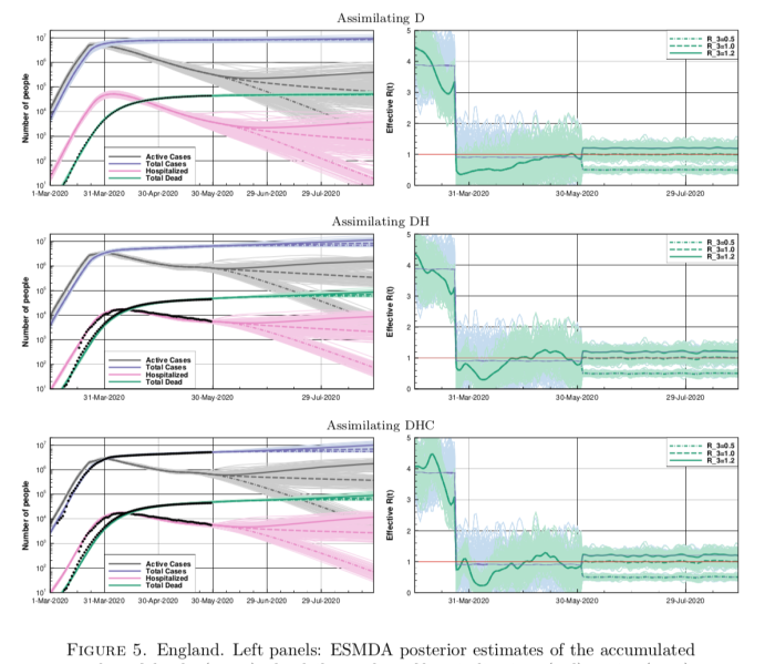
Anyhow, back to this new paper. This figure below is a set of results they have generated for England (they preferred to use these data than accumulate for the whole of the UK, for reasons of consistency) where they assimilate different sets of data: first deaths, then deaths and hospitalised, and finally adding in case data on top (with some adjustments for consistency).

Screenshot 2020-06-24 21.25.10

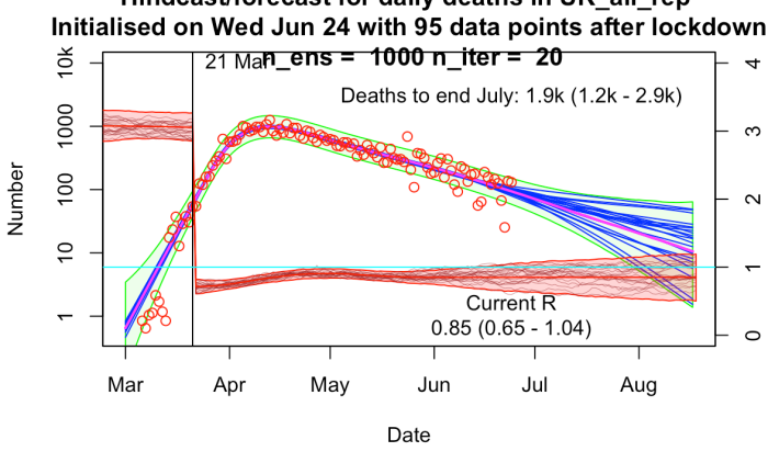
The results are broadly similar to mine, though their R trajectories seem very noisy with extremely high temporal variability – I think their prior may use independently sampled values on each day, which to my mind doesn’t seem right. I am treating R as taking a random walk with small daily increments except on lockdown day. In practice this means my fundamental parameters to be estimated are the increments themselves, with R on any particular day calculated as the cumulative sum of increments up to that time. I’ve include a few trajectories for R on my plot below to show what it looks like.

uk_24_jun_1000